Creative studiolo specialized in brand identity and creative direction.
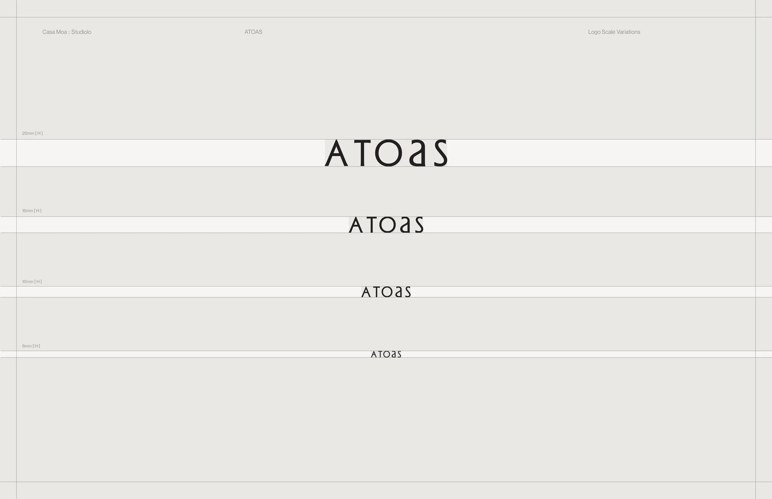
ATOAS
SECTOR
SOLUTIONS
Naming
Identity
Ecosystem
Photography Direction
Packaging
Collateral
Luxury Rest & Ritual Goods
Atoas emerged from the reclamation of slowness. A modern apothecary built around the rituals of sleep, dream, and nervous system repair. The founder envisioned a world where rest is not an afterthought but a right, tended to with tenderness, design, and devotion. As the brand moved beyond concept and into form, it needed a visual and structural world that could hold its depth: elemental, restrained, and sensorial.
Our role was to shape that world, translating physiological states into visual language, crafting vessels that echo the movement of breath, and establishing a design system that feels timeless, tactile, and quiet. The result is a brand that exhales, inviting modern life into a slower rhythm.
OVERVIEW

Texture

Art Direction
Context
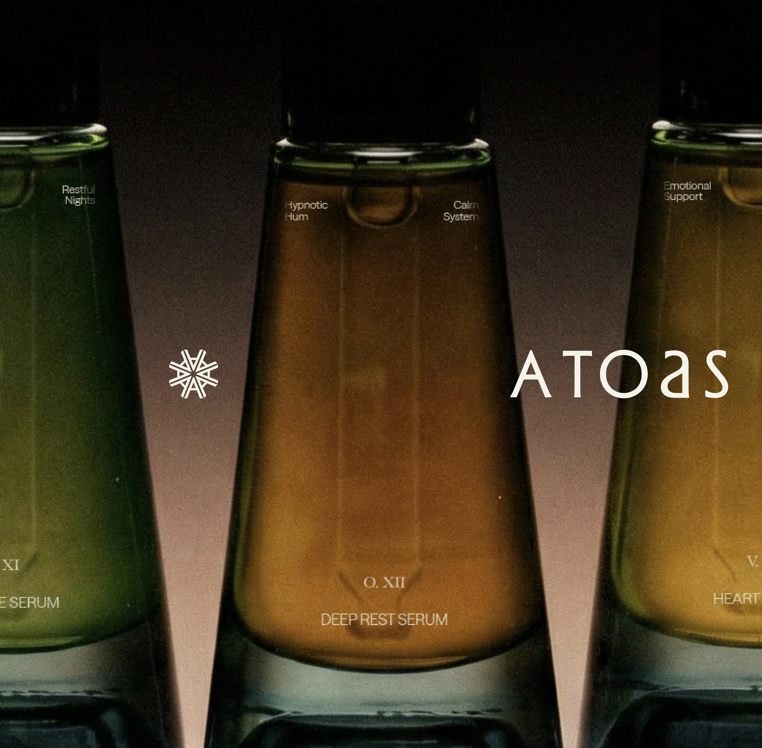
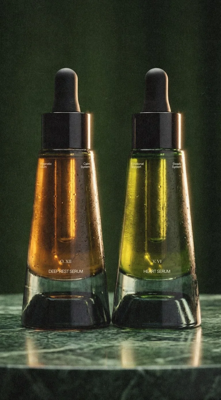
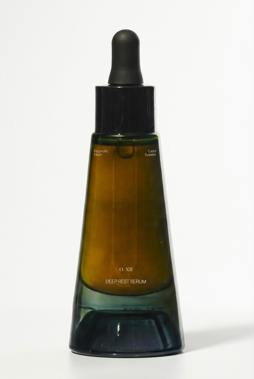
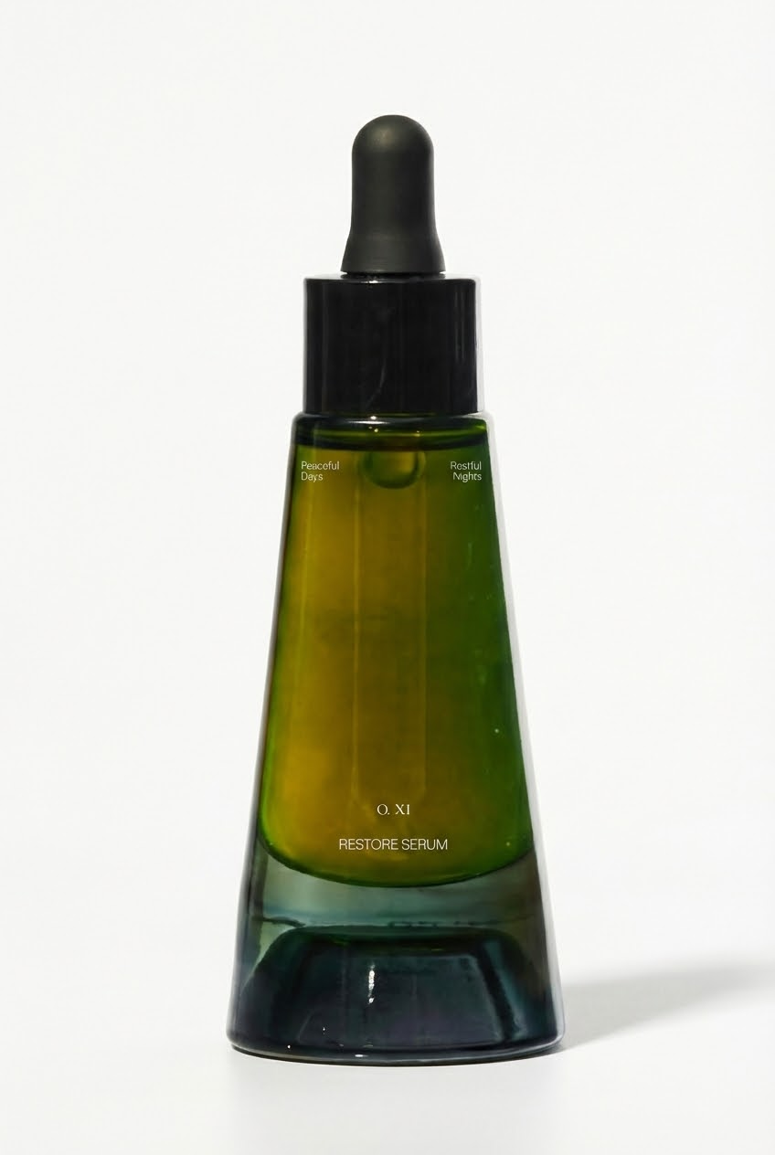
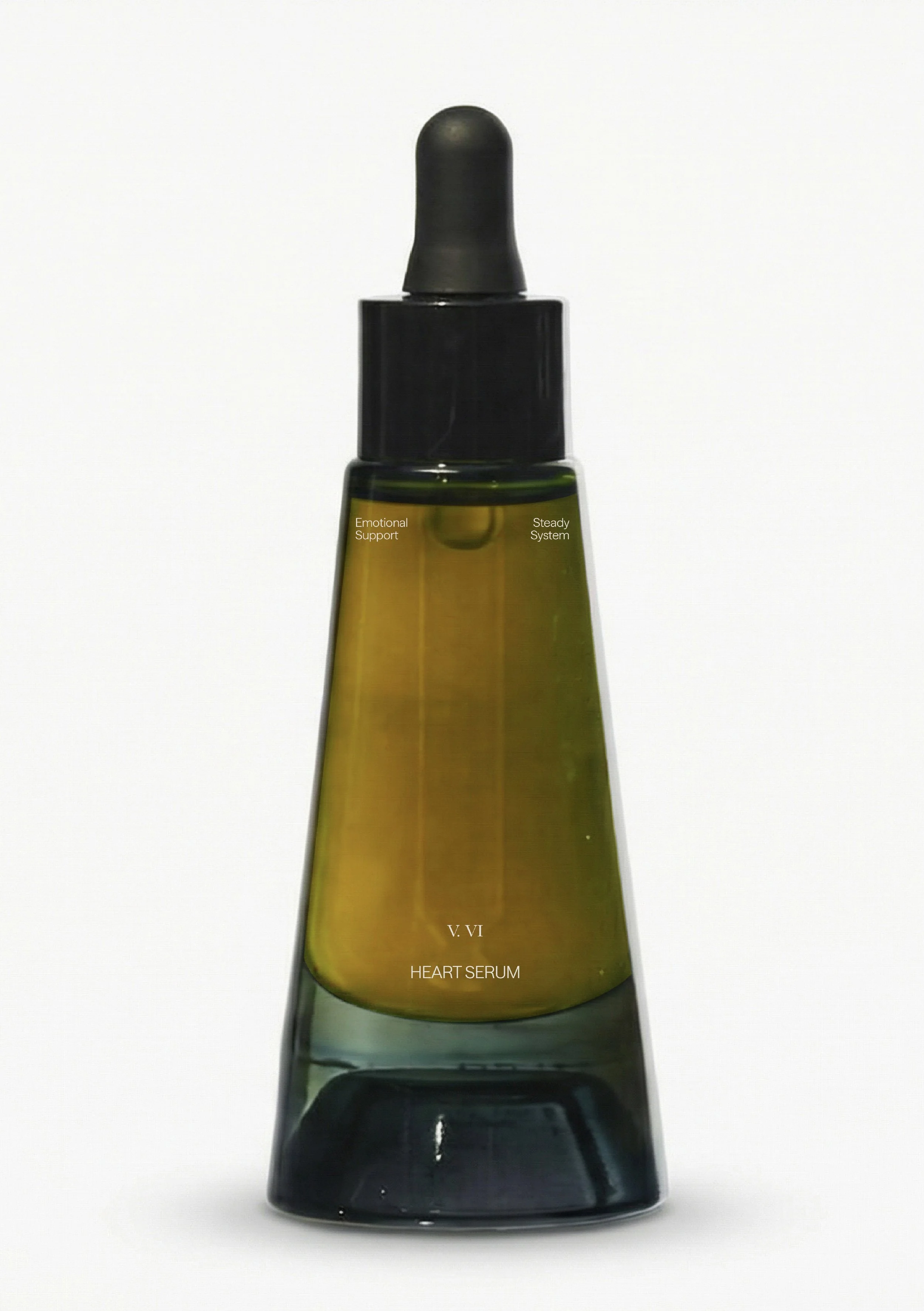
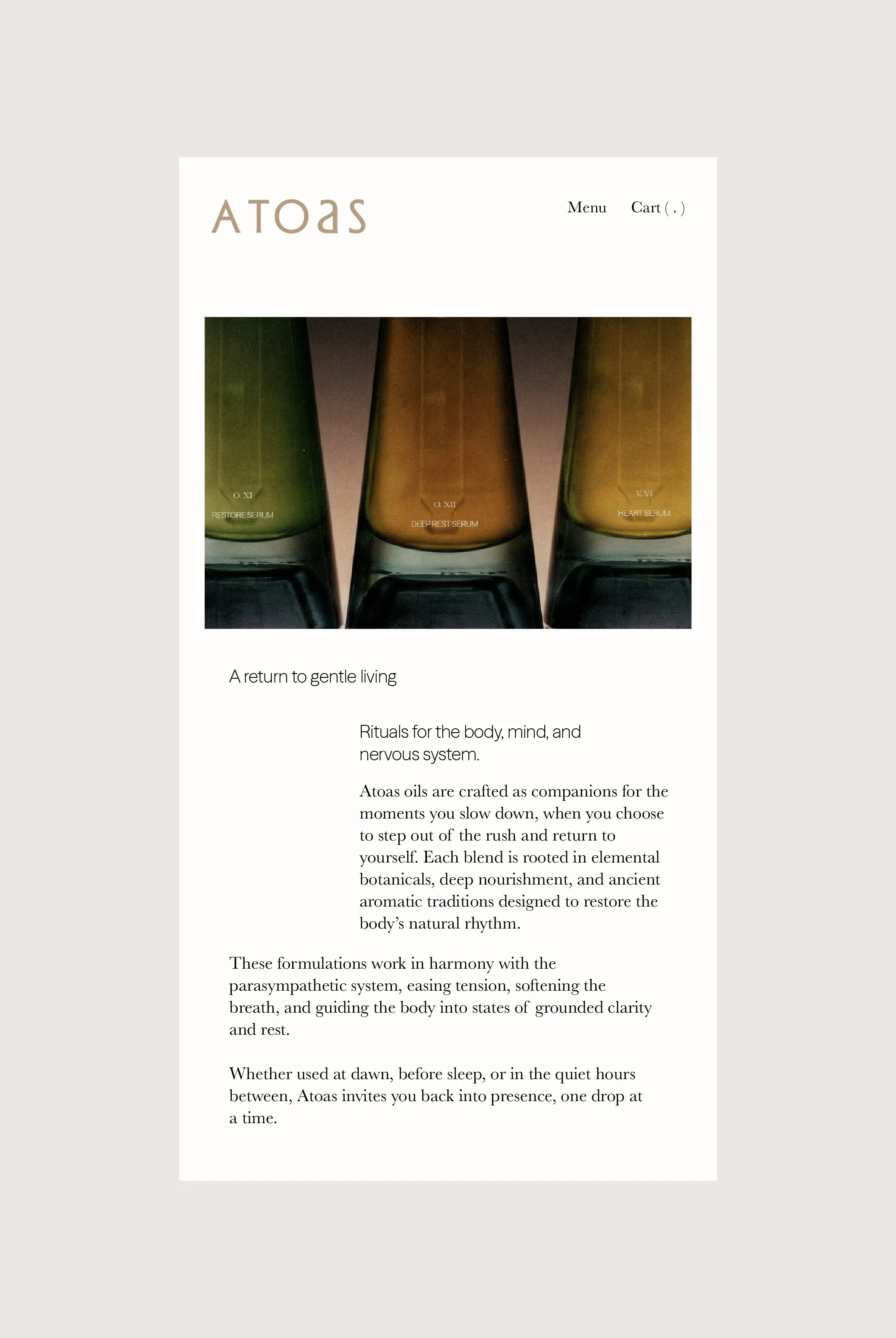
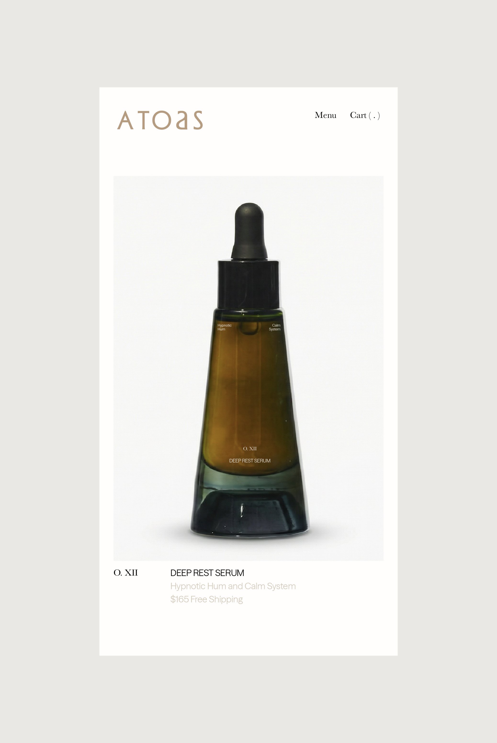
Designed as ritual objects, the Atoas vessels were crafted to feel like companions, intimate, grounded, and atmospheric. Their geometry draws from the language of old-world apothecaries but softened into something more human: a silhouette that feels architectural and yet warm, inherently calming. Each tone in the glass shifts with the light, echoing the movement of the nervous system, from deep greens for grounding to amber for warmth to honeyed hues that evoke rest.
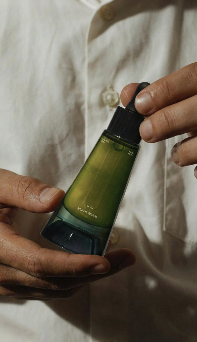
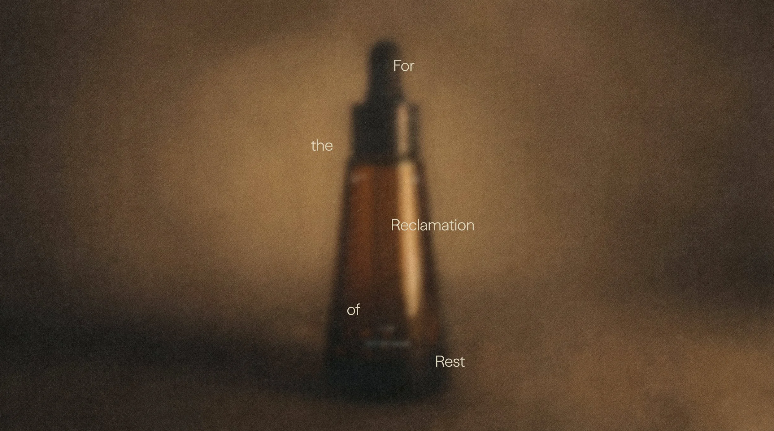
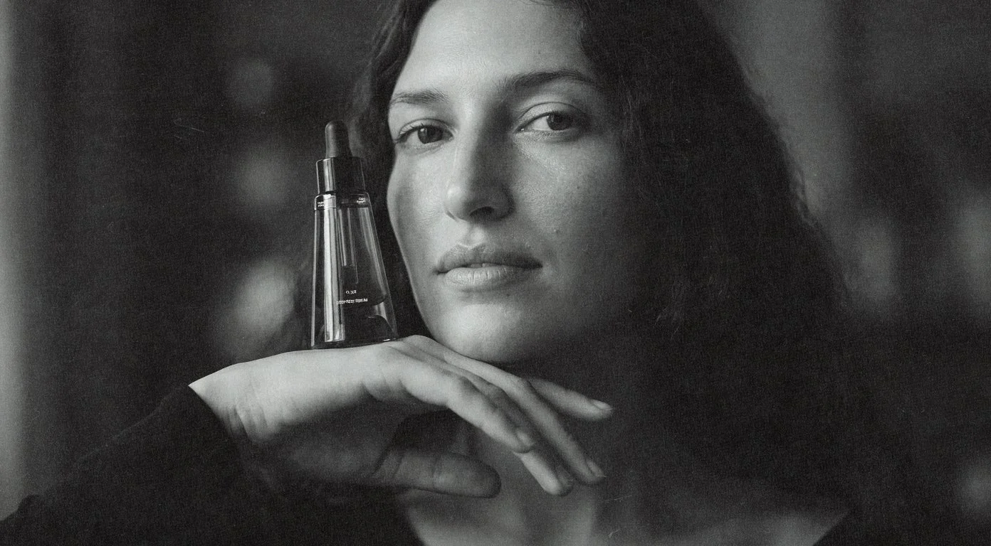
Every product was photographed as if caught inside a moment, a breath, an exhale, a pause. The imagery carries a cinematic softness, reflecting the emotional temperature of the brand: slow, nourishing, hypnotic. The intention was to build a world that feels lived-in and real, where wellness isn’t aesthetic perfection but presence.
Solutions
Naming
Brand Identity
Ecosystem
Photography Direction
Packaging
Website
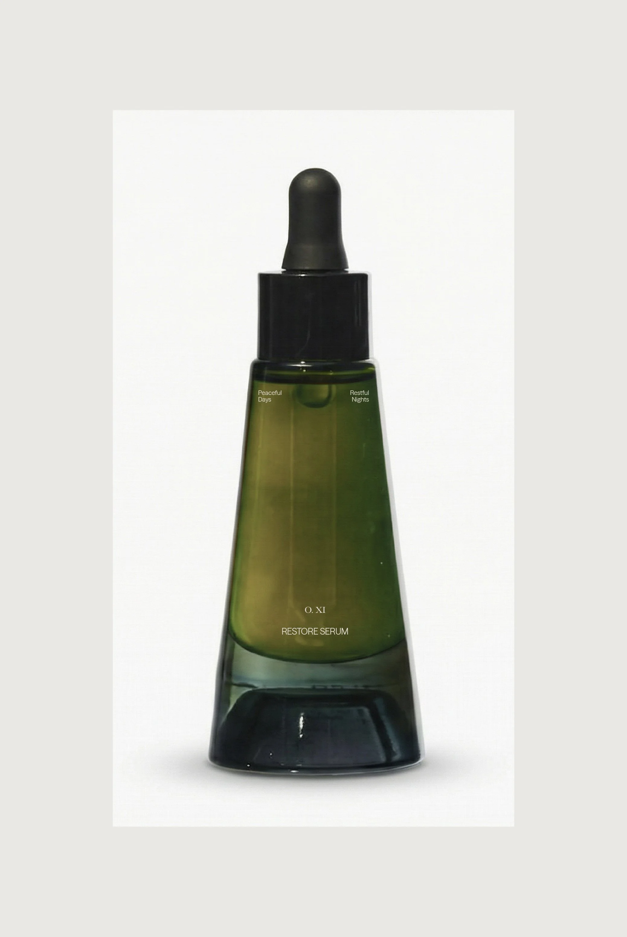
Product Detail

Compass
Vessel Set
Packaging
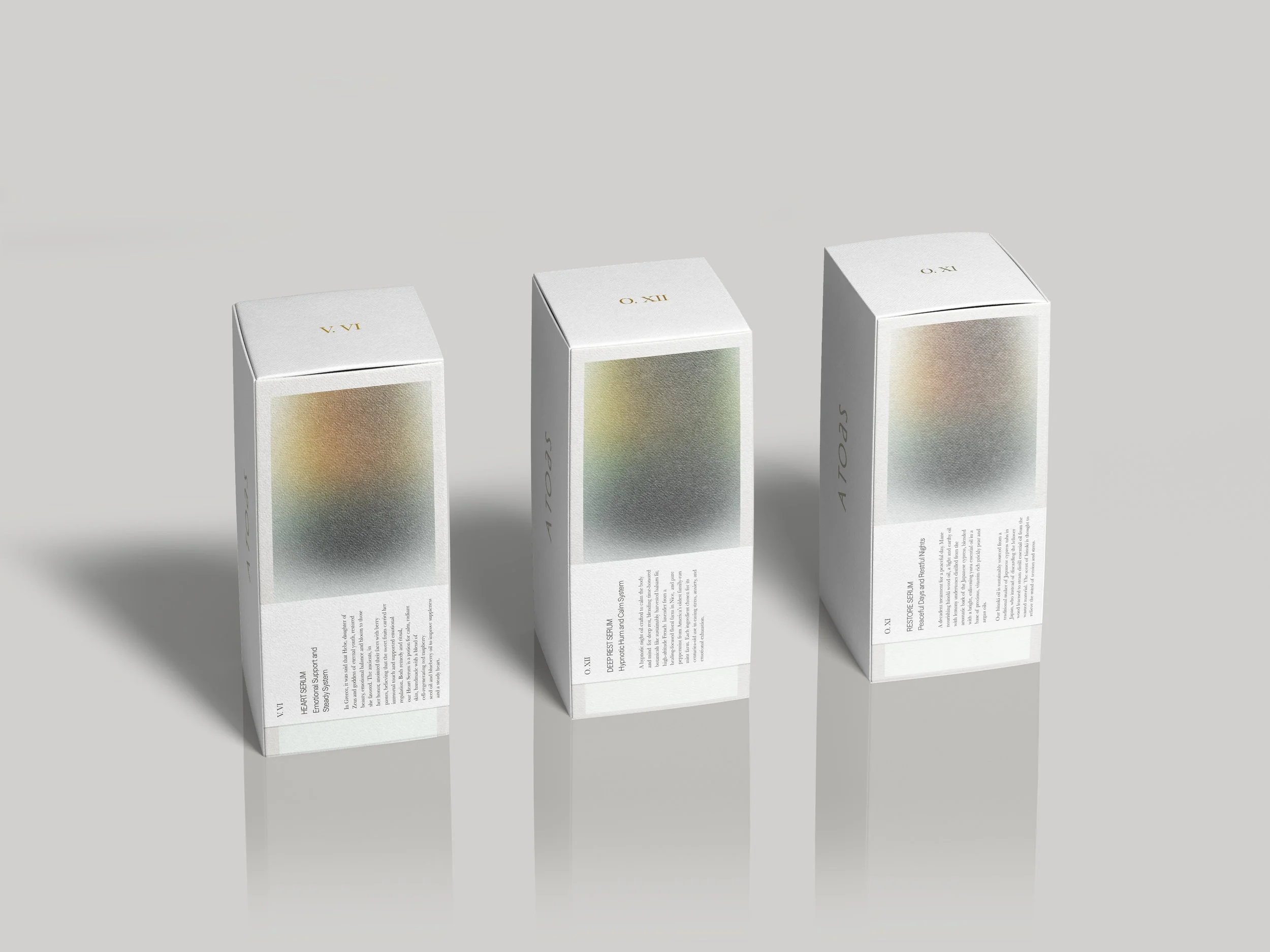
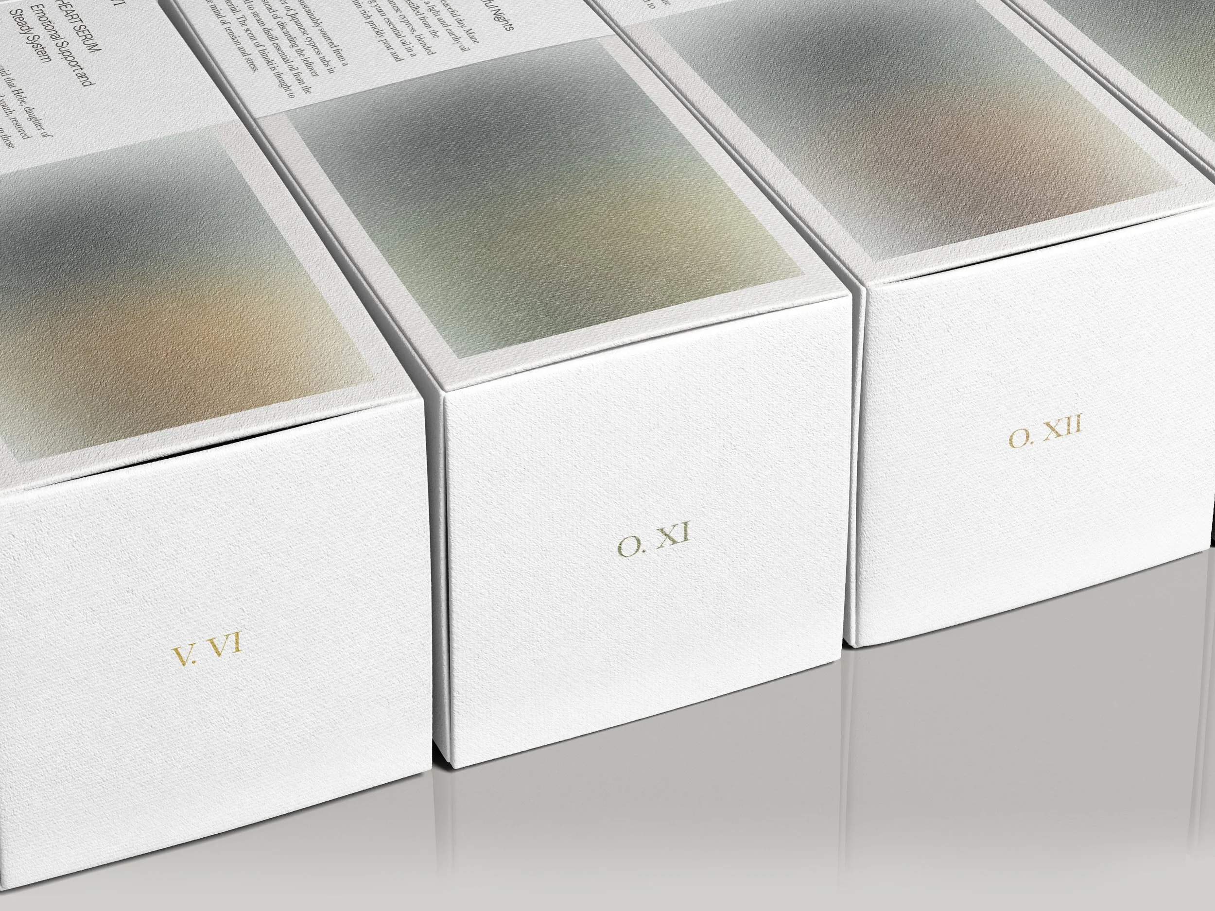
The packaging system was designed to feel like an exhale. Soft gradients echo the hypnotic tones of the oils inside, creating a visual transition from wakefulness to rest. Each box acts as an entry point into the ritual, minimal in structure yet atmospheric in presence. The goal was to build a sensory quietude before the product is even opened.
The vessels themselves are expressed as a chromatic spectrum, shifting from deep greens to warm ambers. Each tone corresponds to a distinct emotional state and botanical profile, allowing the collection to communicate intuitively through color. The result is a system that feels modern, ceremonial, and deeply grounded in the body’s natural rhythms.
Packaging
Ethos
Packaging System
Context
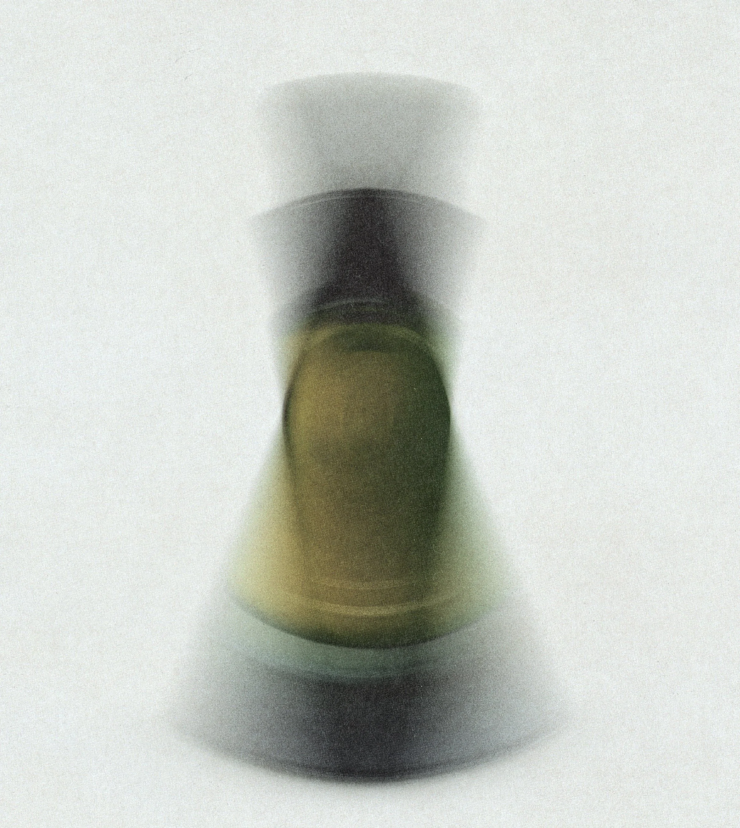
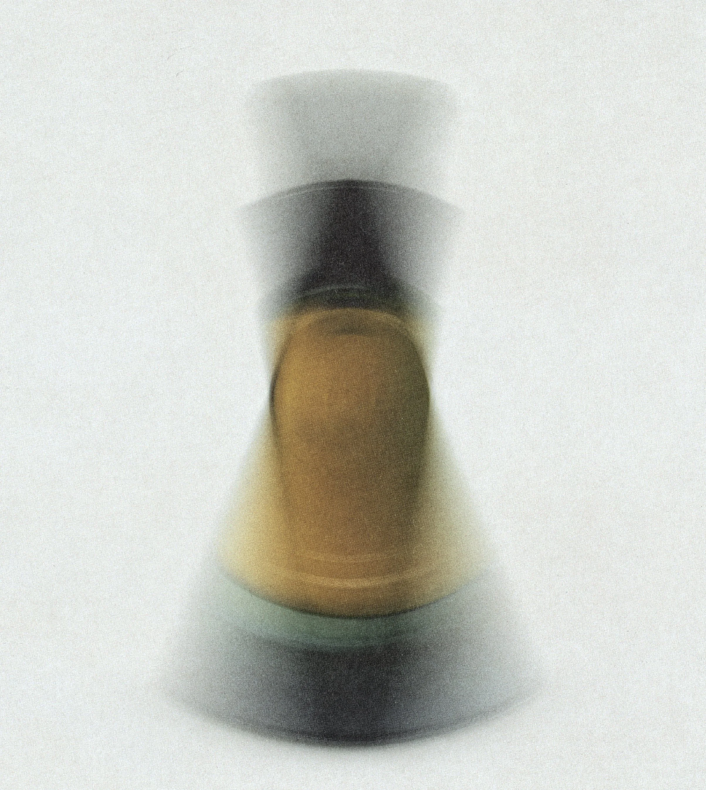
Atoas invites the body back into itself. The brand was developed to hold a quiet, grounding intimacy, dissolving the distance between product and person. The imagery places the vessel close to the skin to echo this intention, a reminder that rest is not a luxury but a biological rhythm waiting to be reclaimed.
Each oil lives within a deliberate spectrum to express the emotional and somatic quality of every blend. These blurred, atmospheric studies translate the potency of botanicals into color and light, giving the line its own visual language of calm.

Textural Language
Website
The website was designed as a quiet, calming environment, a digital extension of the brand’s ritualistic world. Soft gradients, spacious layouts, and textural choices create an experience that feels slow, tactile, and grounding. Each interaction is intentionally gentle, guiding the visitor through the line with clarity and calm.
Serums appear as small monoliths of rest, organized through pathways like Sleep, Dream, and Nervous System Reset. The interface blends clarity with atmosphere, allowing the bottles, textures, and subtle color shifts to hold the emotional weight of the brand. The result is a digital home that mirrors the Atoas ethos: spacious, intentional, and devoted to the reclamation of rest.
Home Page
Mobile View