Creative studiolo specialized in brand identity and creative direction.
EMMA ROSE
SECTOR
SOLUTIONS
Identity
Ecosystem
Photography Direction
Packaging
Website
Botanical Skin Care & Ritual Goods
Emma Rose was born from the pursuit of elemental beauty, a practice of tending to the skin with clarity, quiet ritual, and modern restraint. The founder envisioned a brand where skincare feels less like routine and more like returning to oneself: distilled, intentional, and deeply sensory. As the concept matured, it needed a visual language that could hold that purity, unfussy, architectural, and warm.
Our role was to shape that world, translating a philosophy of essentialism into a refined identity system, crafting imagery that is intimate through expressions that are soft, never dramatic, and building packaging rooted in tactile simplicity. The result is a brand that feels both contemporary and timeless, a gentle luxury that reveals itself slowly.
OVERVIEW
Packaging
Art Direction
Context
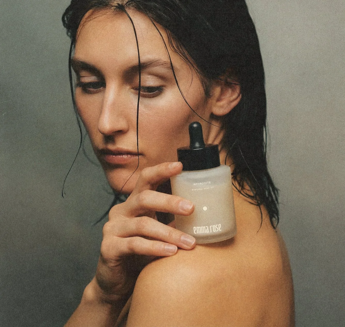
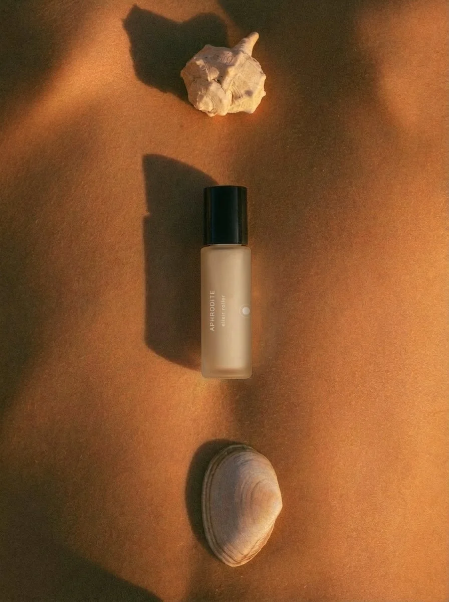
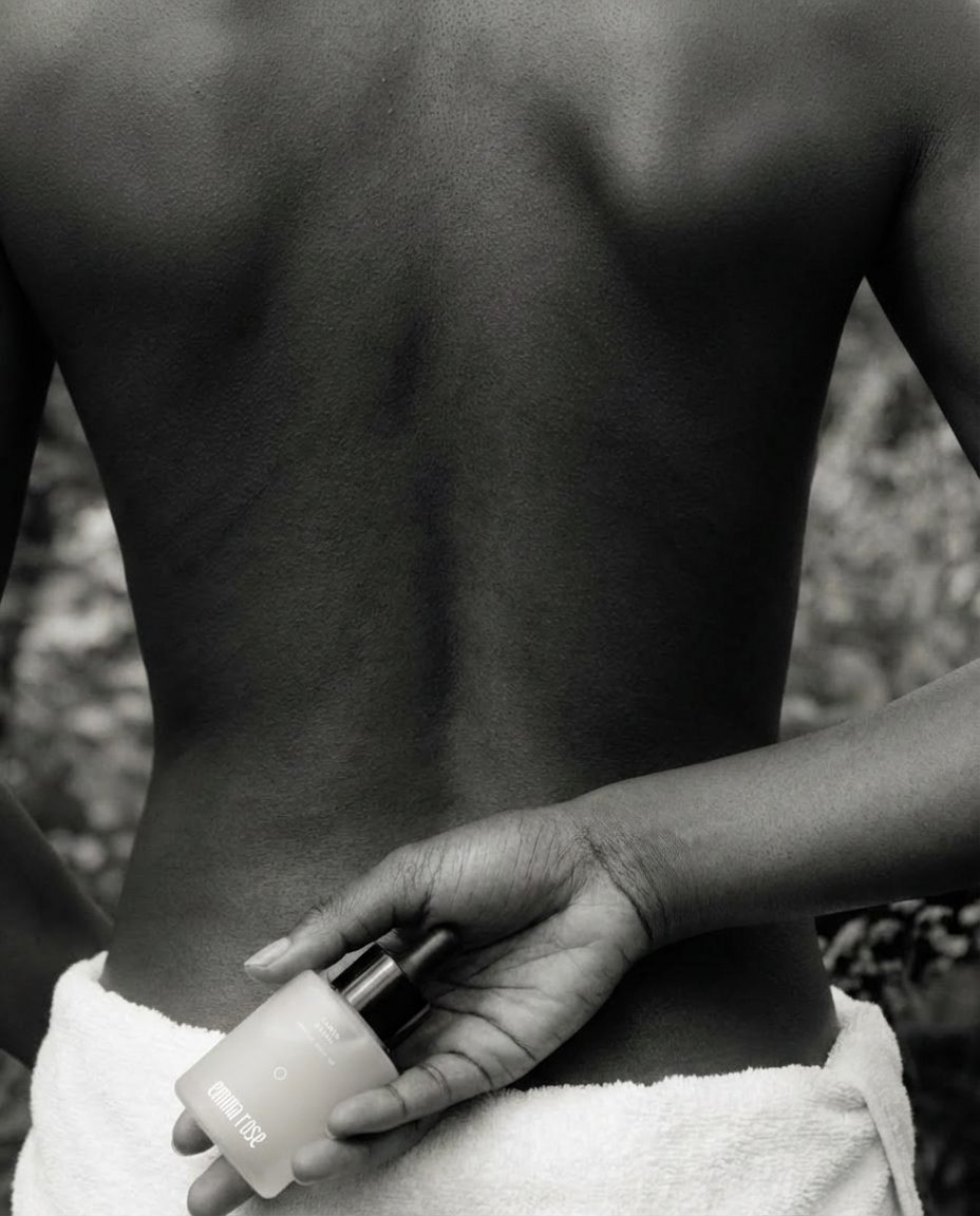
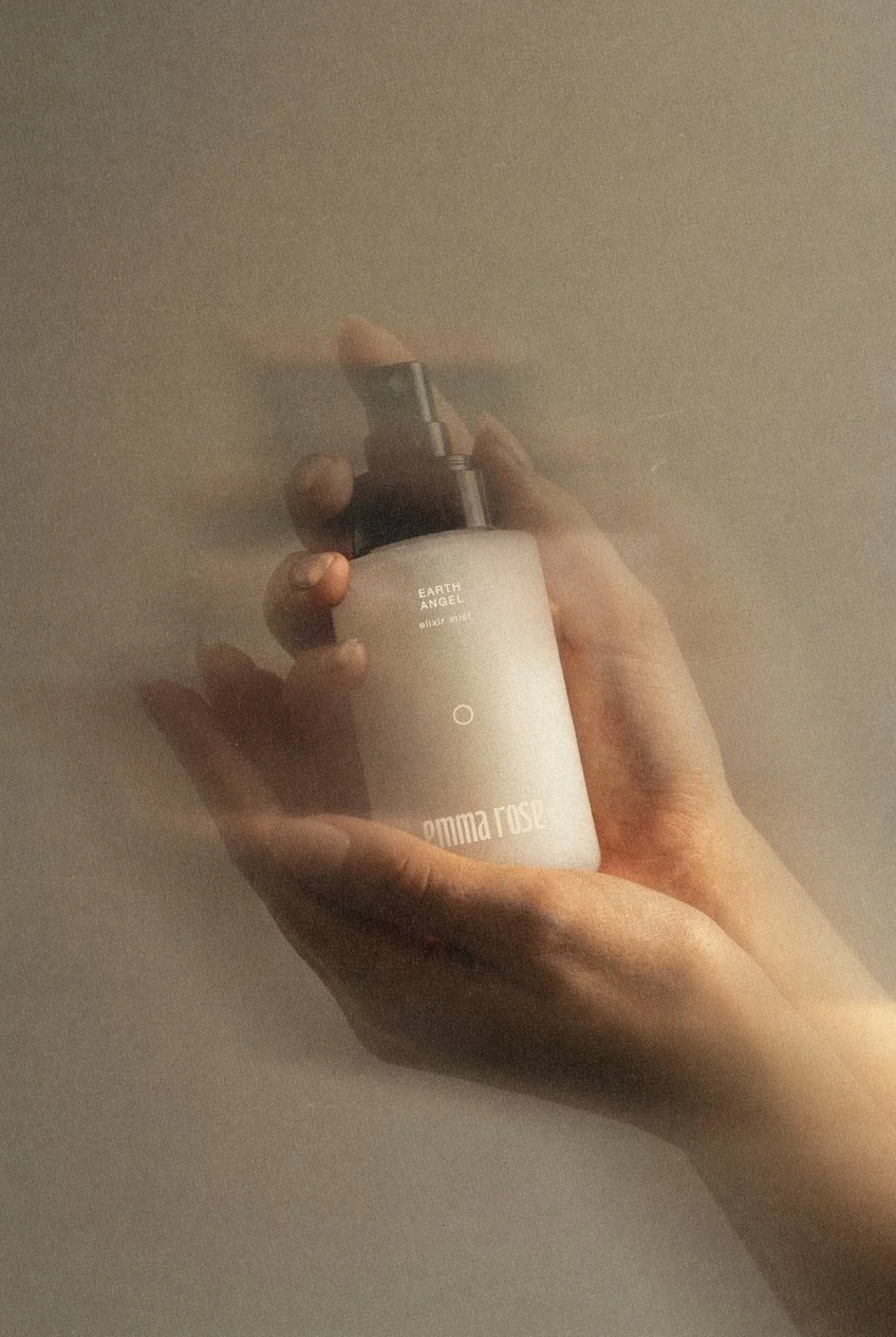
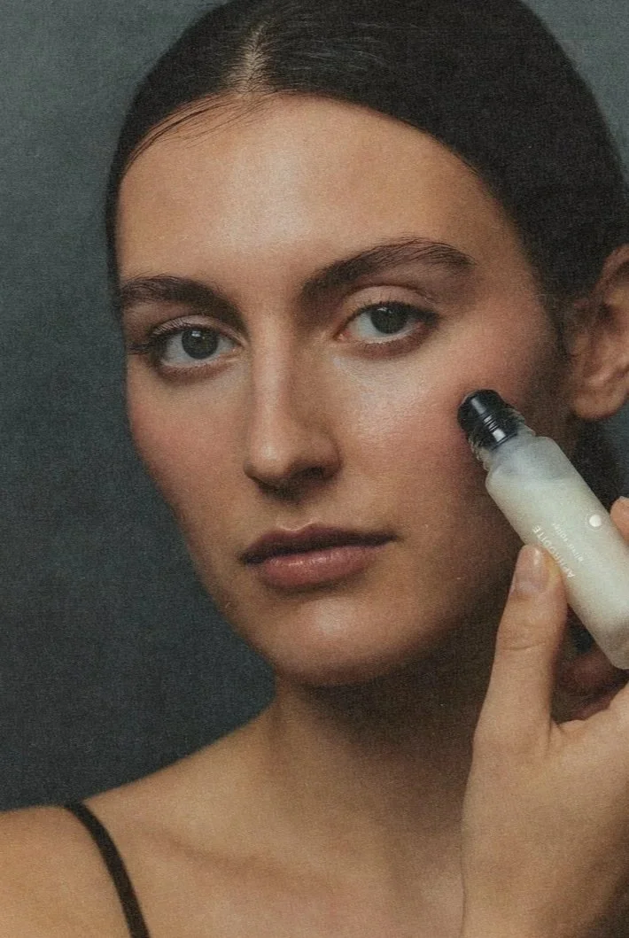
The visual language for Emma Rose is rooted in elemental beauty: soft light, honest skin, and materials that feel naturally lived-in. We directed photography to capture the intimacy of touch and the clarity of the formulations, pairing warm botanicals and brand artifacts with sculptural compositions and gestures. The result is a visual world that feels grounded, refined, and quietly sensual.
Solutions
Brand Identity
Ecosystem
Photography Direction
Packaging
Website
Packaging

Art Direction
Product Details
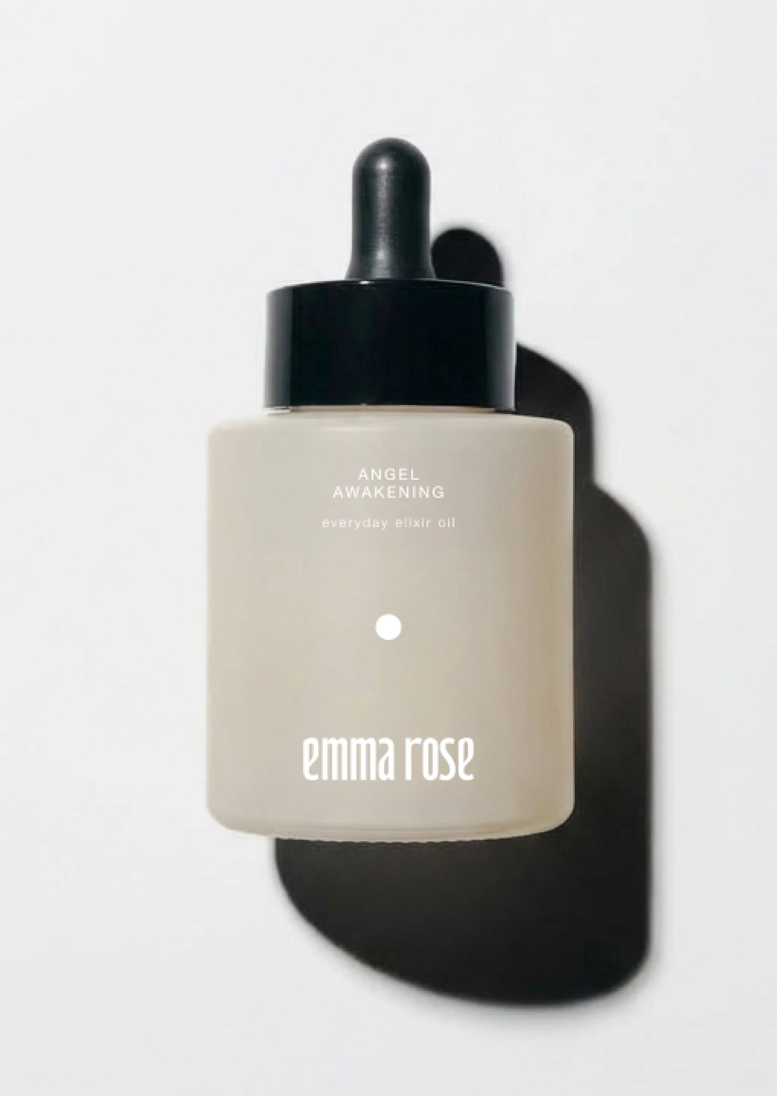
Packaging
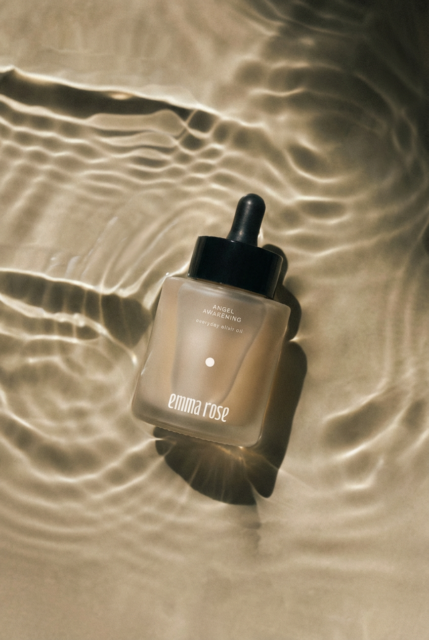
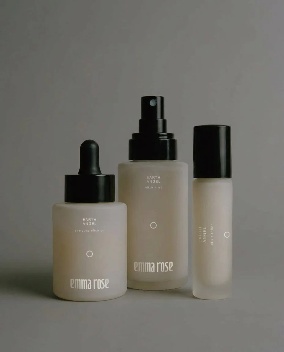
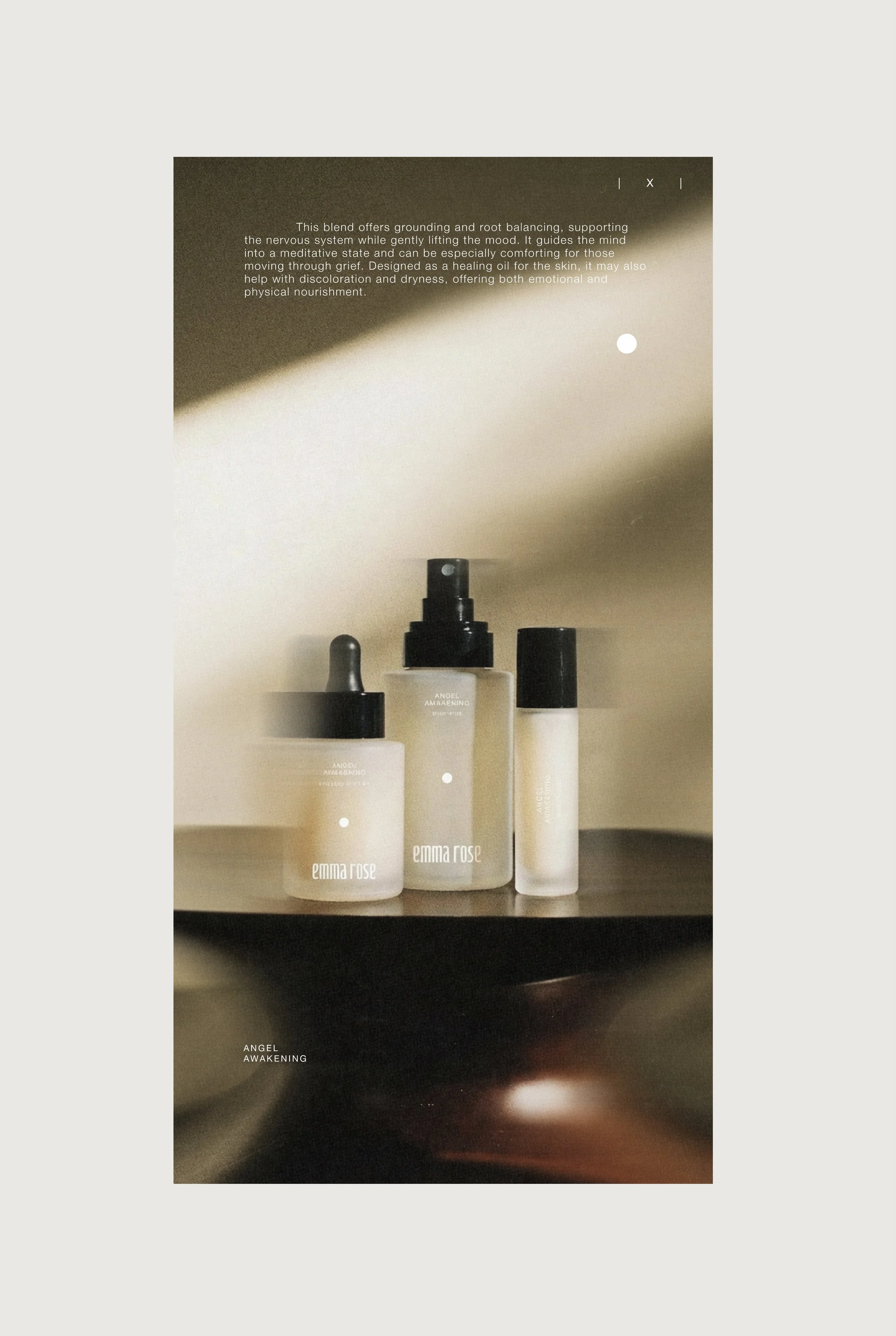
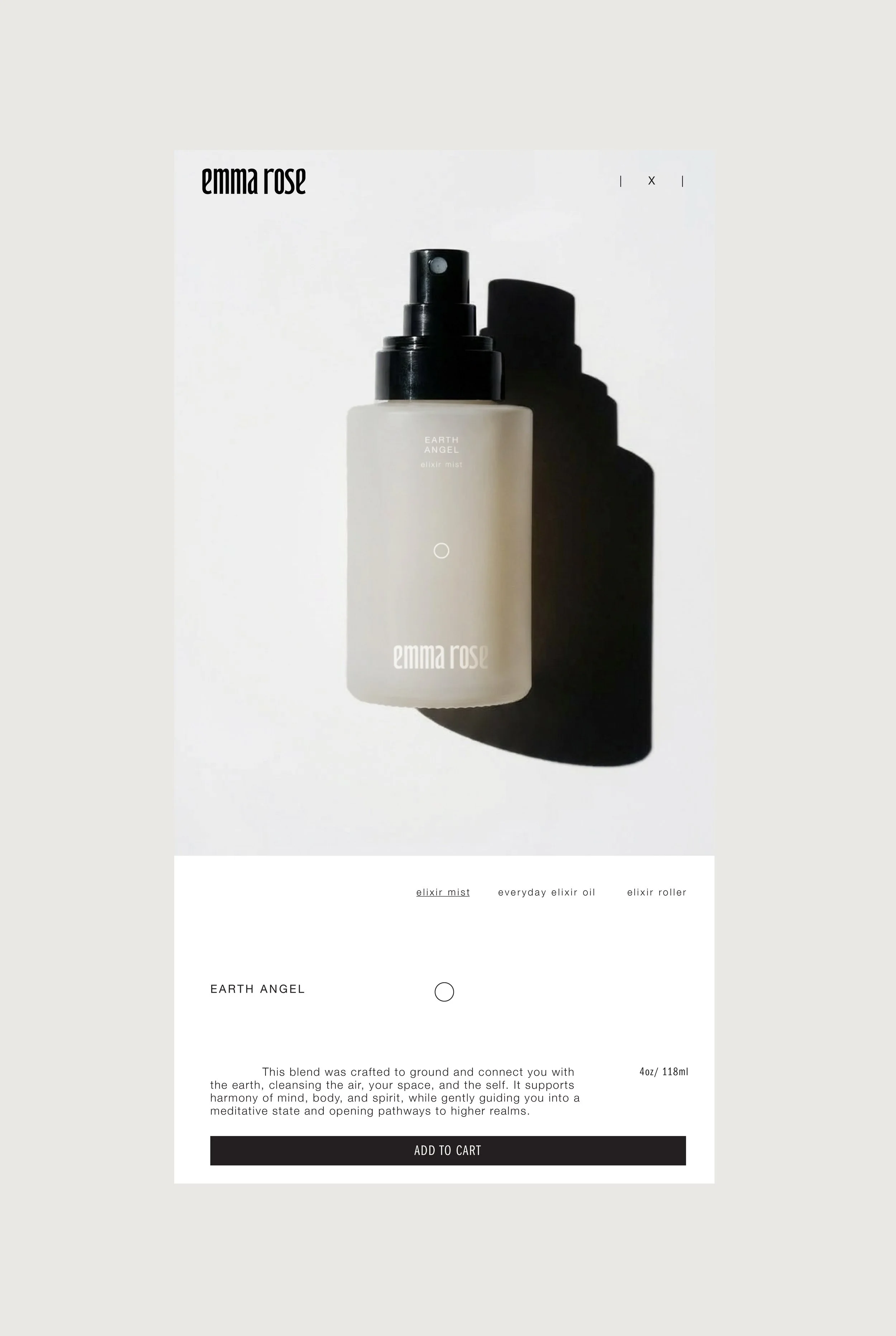
The packaging system embodies a balance of strength and softness, expressed through diffused glass vessels, timeless silhouettes, and a restrained typographic system. Each vessel was designed to feel intentionally calm, warm, minimal, and quietly expressive. The circular icons for each formula offer a subtle point of focus, creating cohesion across the collection without overpowering the purity of the formulas. Through still-life studies and gentle motion, the packaging reveals its duality: sculptural at rest, intimate in use. Strength held softly.
Art Direction

Root Balancing
Elixir Oil Dropper

Heart Opening
Elixir Oil Dropper

Grounding
Elixir Oil Dropper
Website
The digital expression translates the identity into a clear and functional system, using controlled typography, generous whitespace, and a balanced image rhythm to create coherence across every interaction. By foregrounding materiality and reducing visual noise, the digital experience elevates the products themselves, reinforcing the brand’s commitment to purity and refinement. The effect is a unified presence that feels intelligent and composed, giving Emma Rose a distinct position in the modern botanical skincare space.
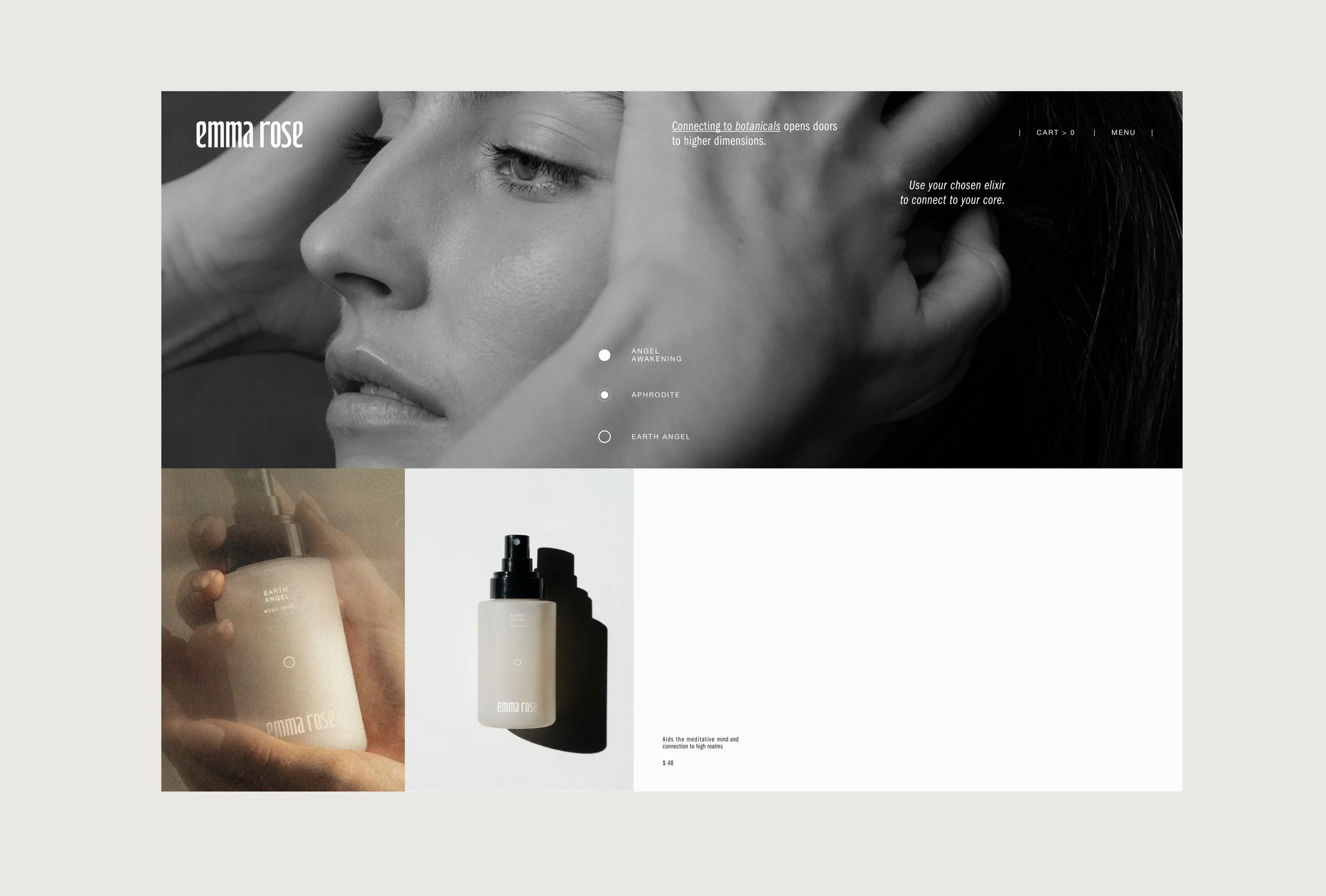
Home Page
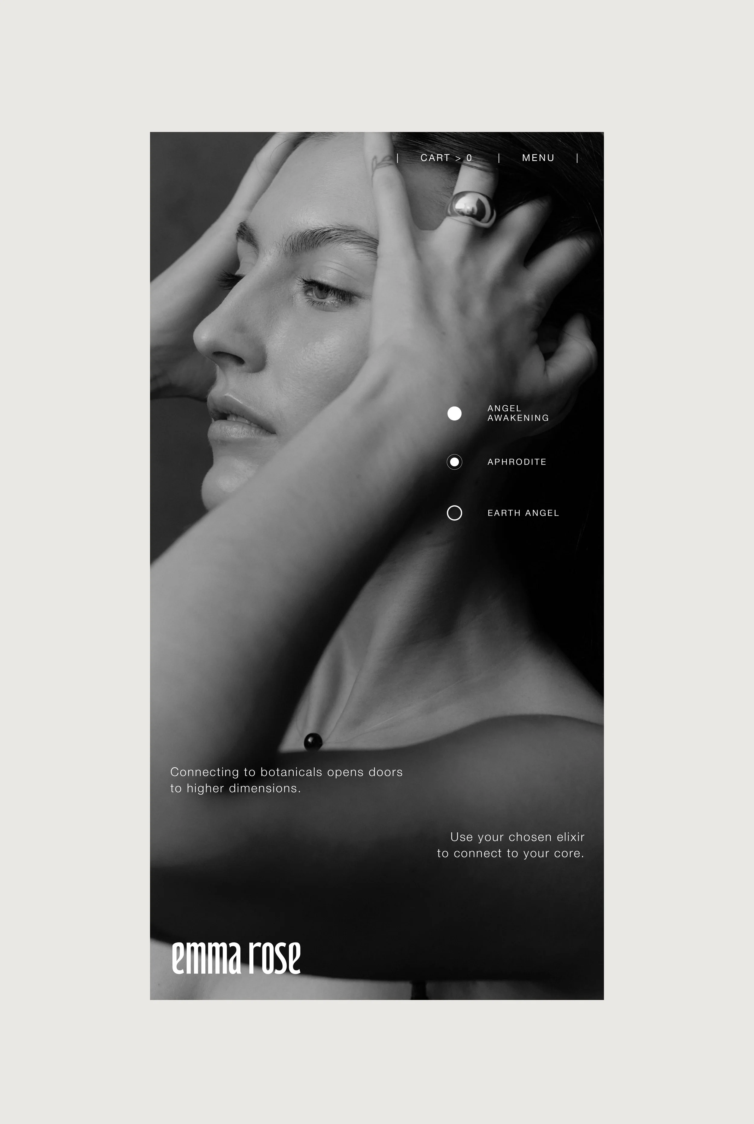
Mobile View