GRACE KELLY
SECTOR
SOLUTIONS
Naming
Identity
Guidelines
Packaging
Collateral
Artistry + Floral Design
Grace Kelly is a floral studio rooted in botanical artistry, creating work that moves between sculpture, gesture, and human presence. The studio’s new identity needed to hold the raw elegance of florals with a modern, unembellished honesty, a visual world that feels distilled, contemporary, and intimately attuned to form and atmosphere. As the founder’s practice evolved, the brand required a system quiet enough to let the work breathe yet intentional enough to frame its depth, allowing each botanical piece to be experienced as a moment of stillness and emotional gravity.
Our role was to shape that world, translating organic movement into graphic rhythm and building an identity that mirrors the tactile, sculptural quality of the studio’s work. The emblem became an abstract symbol, part stem, part vessel, part gesture, while the surrounding palette, typography, and imagery offer a calm, editorial environment for the florals themselves. The result is a brand that feels grounded and atmospheric, a presence that positions Grace Kelly not simply as a floral designer but as a contemporary botanical artist working with clarity, depth, and quiet confidence.
OVERVIEW

Brand Totem

Context
Floral studio Grace Kelly was developed to evolve into a broader creative brand, seeking an identity that could hold both its refined femininity and the expressive vision of its founder. As the studio expanded, we were brought in to develop a visual system that felt timeless, intuitive, and rooted in nature’s rhythms. The process began with brand totems, exploring symbolic anchors to articulate strength, instinct, and movement. This exploration led to a mark that balances power with restraint, supported by a seasonal palette informed by floral narratives and color psychology. The result is an identity that offers clarity, coherence, and room to grow — a system that allows the studio to move through the world with a renewed sense of elegance and intention
Solutions
Naming
Brand Identity
Packaging
Development
Digital Assets

Oil Eye Packaging

Oil Eye Packaging
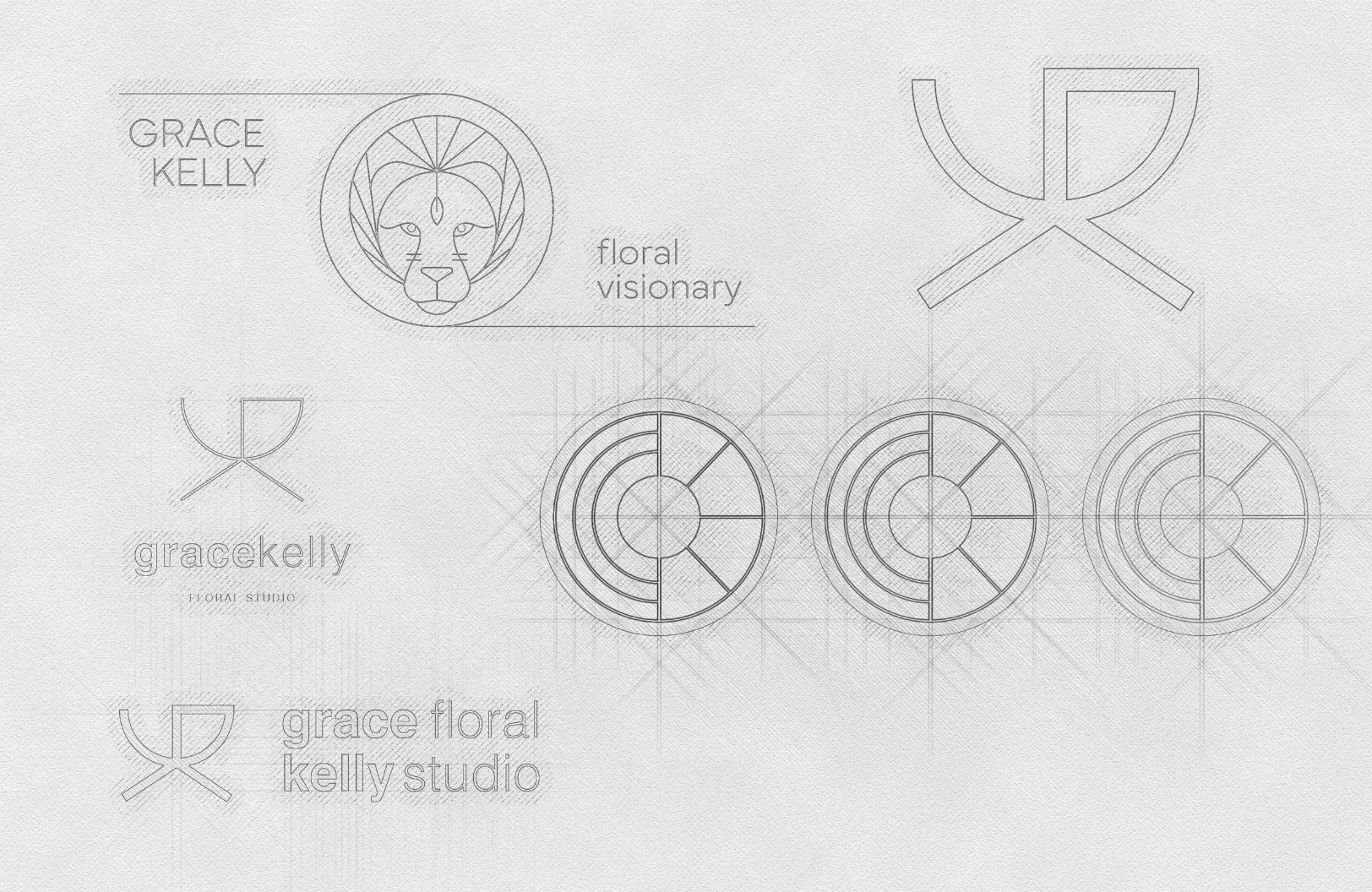
Identity Exploratory Sketches

Oil Eye Packaging
Packaging
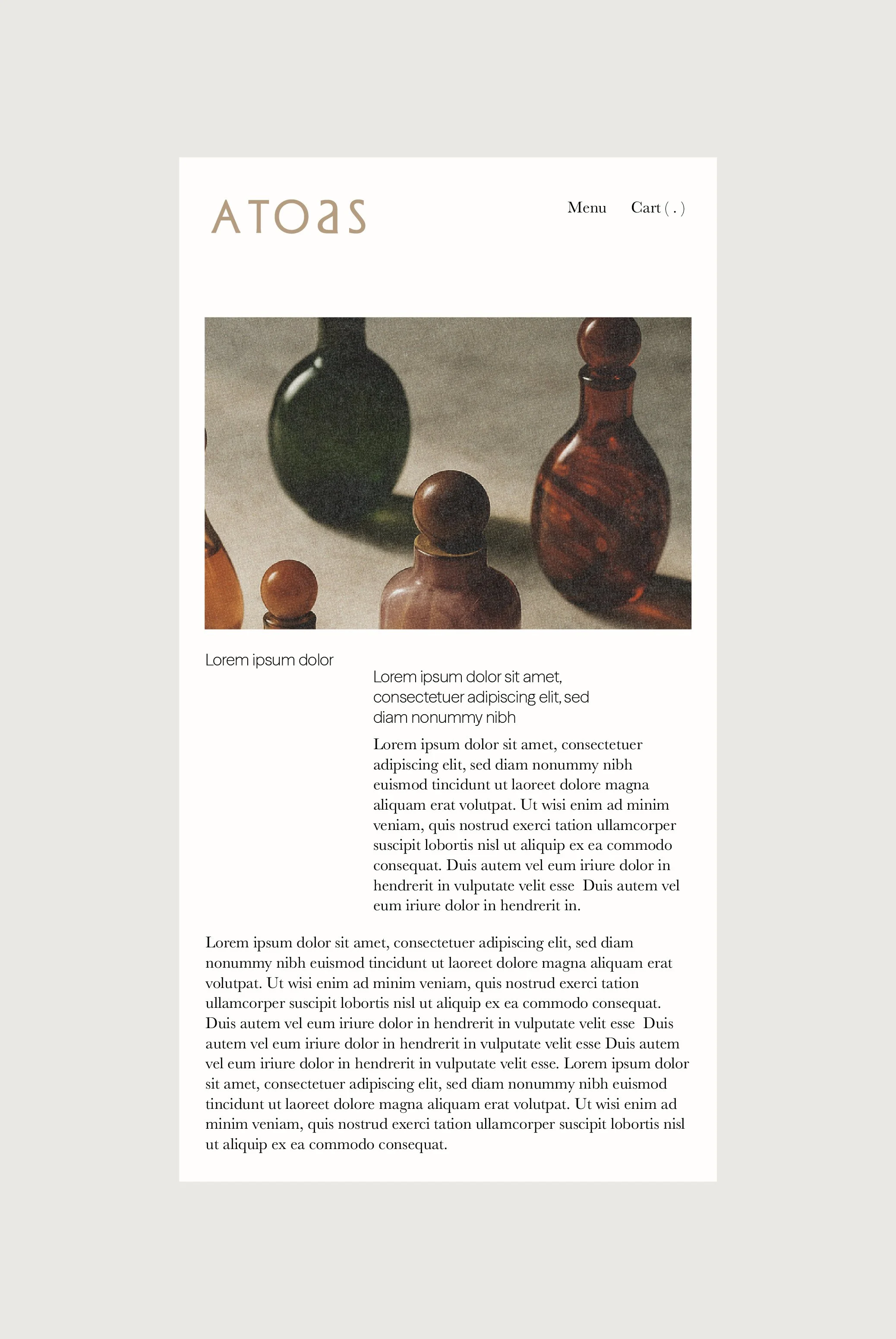
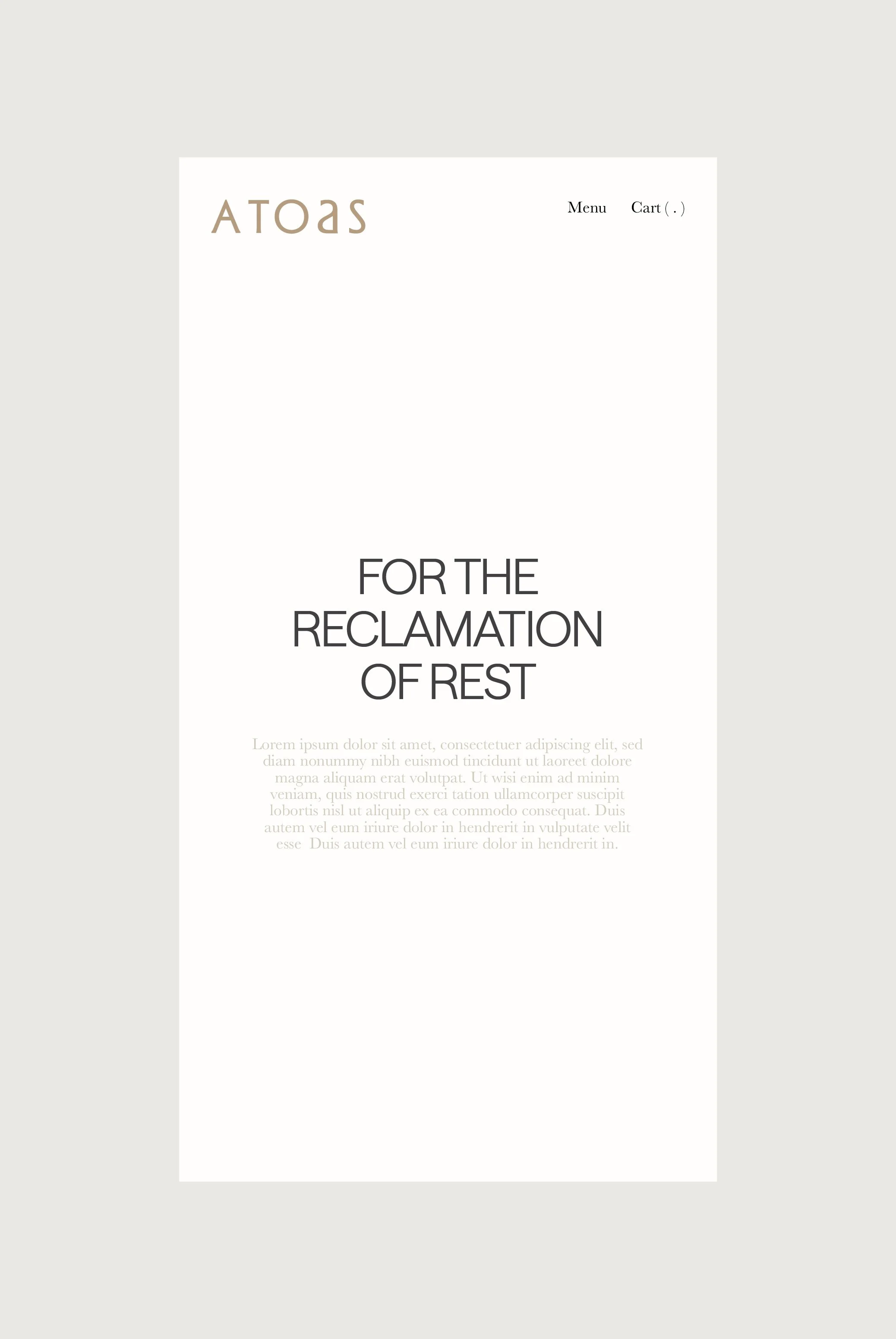
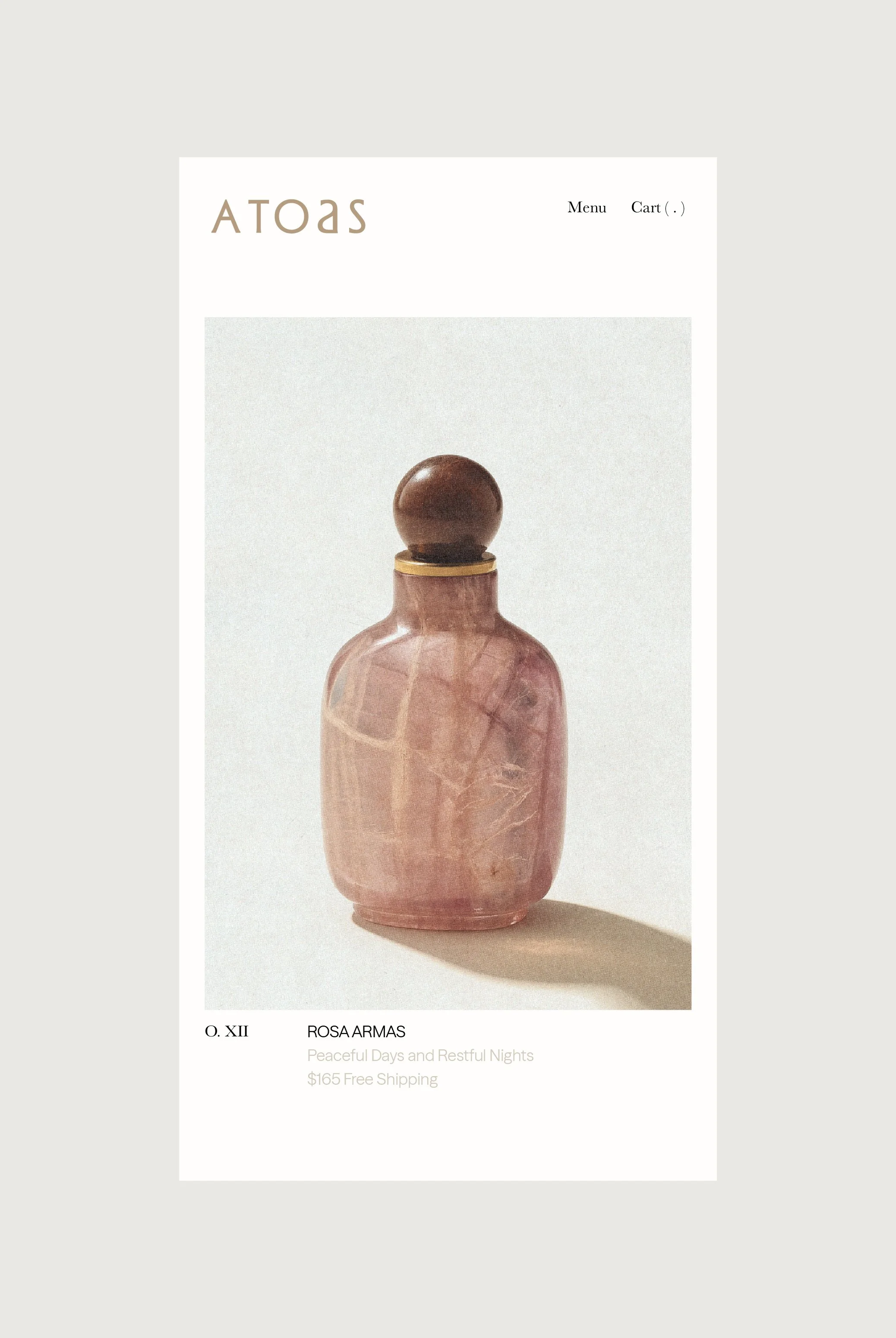
Botanical skincare line F. Miller was developed to embody the essentialism that its creator, Fran Miller, found to be lacking in the market when she debuted her signature Face Oil in 2014. Four years in, she approached us to embark on a long-term partnership to develop and evolve a new brand identity that conveyed the values behind her formulations. We translated Fran’s emphasis on simplicity and versatility through a pared-back design language to recentre the F. Miller brand around typographic clarity, consistency and modularity.

Oil Eye Packaging
Oil Eye Packaging
Packaging System


Website
Botanical skincare line F. Miller was developed to embody the essentialism that its creator, Fran Miller, found to be lacking in the market when she debuted her signature Face Oil in 2014. Four years in, she approached us to embark on a long-term partnership to develop and evolve a new brand identity that conveyed the values behind her formulations. We translated Fran’s emphasis on simplicity and versatility through a pared-back design language to recentre the F. Miller brand around typographic clarity, consistency and modularity.
Home Page Altar
Mobile View
Mobile View
Collateral
Botanical skincare line F. Miller was developed to embody the essentialism that its creator, Fran Miller, found to be lacking in the market when she debuted her signature Face Oil in 2014. Four years in, she approached us to embark on a long-term partnership to develop and evolve a new brand identity that conveyed the values behind her formulations. We translated Fran’s emphasis on simplicity and versatility through a pared-back design language to recentre the F. Miller brand around typographic clarity, consistency and modularity.
Oil Eye Packaging
Oil Eye Packaging
Home Page Altar