Creative studiolo specialized in brand identity and creative direction.
MONAAD
SECTOR
SOLUTIONS
Naming
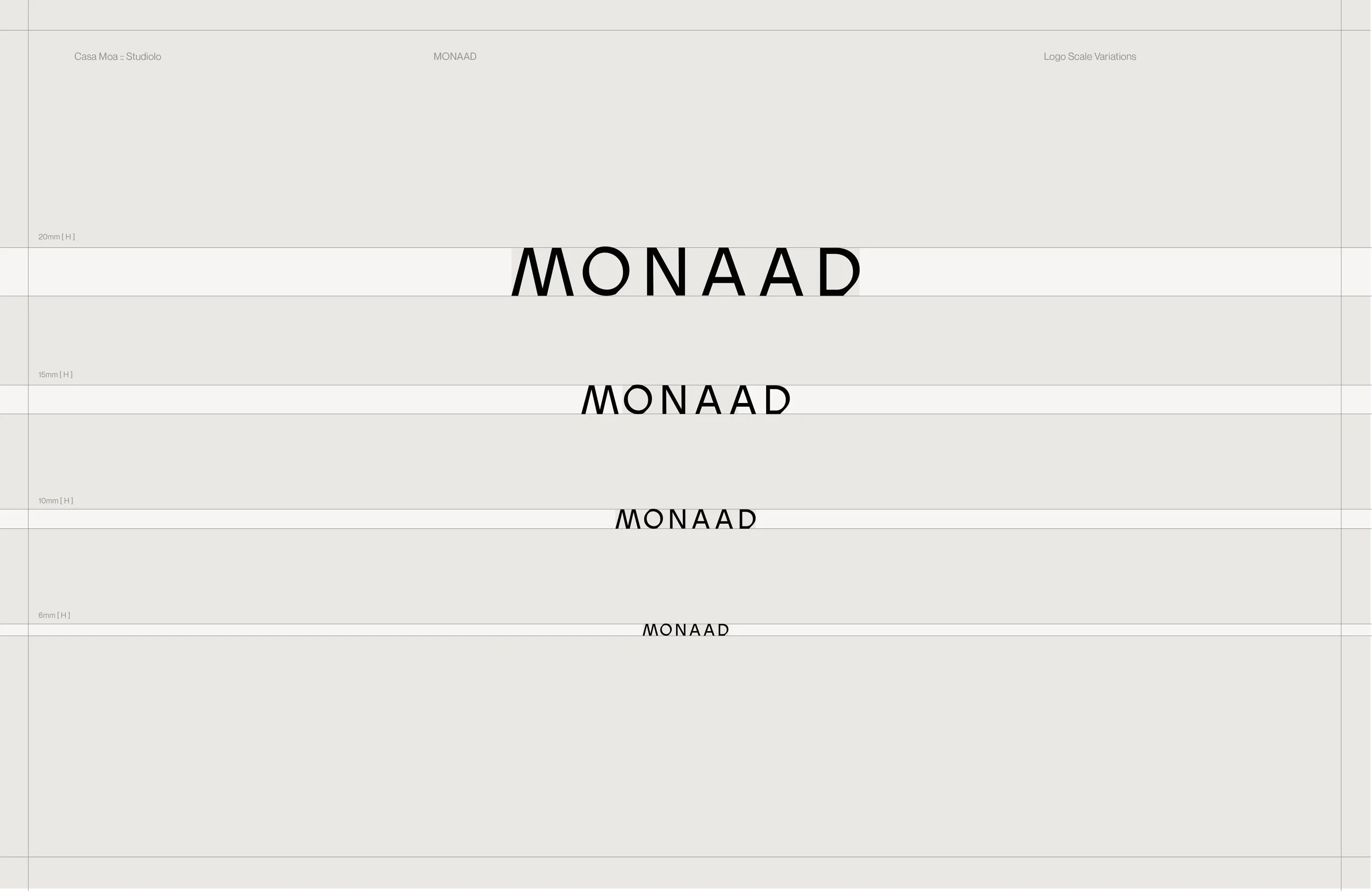
Identity
Ecosystem
Photography Direction
Packaging
Collateral
Arts & Ritual Object
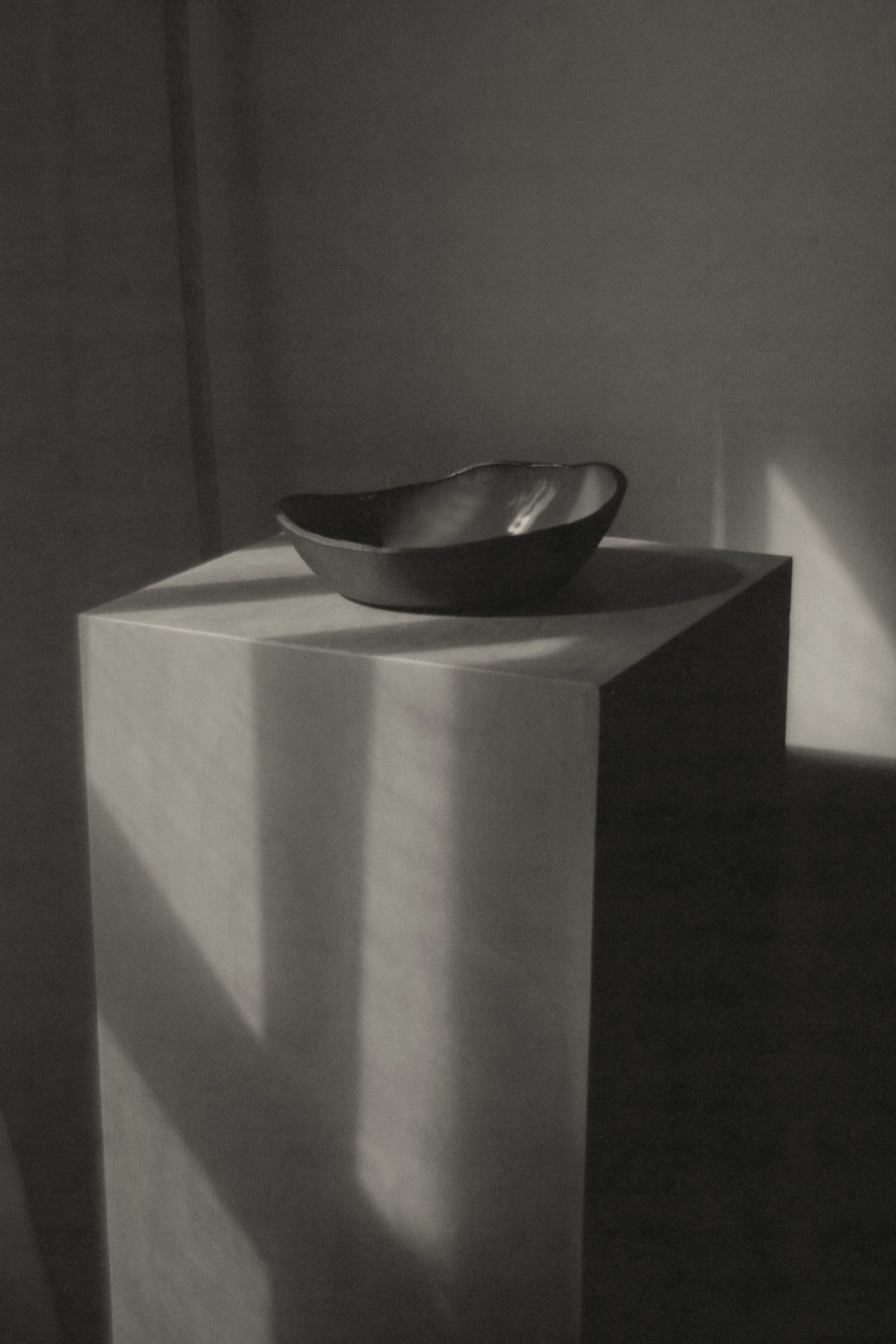
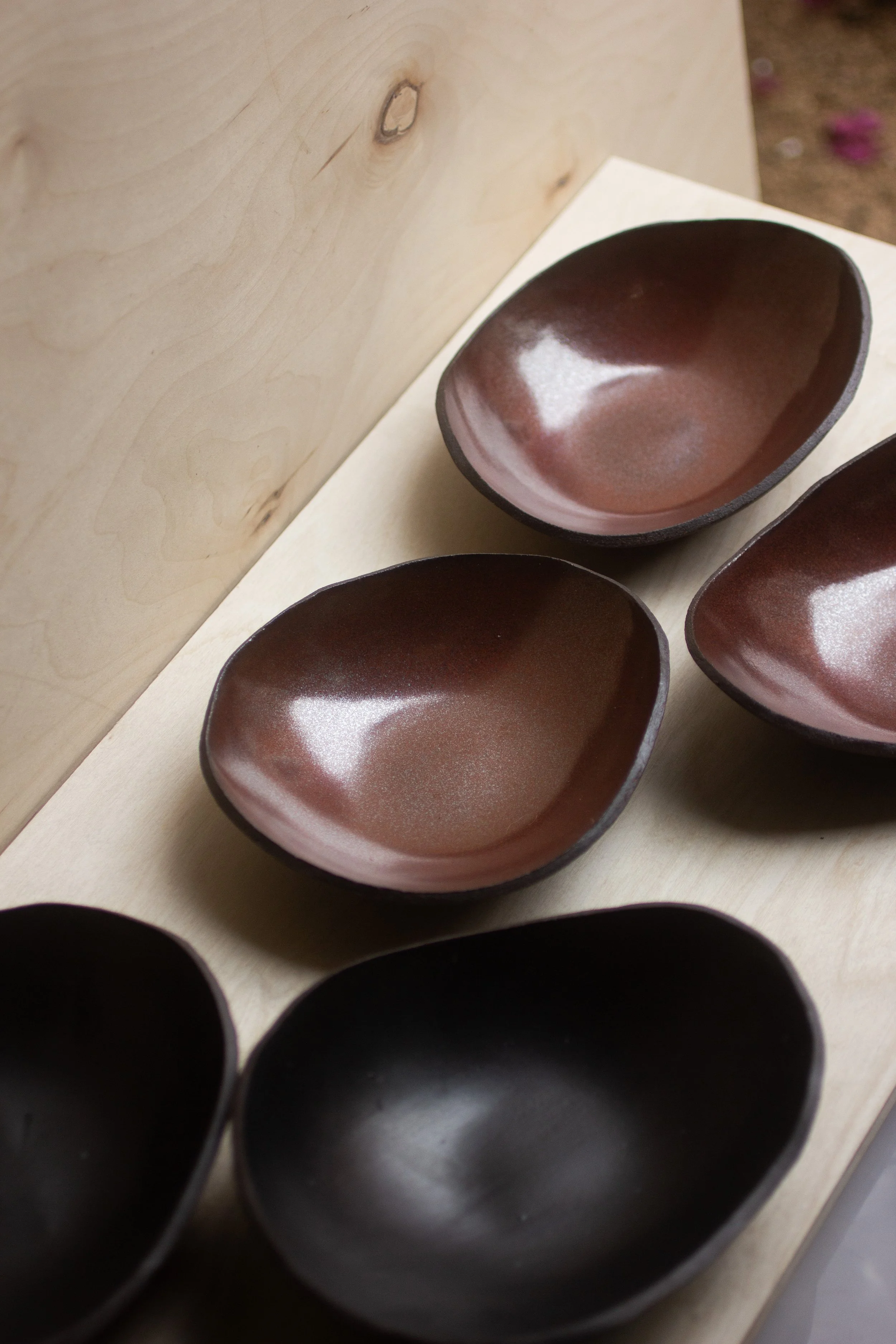
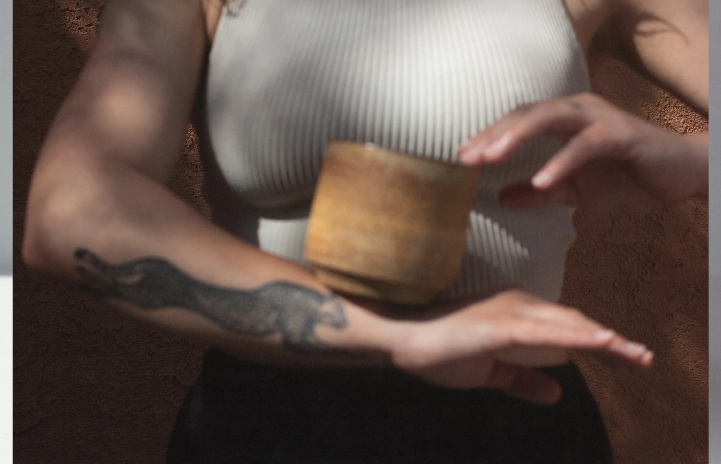
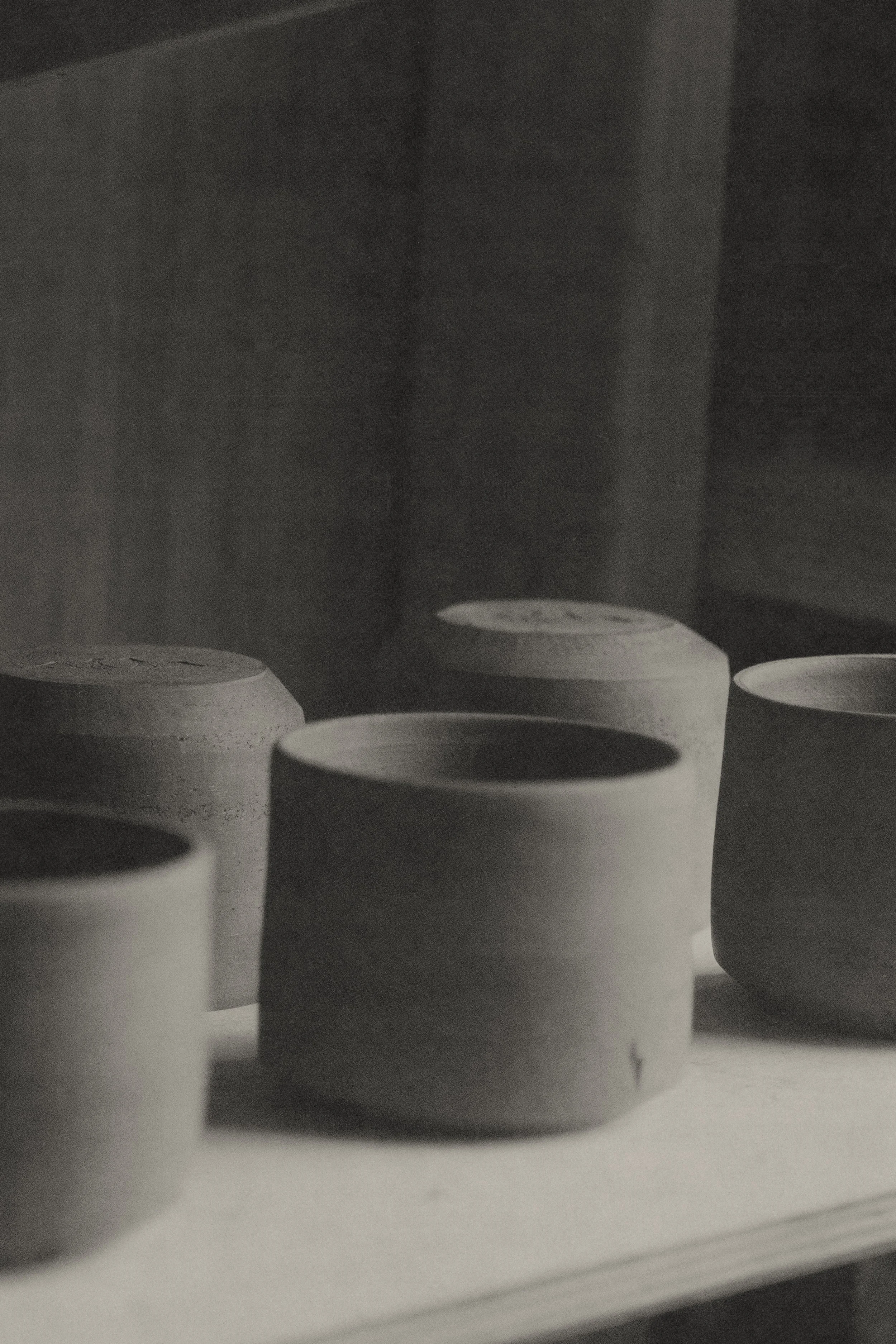
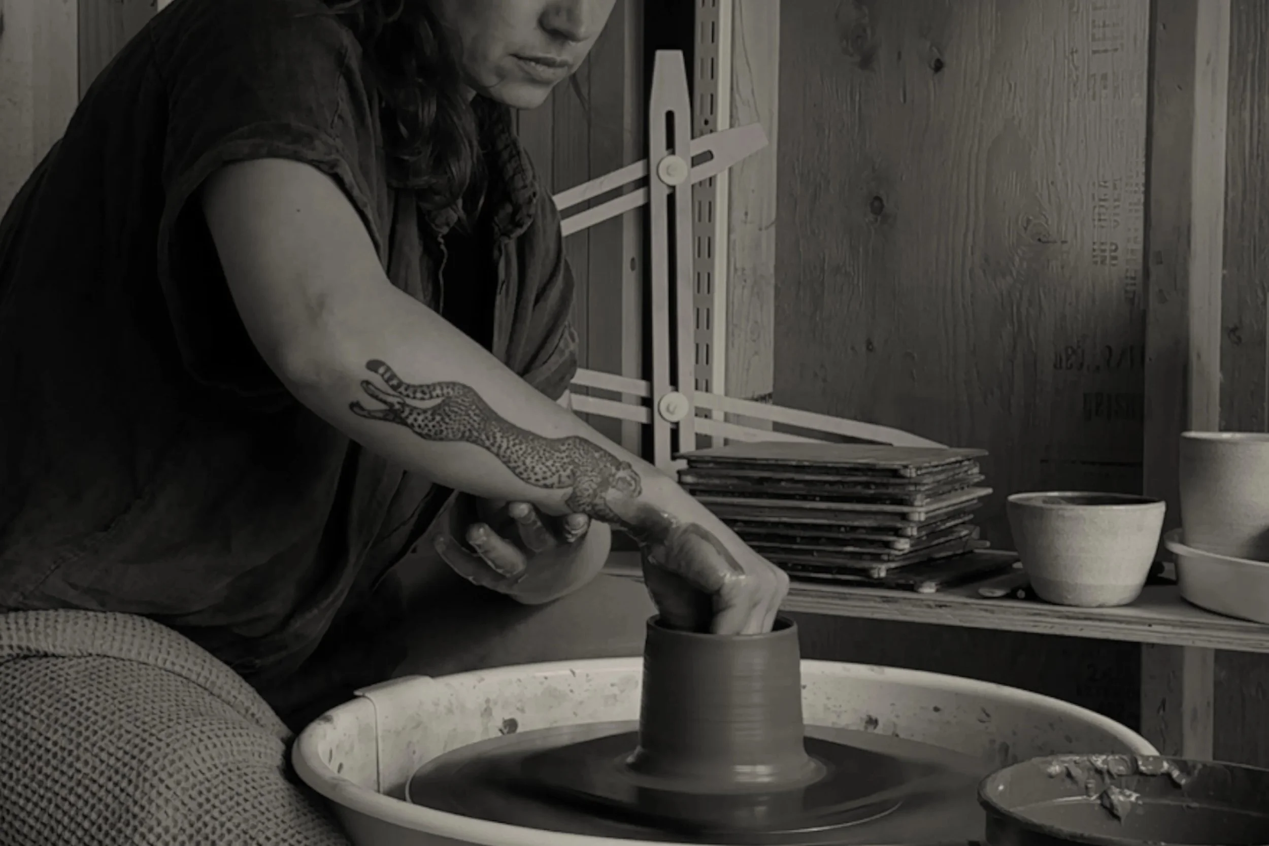
Monaad is a Los Angeles–based mud studio creating functional stoneware for intentional pouring, sharing, and sipping. As the practice evolved into a brand, it required a visual identity and ecosystem that could position the work as both craft and ritual object.
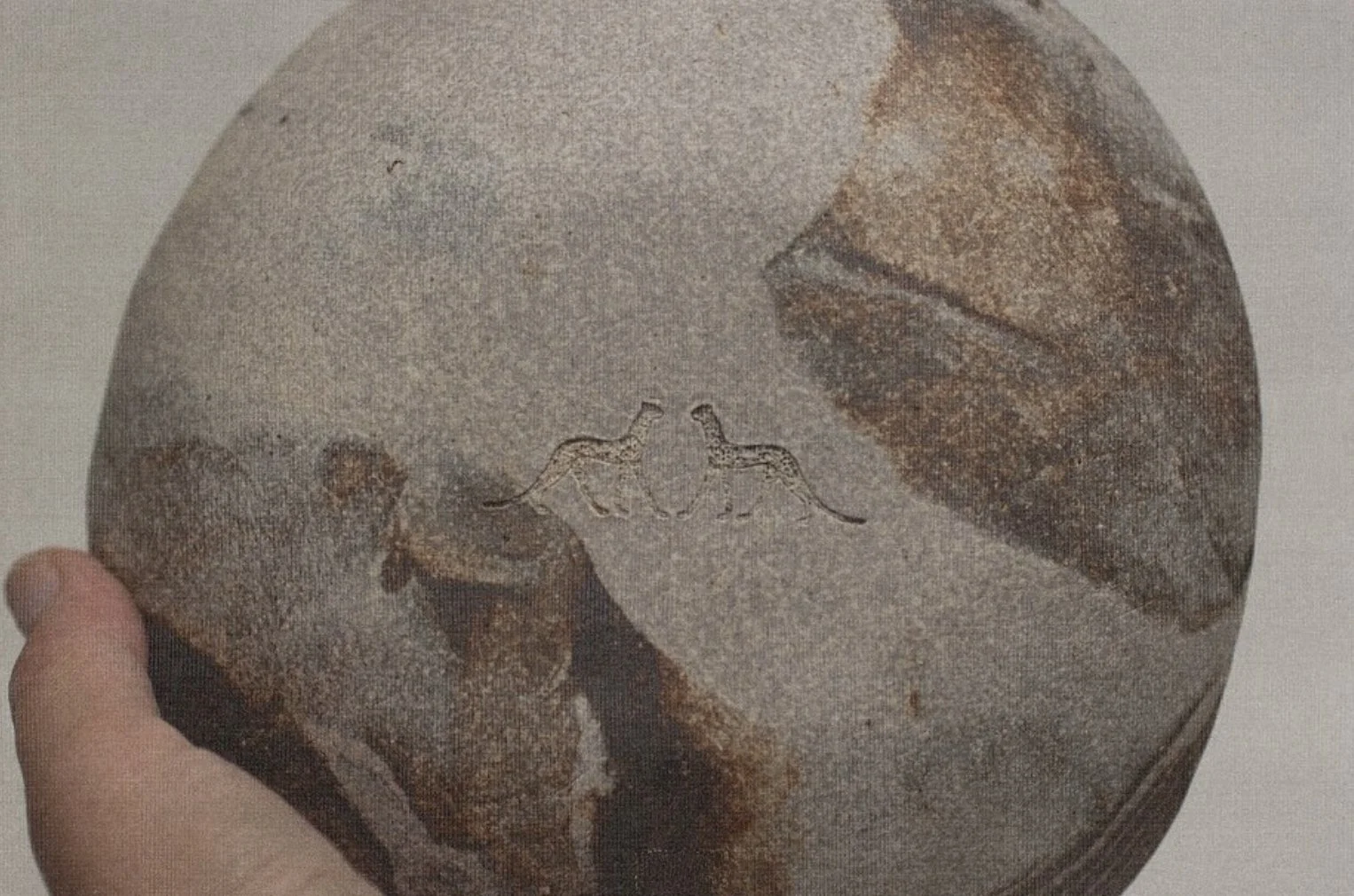
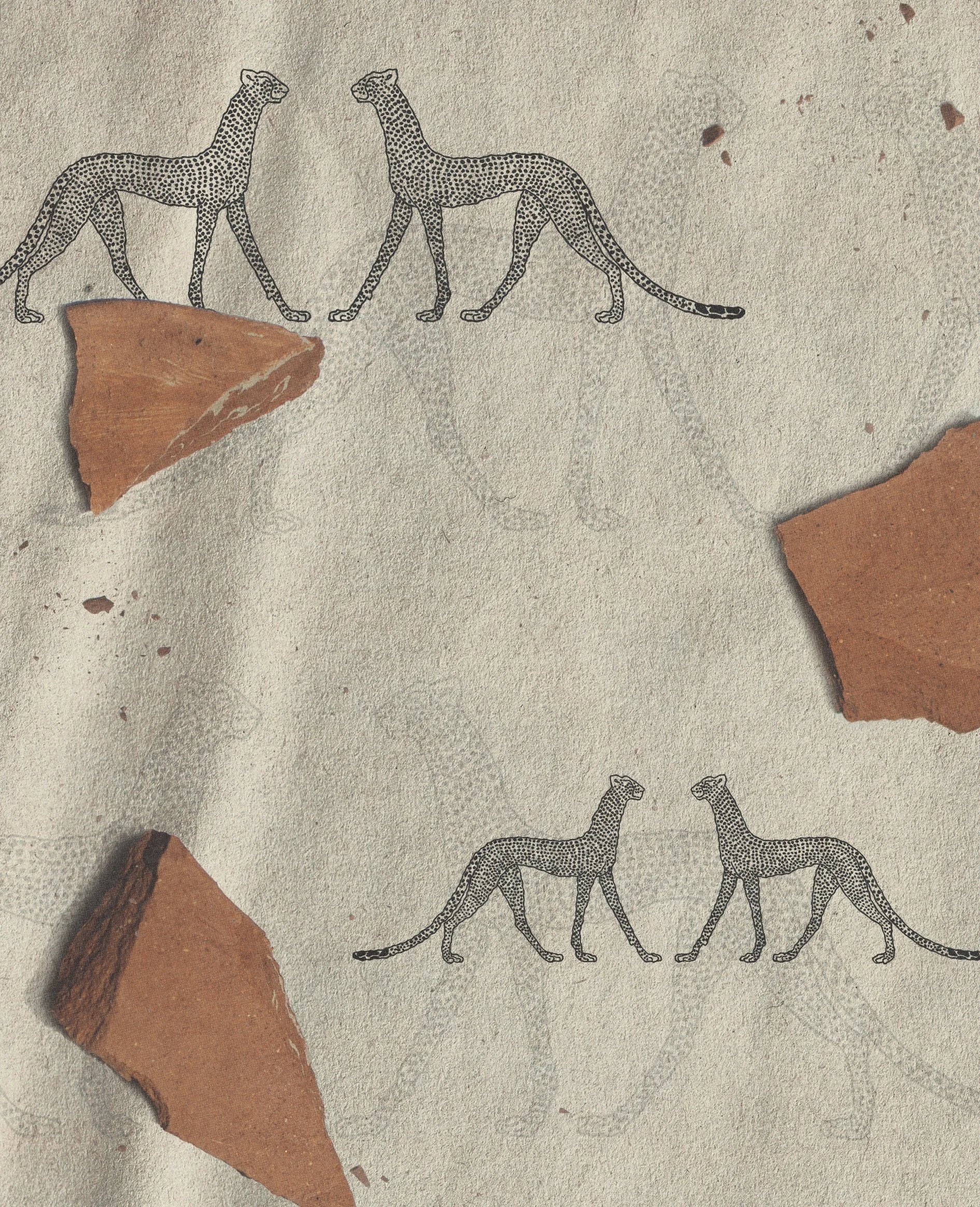
The objective was to translate material weight and symbolic reference into a disciplined, enduring system. Drawing from Egyptian mythology, the sacred cat was introduced as a restrained secondary mark, supported by an architectural typographic framework and earth-based palette.
The result is a cohesive identity that feels elemental and structured, aligned with the permanence of the objects themselves.
OVERVIEW
Art Direction
Context
The identity was developed to extend beyond the vessel itself, shaping how the brand becomes part of the artifacts. Pattern, typography, and mark work together as a restrained framework, adaptable across packaging, printed matter, and studio environments.
The sacred cat motif functions as a totemic element. Architectural typography provides clarity and proportion, grounding softer material textures. Across applications, the system integrates seamlessly into shelf, surface, and setting, allowing the objects to remain central while the brand quietly structures the environment around them.
Solutions
Naming
Brand Identity
Ecosystem
Photography Direction
Packaging
Website
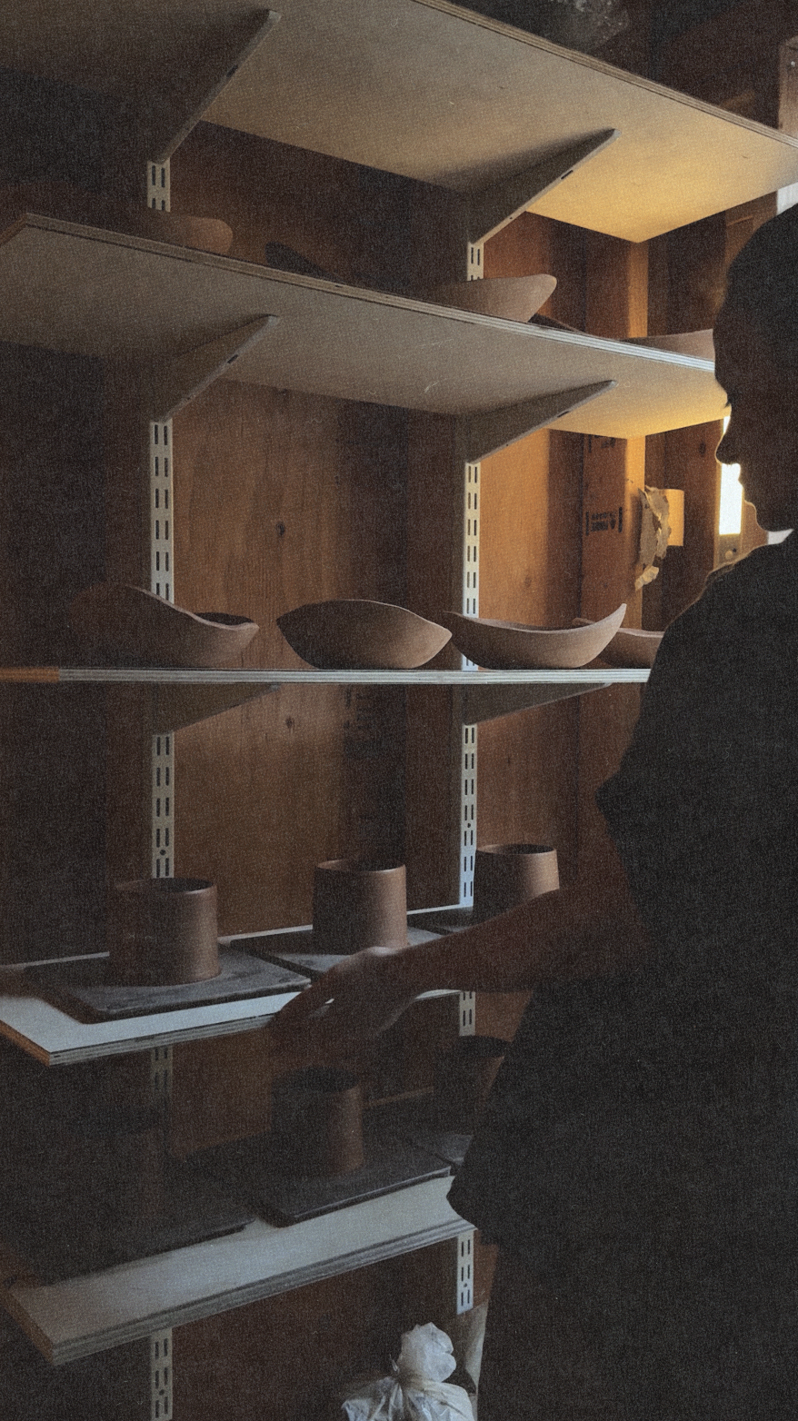
In the studio
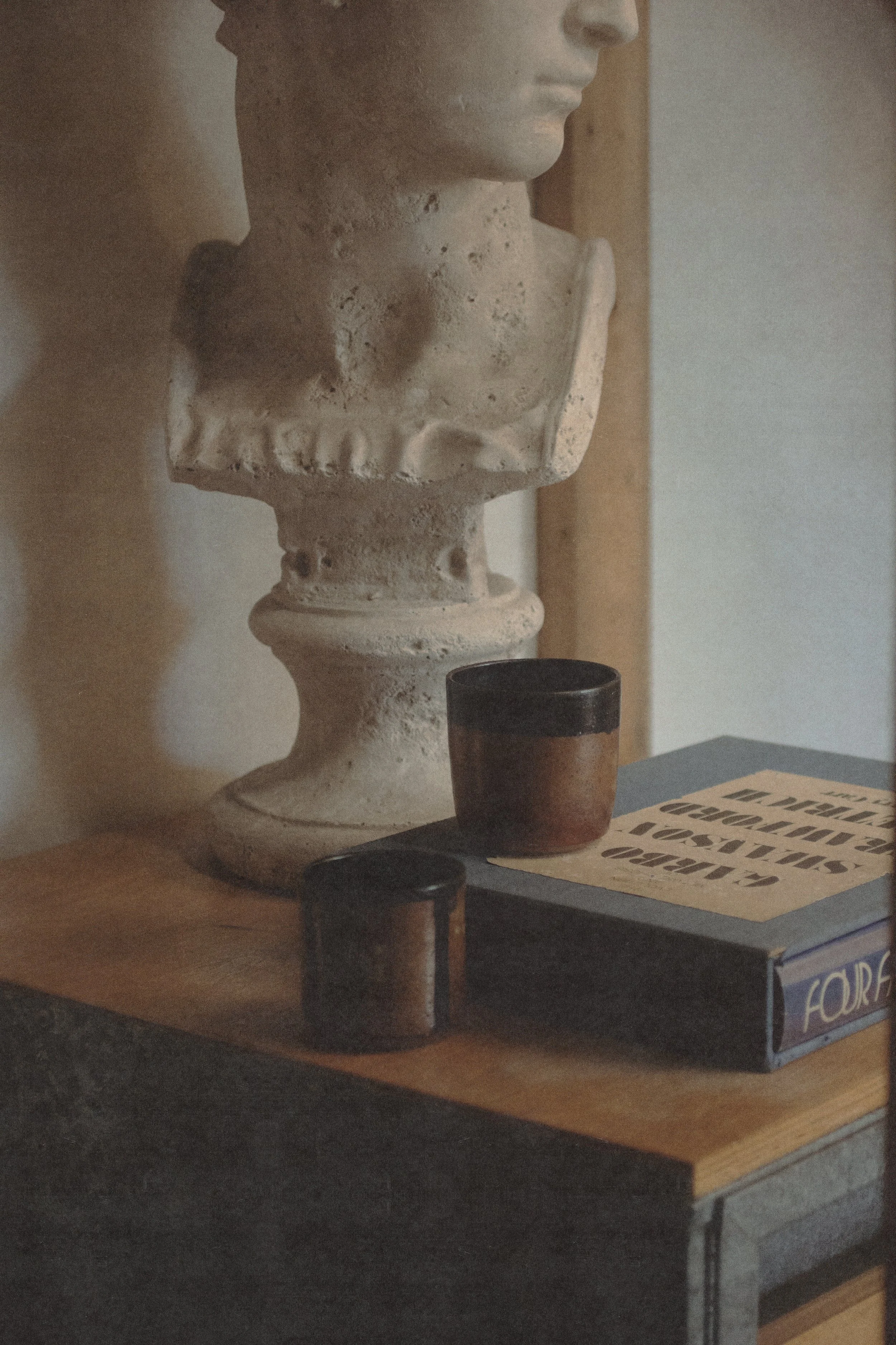
Vessel Set
Packaging
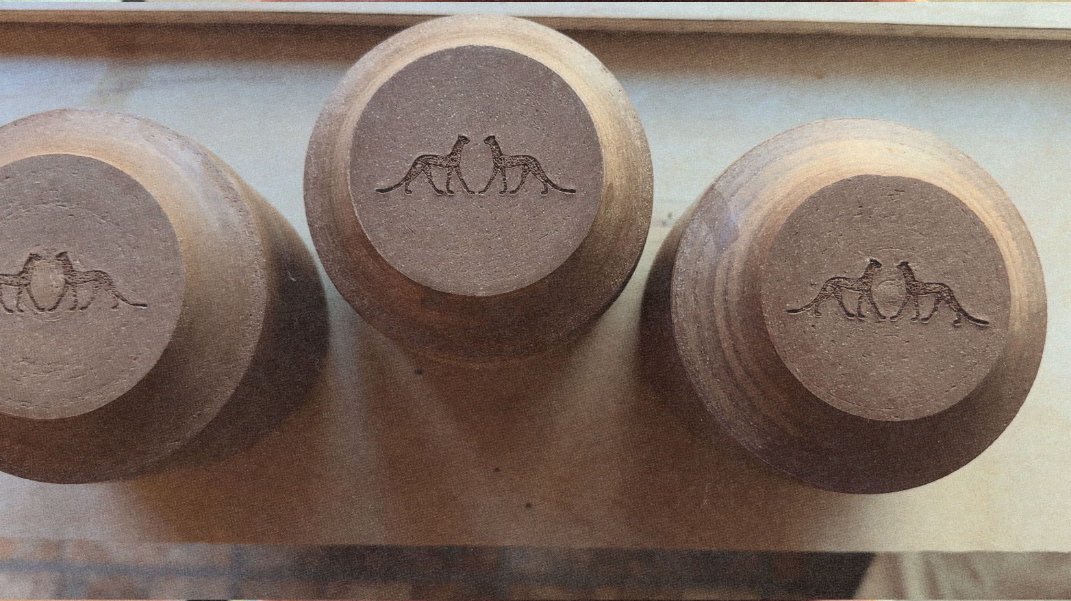
The cats function as the primary brand device, replacing the use of a conventional wordmark on the object itself. By embracing symbol over name, the system avoids overt branding and instead establishes recognition through archetypal form.
Pressed into the base, the mark becomes part of the vessel’s composition. It is not an applied brand element, but an integrated design decision, resolved within the object’s structure. This approach removes the distance between identity and artifact. The brand is carried through proportion, imprint, and repetition rather than graphic assertion.
Context
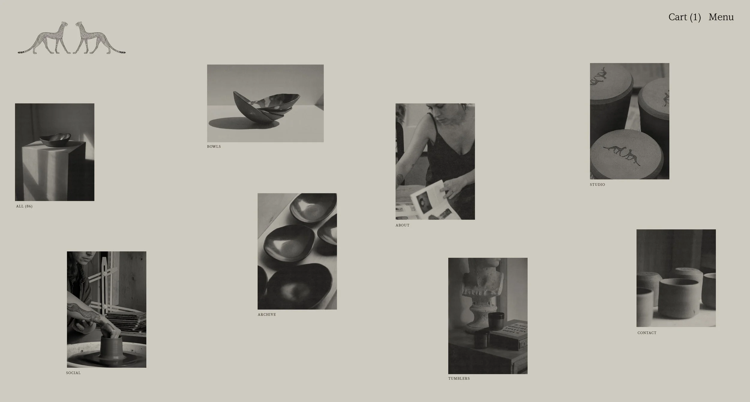
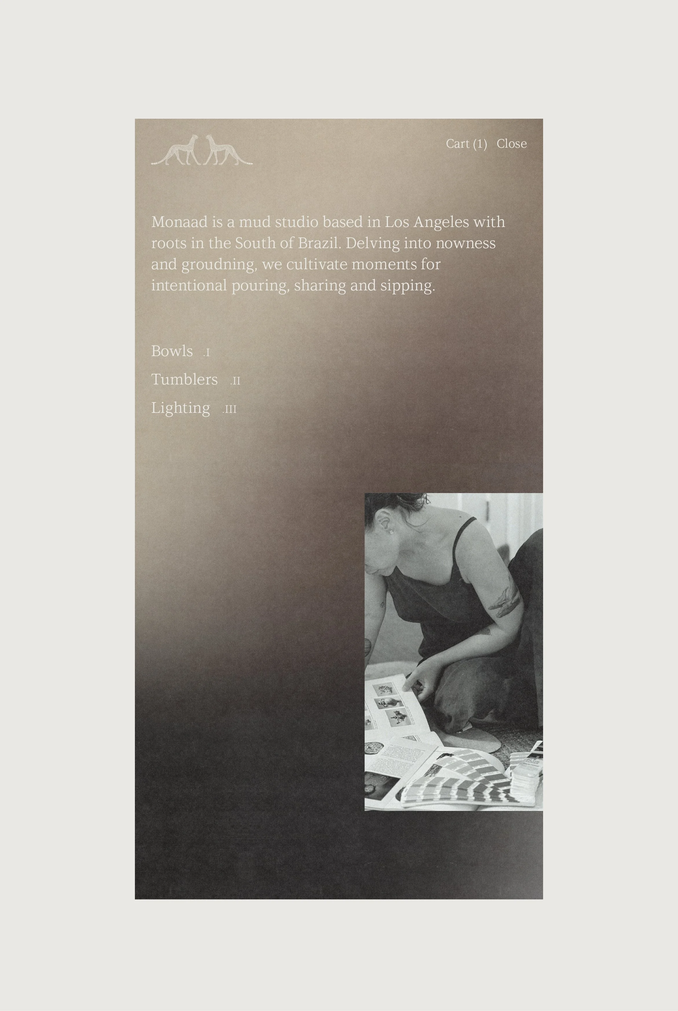
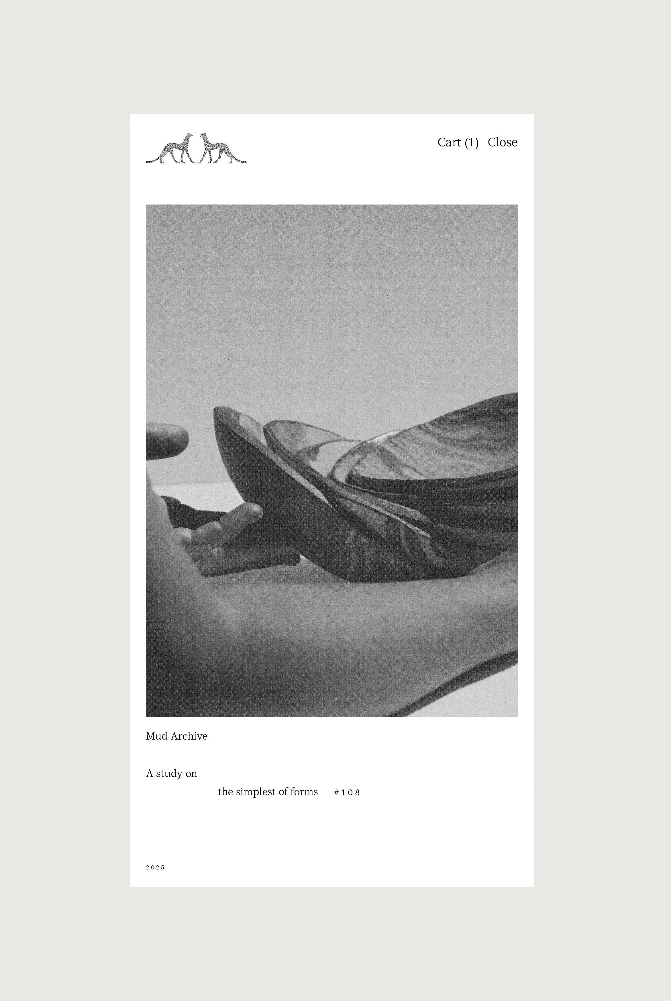
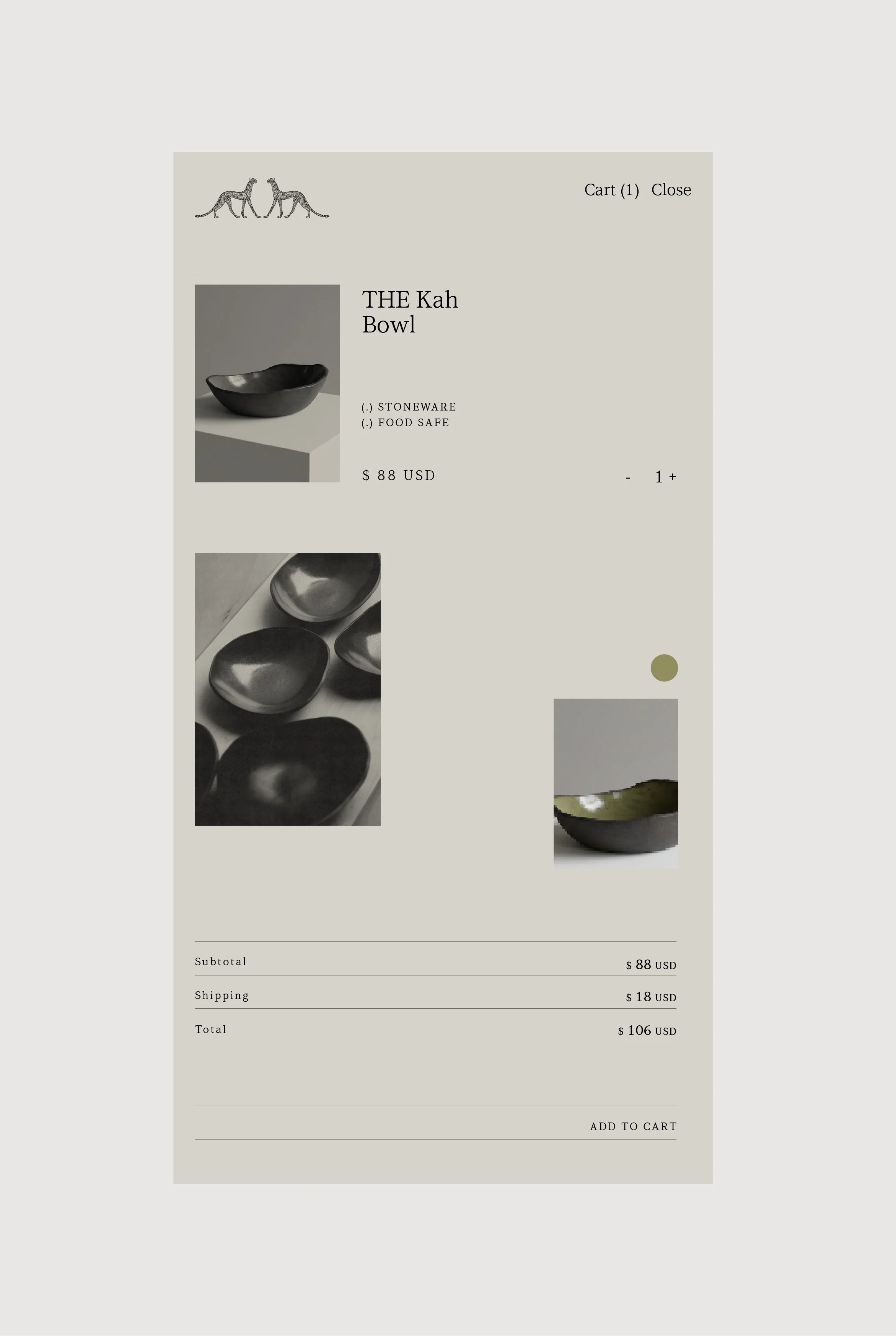
The website extends the identity into a spatial interface. The expression operates as a quiet gallery, prioritizing composition, scale, and negative space. Product pages are treated as studies in form. Information is pared back and sequenced deliberately, allowing the objects to remain central while commerce functions discreetly in the background.
The result is a digital environment that preserves the brand’s restraint. The interface supports the ritual of selection without collapsing into retail language.