Creative studiolo specialized in brand identity and creative direction.
NANDI
SECTOR
SOLUTIONS
Identity
Ecosystem
Photography Direction
Website
Packaging
Collateral
Mythic Studies & Inner Work
Nandi is a school of cosmic mythology devoted to guiding individuals into deeper presence, inner alignment, and expanded states of awareness. Its teachings span the Akashic Records, energy centers, breathwork, meditation, and the study of myths. As the platform matured, it required an identity that could unify these modalities into a single coherent experience: grounded enough for structured learning, yet spacious enough to hold the subtleties of spiritual exploration.
Our work began by listening to the architecture beneath the teachings, tracing the patterns, metaphors, and mythic structures that shape the curriculum. From this emerged a mark rooted in simplistic cosmic symmetry and ancient geometry, supported by a visual system that communicates stillness, resonance, and orientation. Across identity, UX/UI, editorial product development, collateral, photography, and packaging, the brand shapes digital and tangible environments where students can enter, breathe, and feel held by the clarity and atmosphere of the design.
The result is a brand that belongs to a world that’s both modern and mythic, carrying the weight of its lineage while offering students a doorway into their own inner unfolding.
OVERVIEW
Identity
Ethos
Context
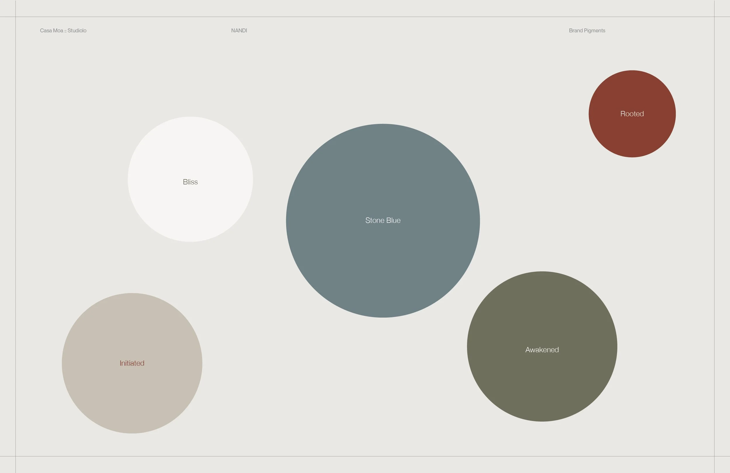
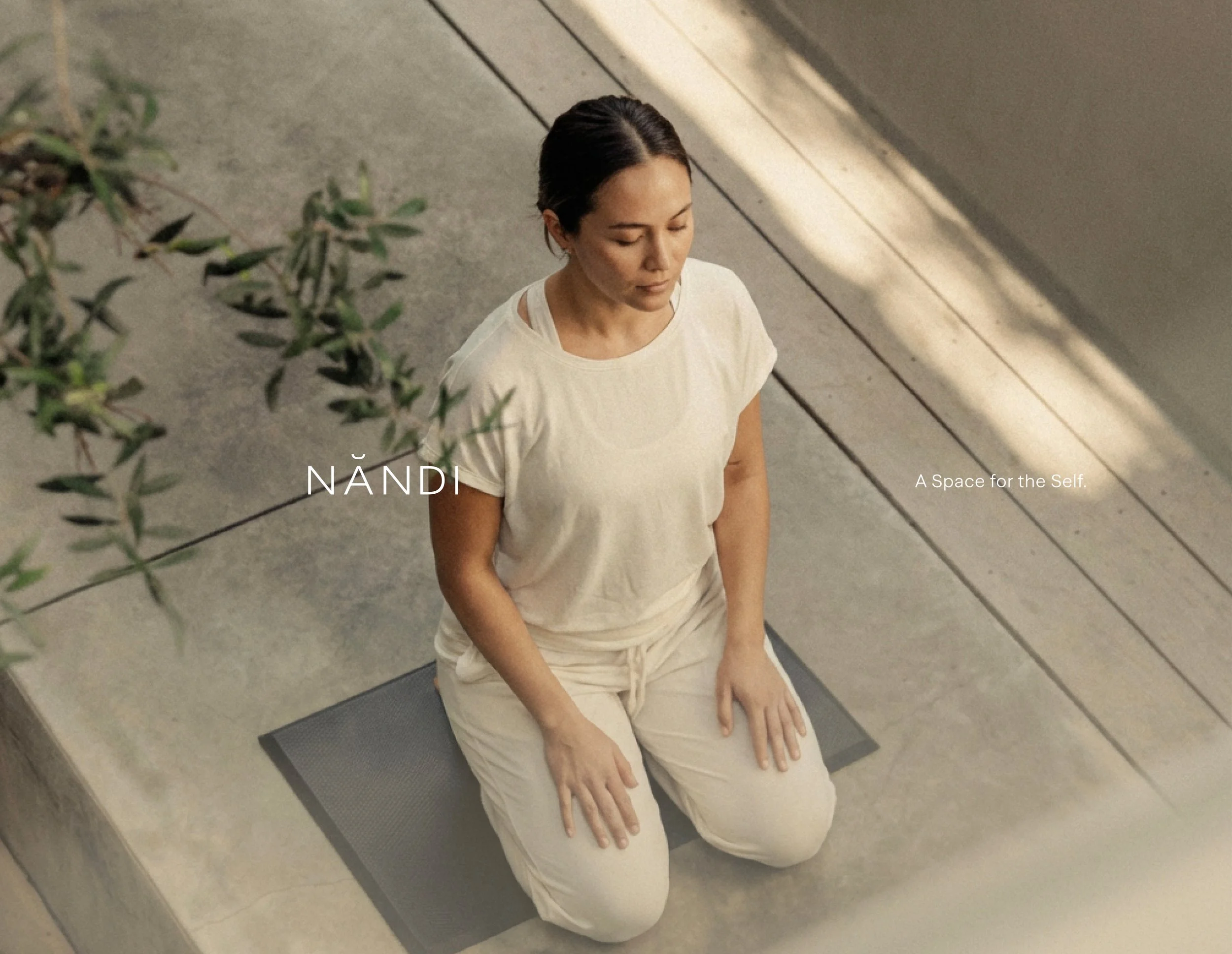
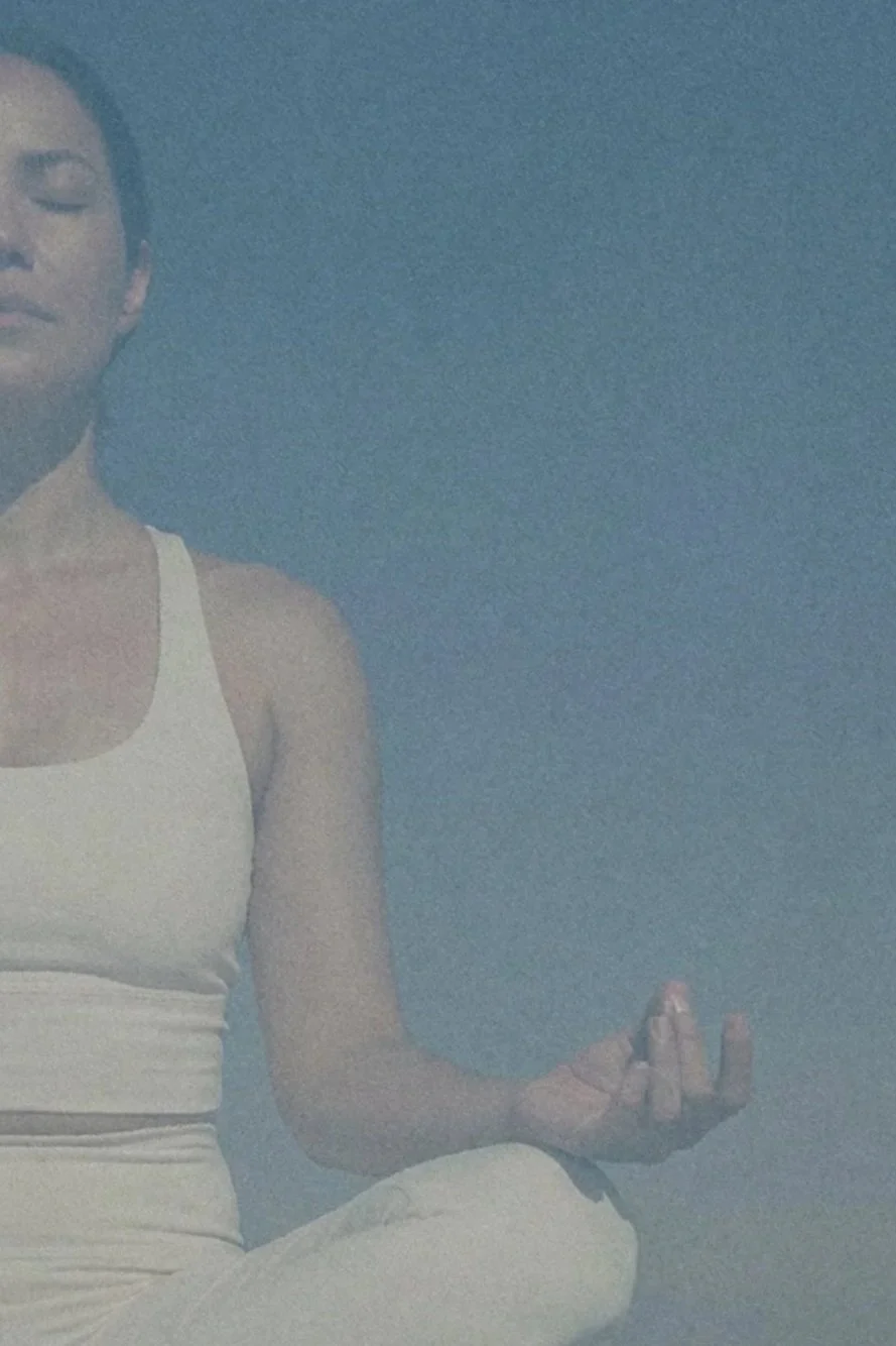
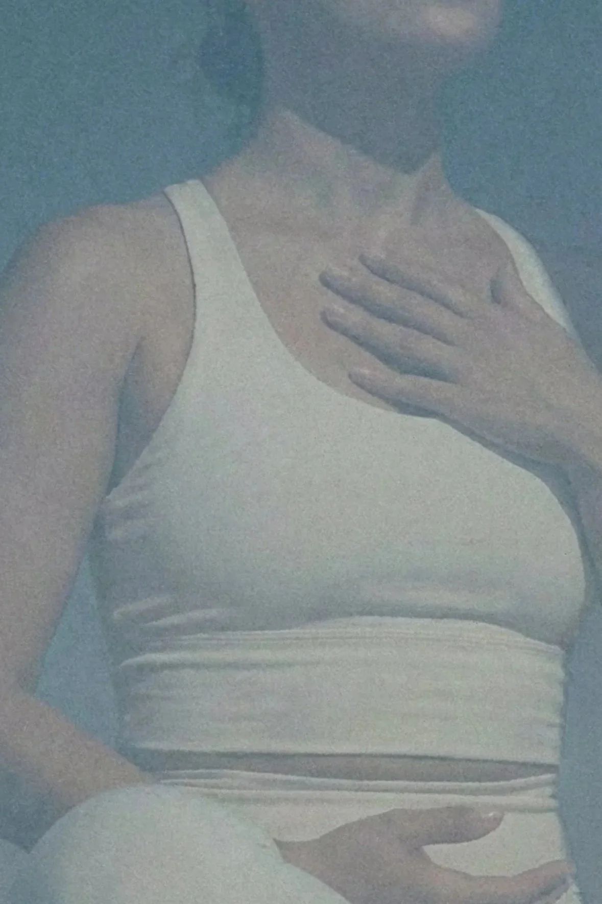
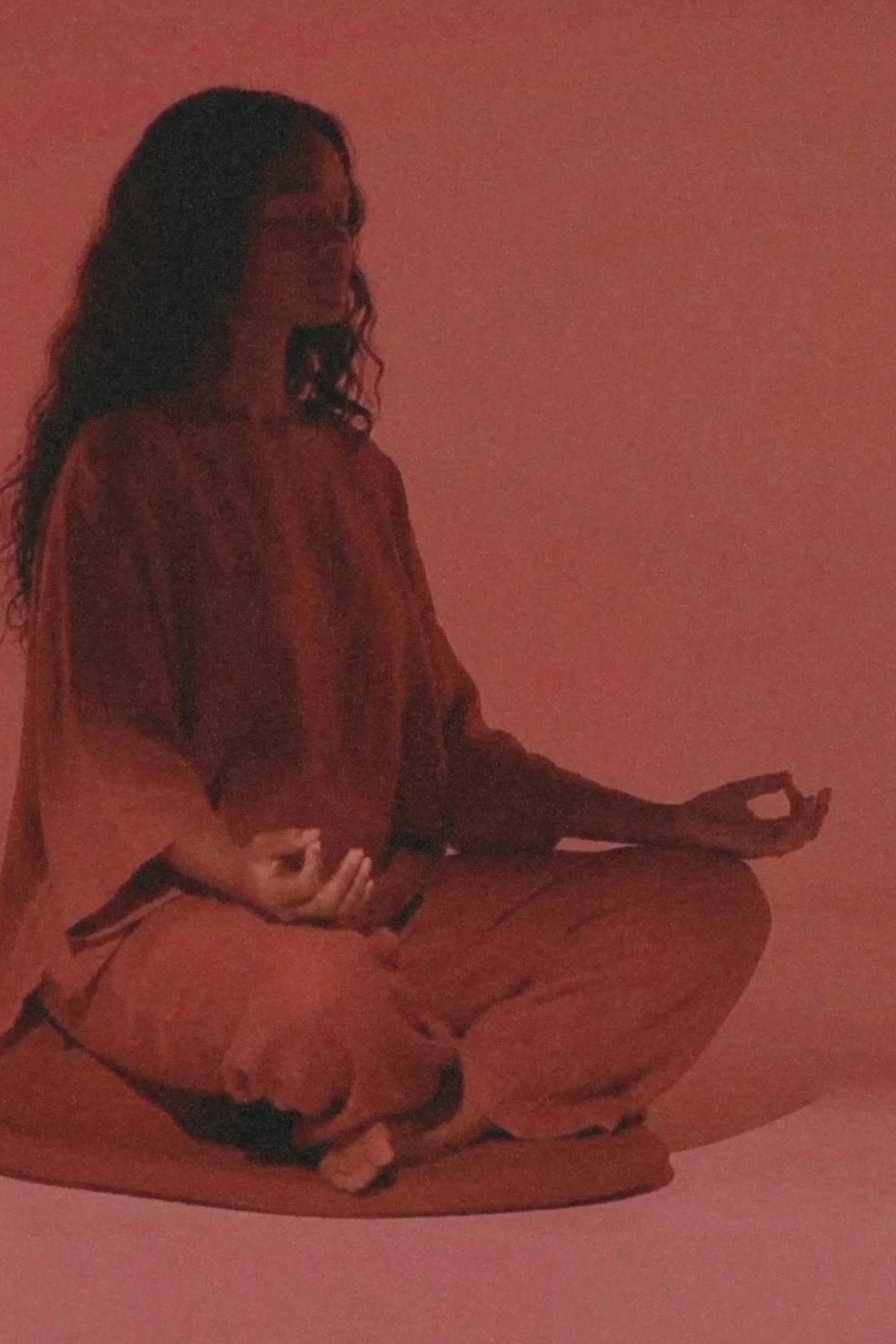
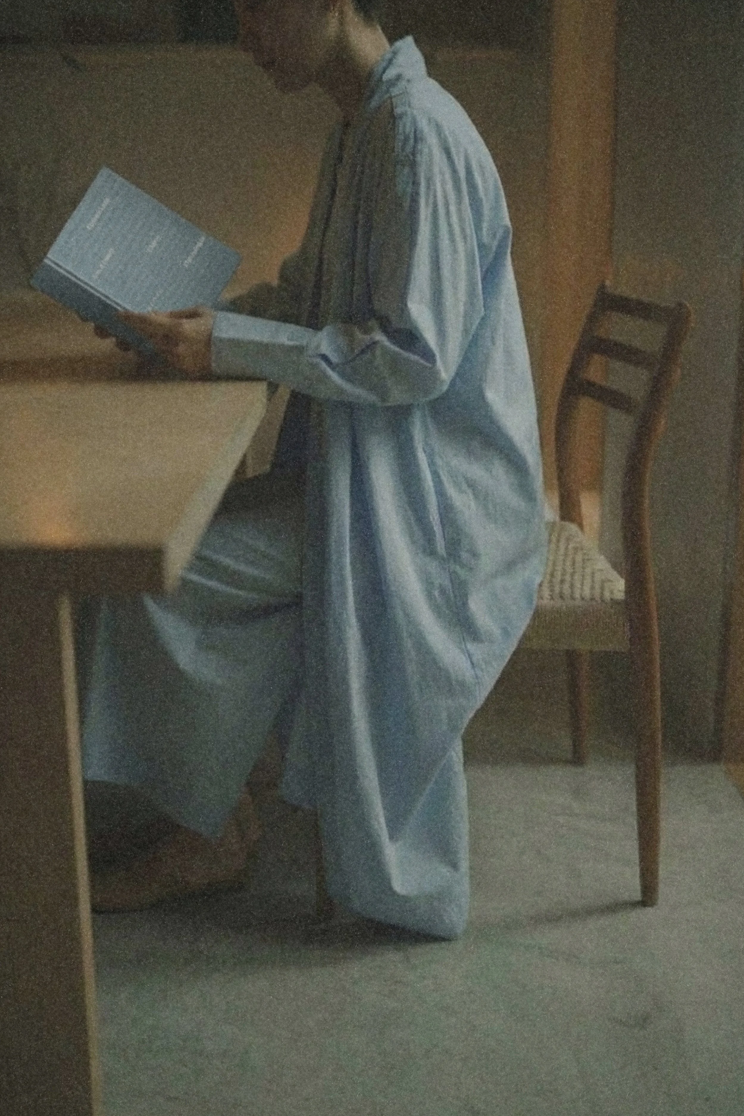
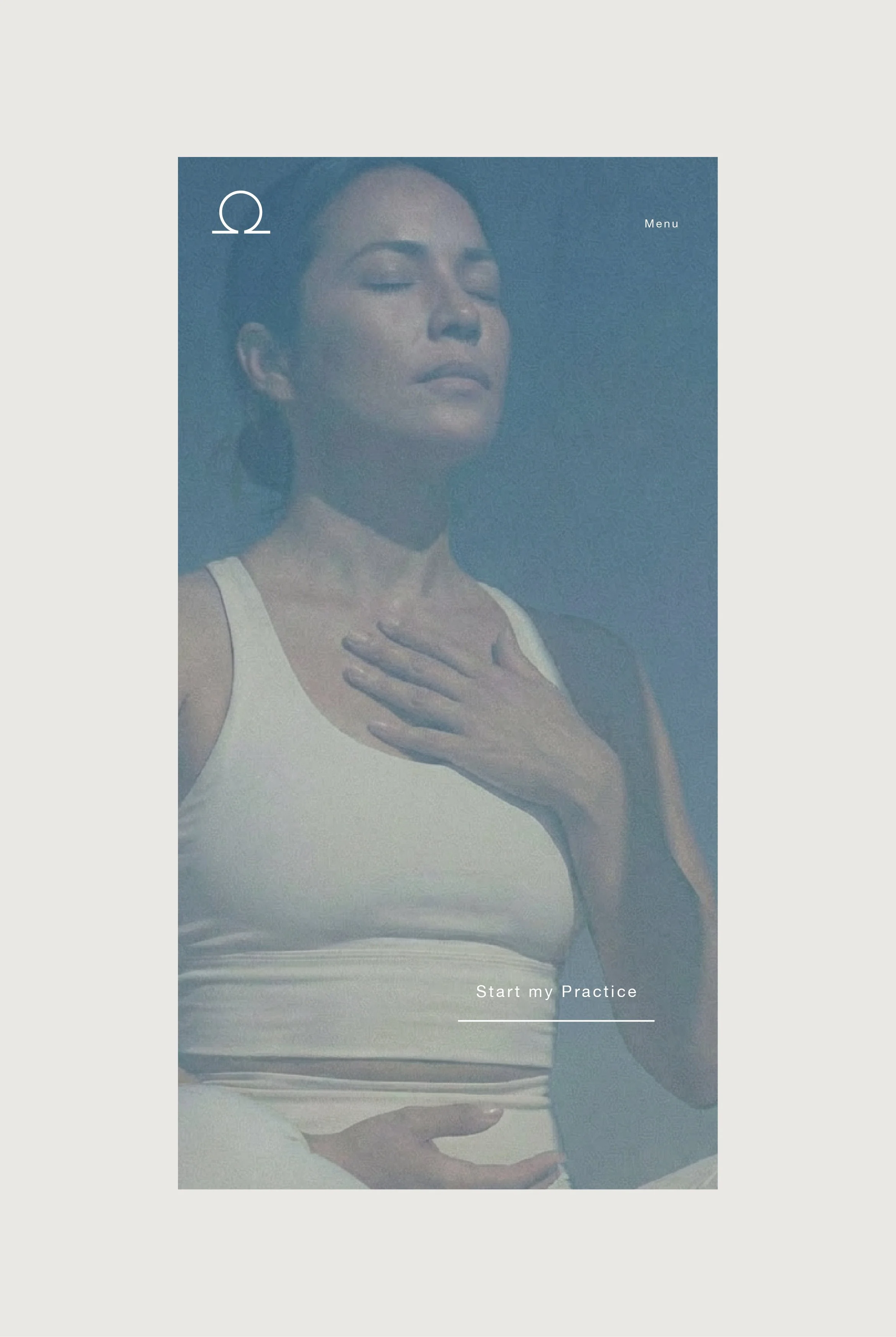
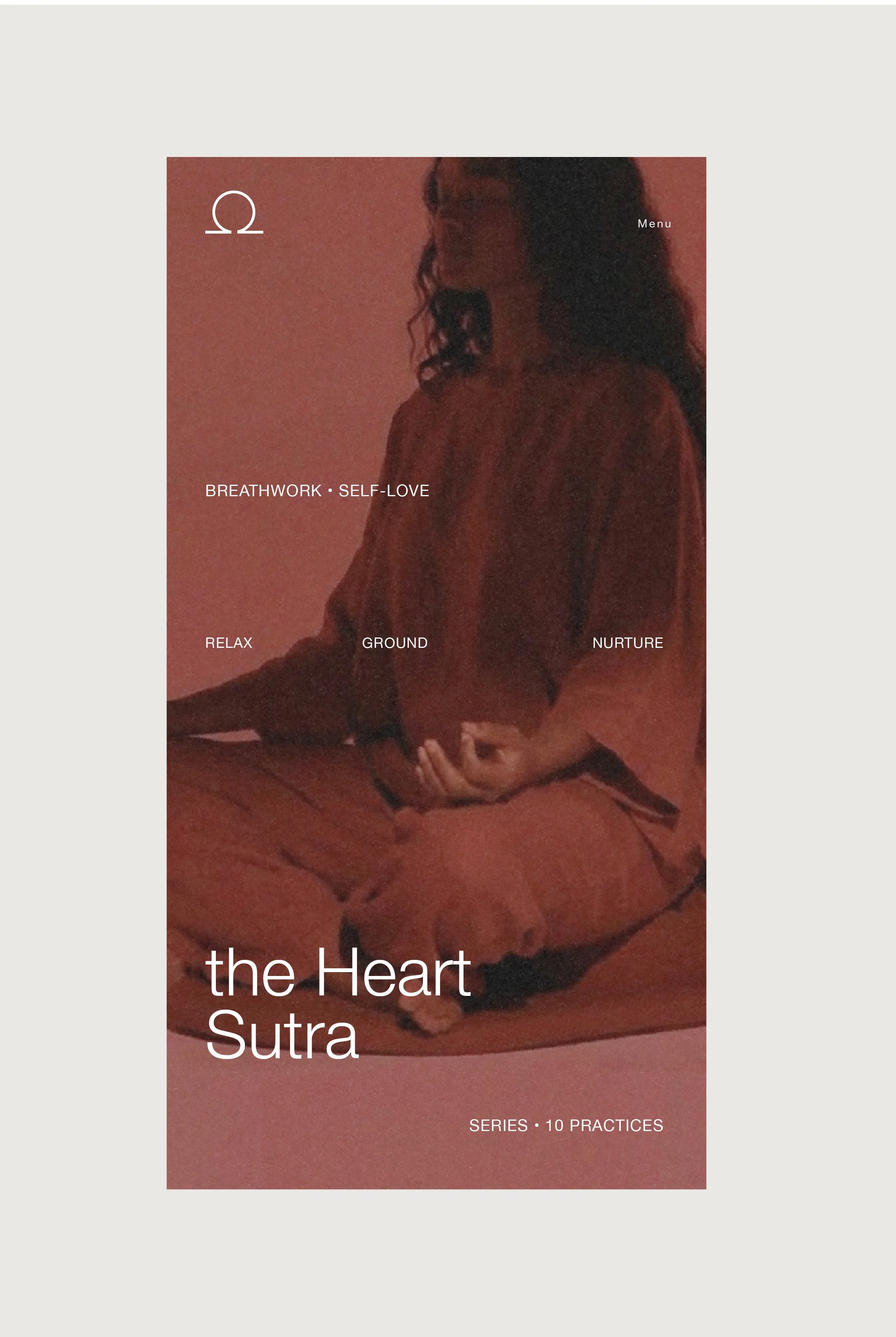
The visual world of Nandi is built around stillness, breath, and the quiet discipline of inner work. Photography favors soft shadows, diffused light, and contemplative posture, creating images that feel less like portraits and more like moments of awareness. Color remains muted and elemental, allowing the teachings to take precedence while the atmosphere holds a sense of spaciousness and mythic calm. Across all visuals, the intention was to evoke presence, a world where the body becomes a vessel, the environment becomes a temple, and the viewer is invited into their own interior landscape.
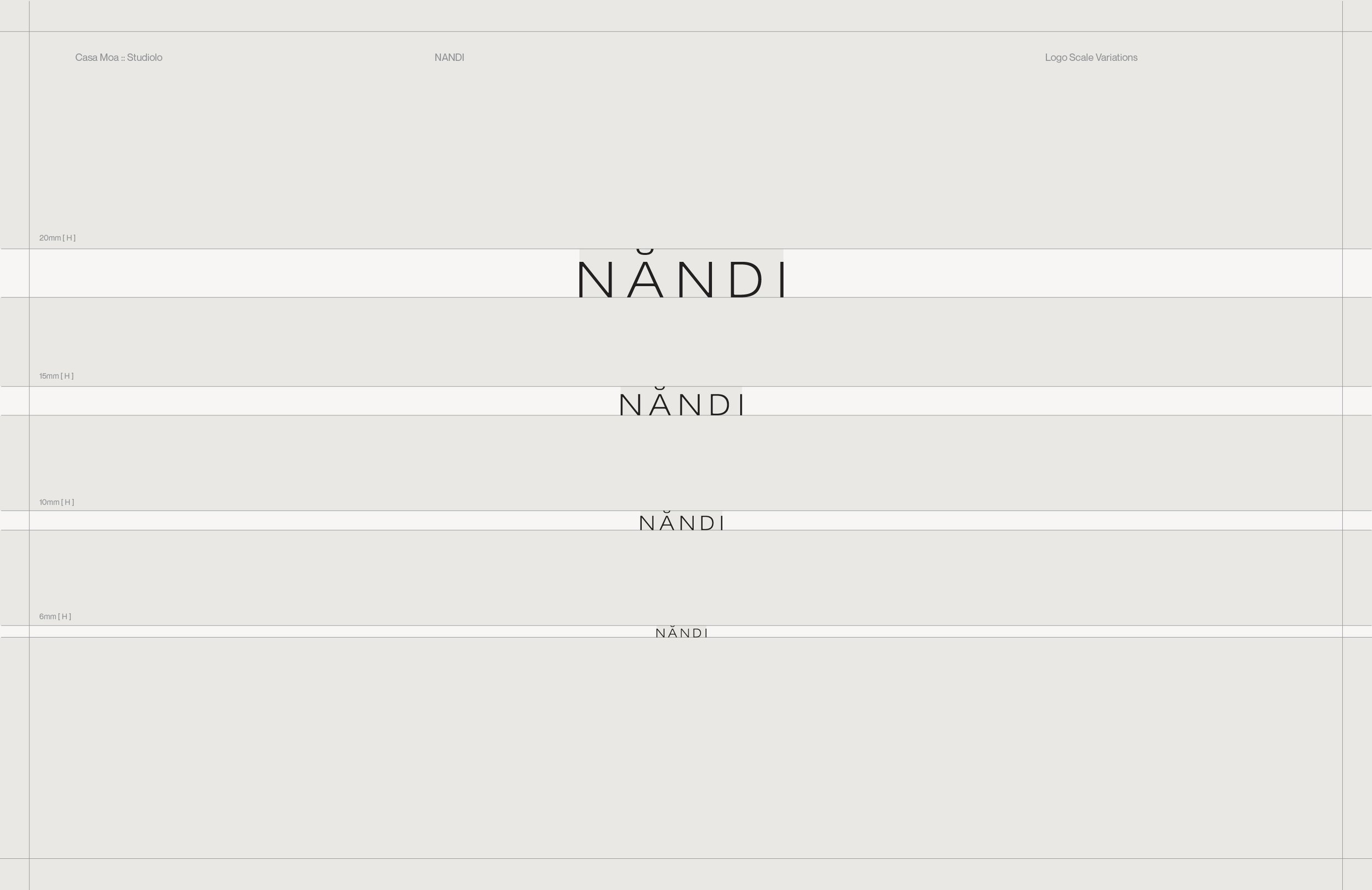
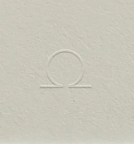
At the center of this world sits the wordmark, a threshold-like form that invites the viewer inward through its quiet geometry and the subtle diacritic that lifts the name into breath. Complementing it, the omega symbol functions as a cosmic anchor, a circle upheld by two grounding lines that mirrors the school’s teachings on wholeness, presence, and the union of the infinite with the embodied.
Solutions
Brand Identity
Ecosystem
Photography Direction
Website
Packaging
Collateral
Art Direction
Art Direction

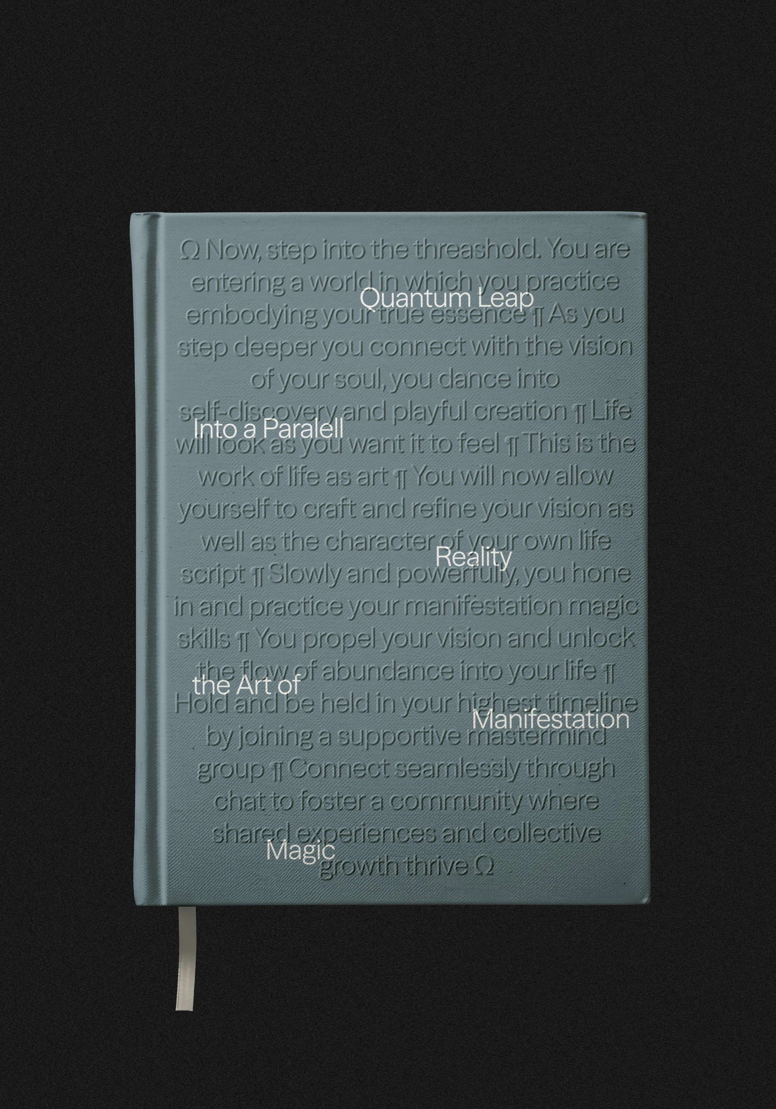
Story Detail
Context
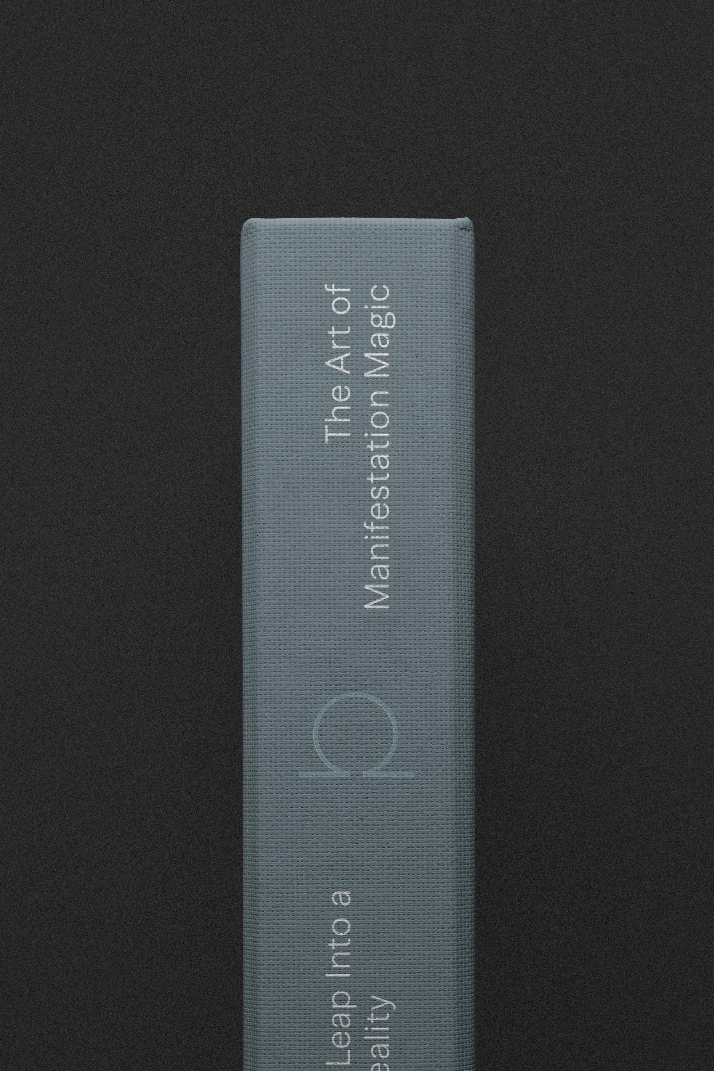
Nandi books are designed as grounding objects with an emphasis on sensorial experience, material intelligence, and clarity of use. Finish choices prioritize stability and presence, creating an object that feels settled and deliberate in the hand. Typography is approached as a structural element, integrated into the surface to support rhythm and pacing rather than visual emphasis. The overall system favors continuity and longevity, allowing the book to function as an enduring companion within a sustained practice.
Product Detail
Context
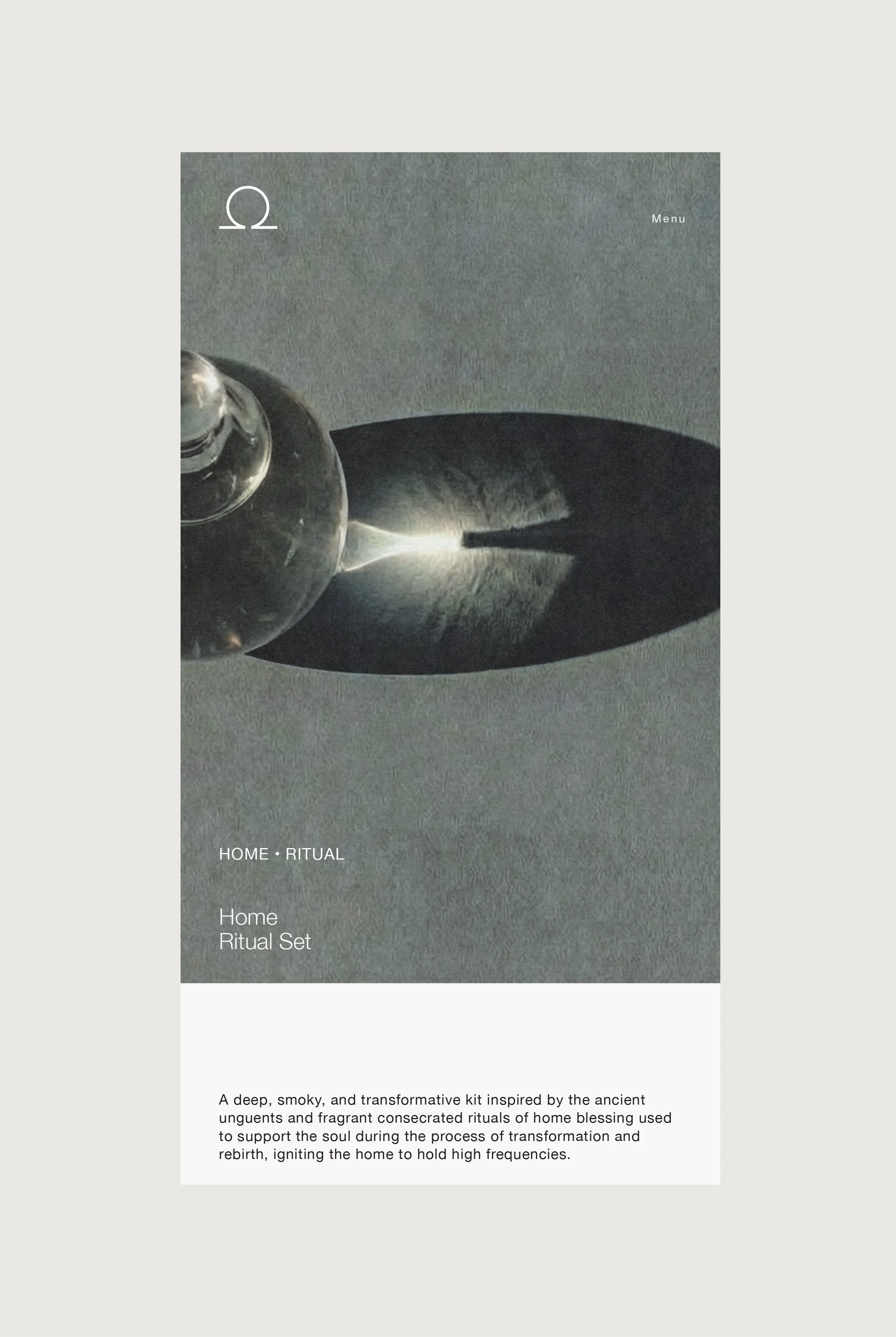
The Home Ritual Set was designed as a contemporary expression of ancient orientation practices. Rather than leaning on ornament or overt symbolism, the design focuses on structure, proportion, and material refinement to establish a sense of thoughtful stimulation that leads to calm. The embossed geometry on the exterior references cosmic symmetry and ritual thresholds, offering a tactile signal of entry before the box is opened. Inside, the system balances precision and openness. Allowing each element to retain autonomy while contributing to a coherent spatial field. Light, shadow, and material contrast are used intentionally to heighten presence and attention, transforming a familiar practice into an elevated, grounded experience that feels both timeless and distinctly modern.
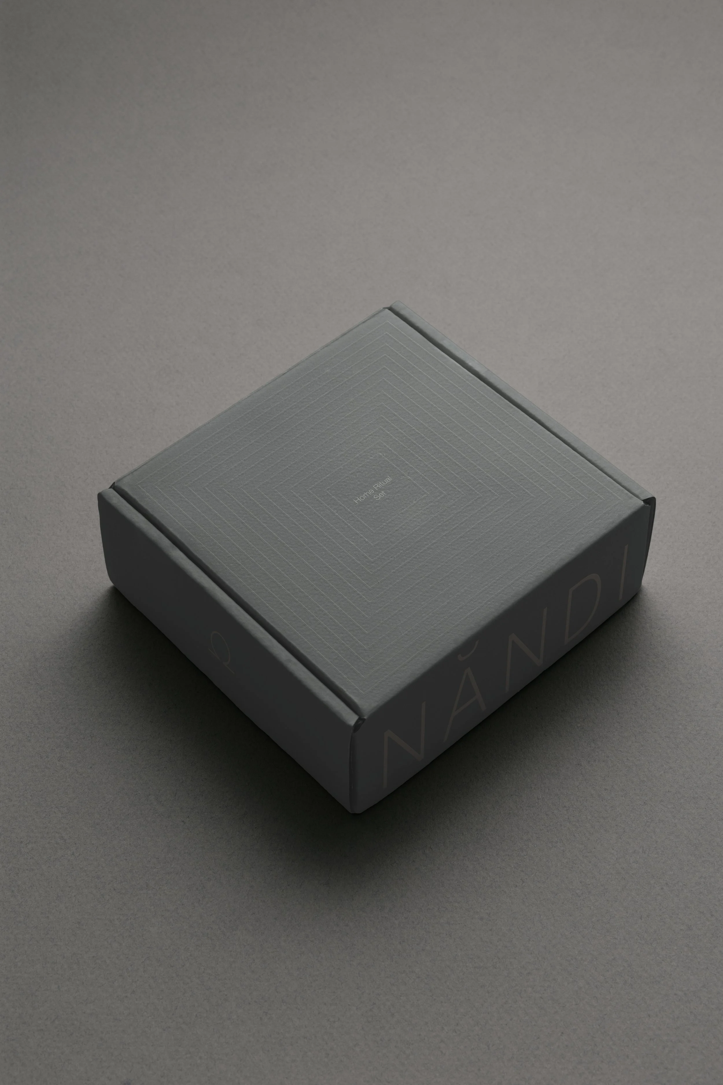
Packaging

Packaging Detail

Website
Digitally the brand was designed as an extension of the practice itself. Rather than functioning as a content container, it operates as environment. Paced, intentional, and quiet. Navigation unfolds gradually, using scale, negative space, and restraint to guide attention without urgency or distraction. Motion, transitions, and hierarchy are subtle by design, supporting orientation and ease rather than stimulation.
Color is deployed atmospherically, establishing emotional tone and energetic state across screens and devices. The interface embraces clarity and breath, allowing users to move through teachings, practices, and tools in a way that feels grounded and self-directed, reinforcing cadence, values, and a sense of inner alignment.
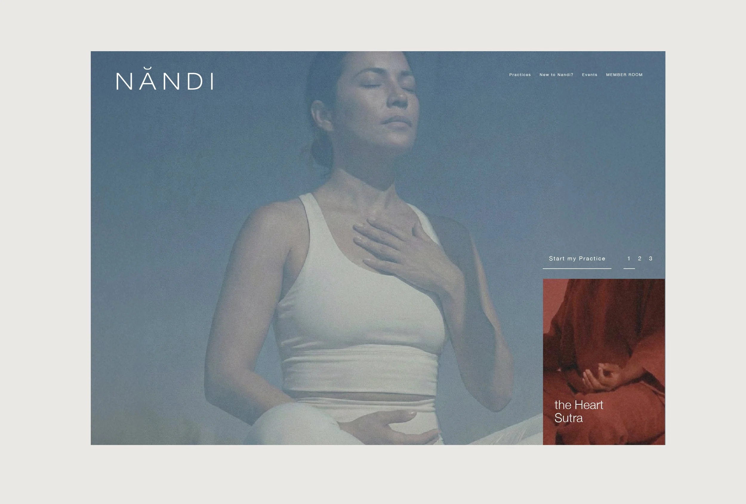
Home Page
Mobile View