Netflix
Friends don’t lie. Stranger Things is more than a show — it’s a cultural touchstone. The task here was to develop a book experience that would extend the series’ eerie, nostalgic atmosphere into the tactile world: a design object fans could hold, explore, and disappear into.
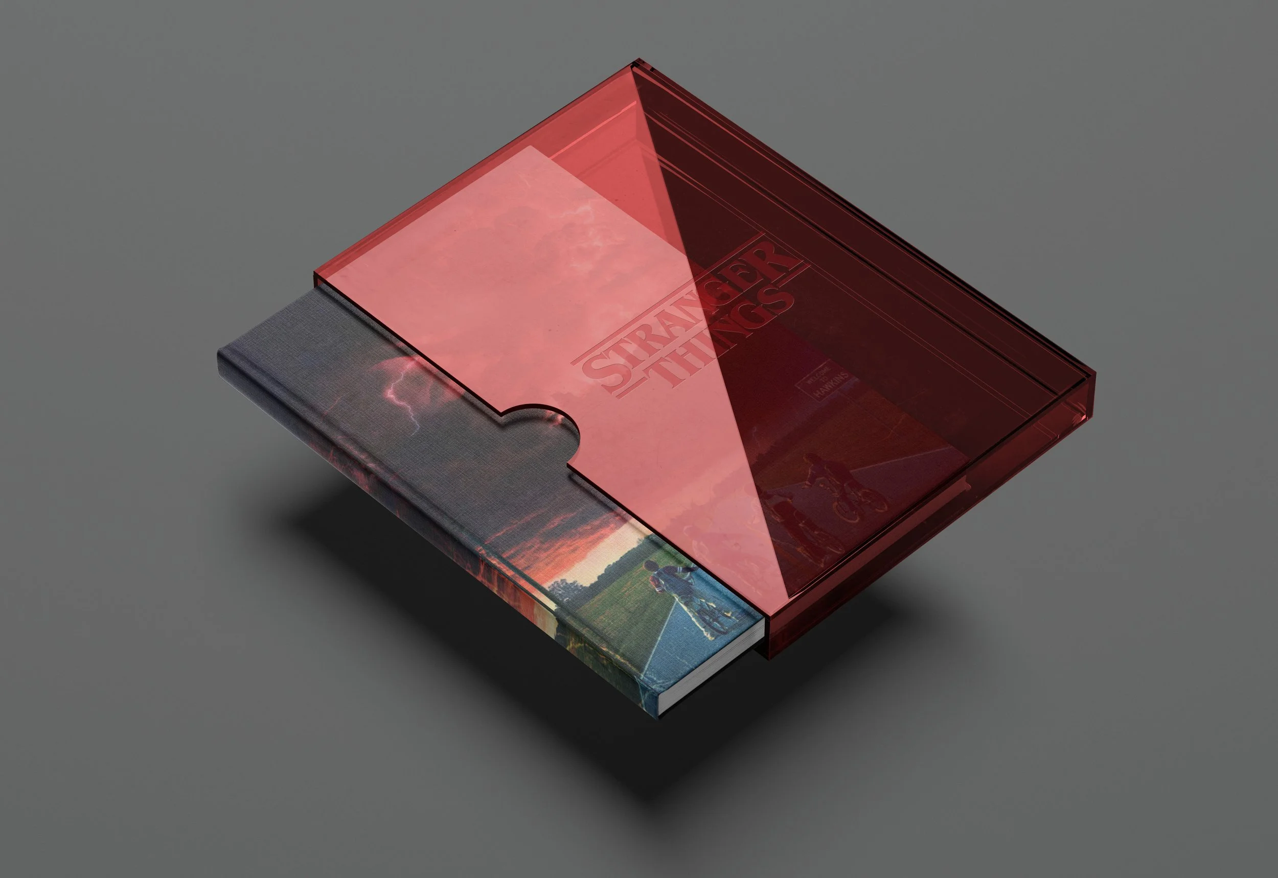
The Alchemy. While at Clever Creative, I directed the creative and editorial design of a printed piece that visually echoes the Stranger Things universe. Retro-inspired typography, iconic imagery, and dimensional layout choices were developed in collaboration with the team, paired with a rich, atmospheric palette — all designed to blur the line between reader and viewer. Visual moments were layered with intention, allowing perception to shift and flicker, much like the series itself.
The Outcome. The finished book became more than a companion piece — it’s a portal. A design that mirrors the show’s dual realities: familiar and uncanny, nostalgic and new. A tribute to story, suspense, and the strange beauty of the in-between.
Sector Entertainment & Editorial
Discipline Brand Development
Services Editorial Design, Book Layout & Production Direction, Creative Direction, Book Binding, Visual Concept Development
Project completed while at Clever Creative
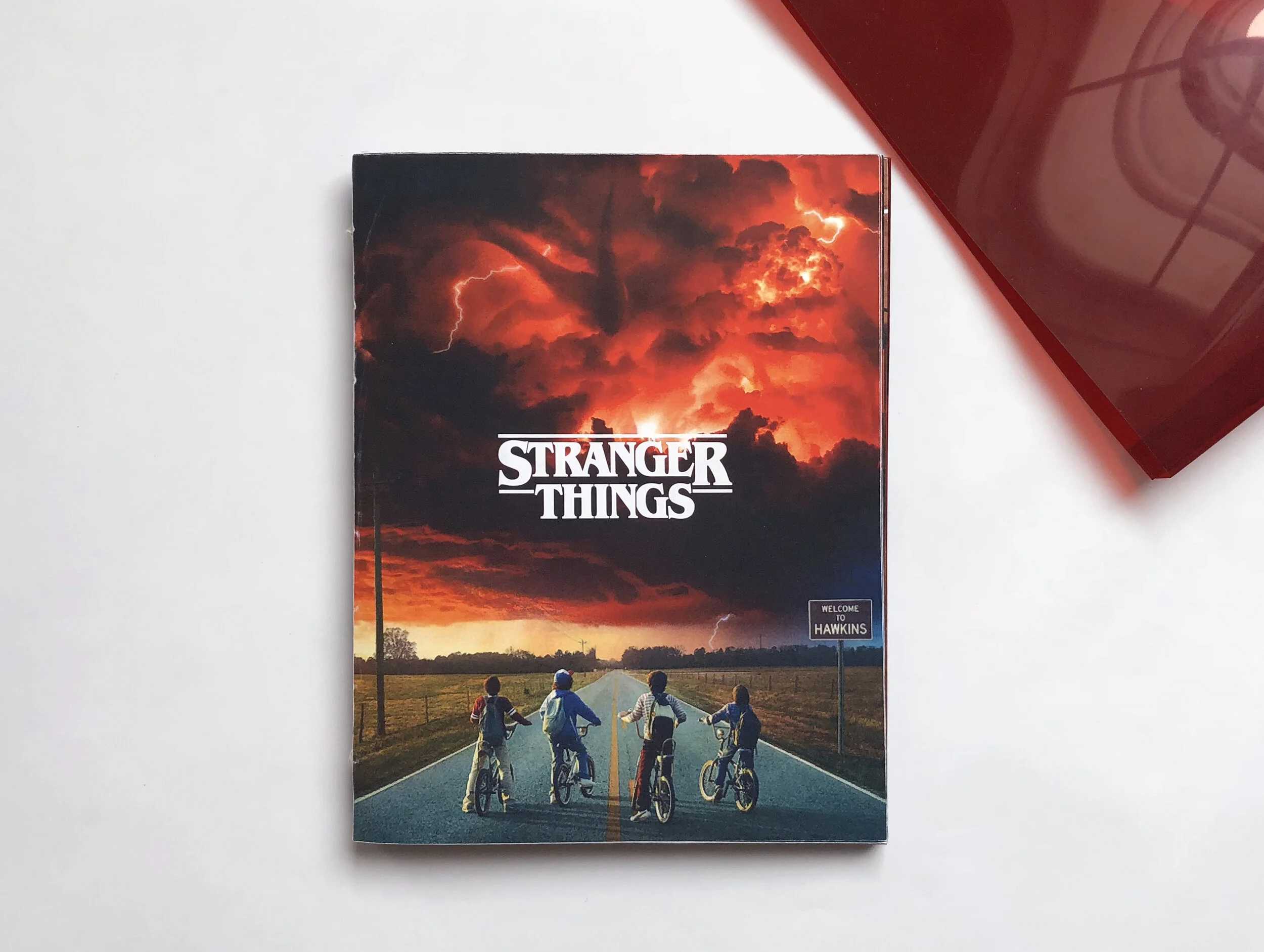
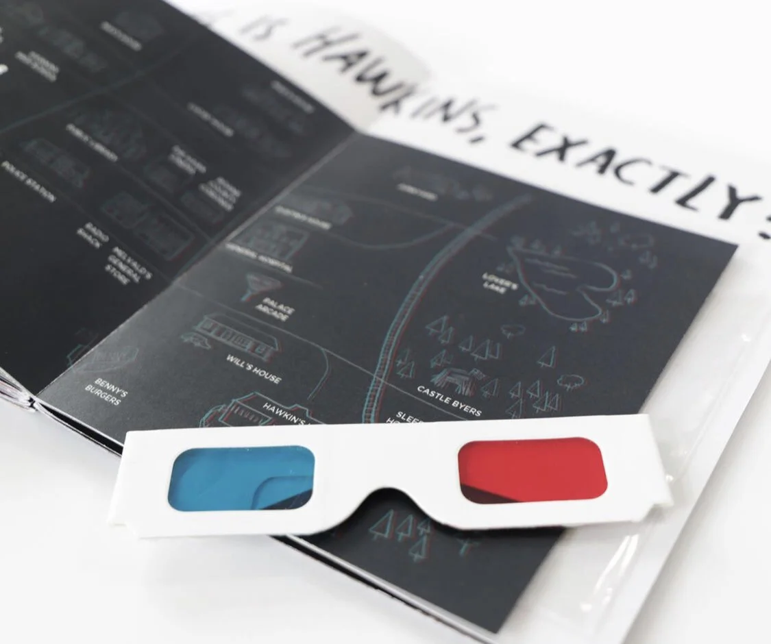
Designed to be a printed interpretation of the acclaimed show, the book is filled with experiential printed materials such as oversized break-the-grid posters, layered substrates that bend the visuals, and 3D engagement in a storytelling format.
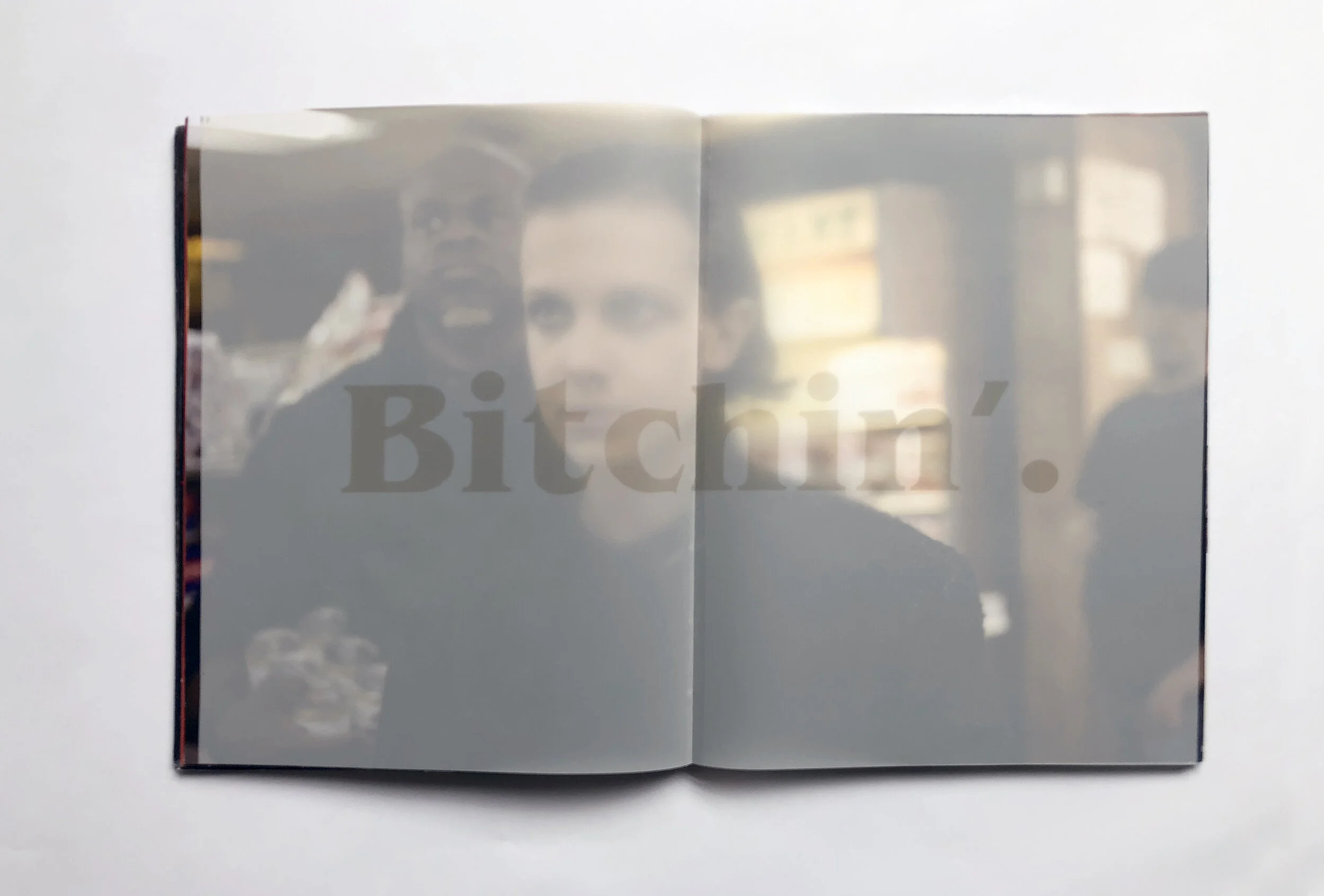
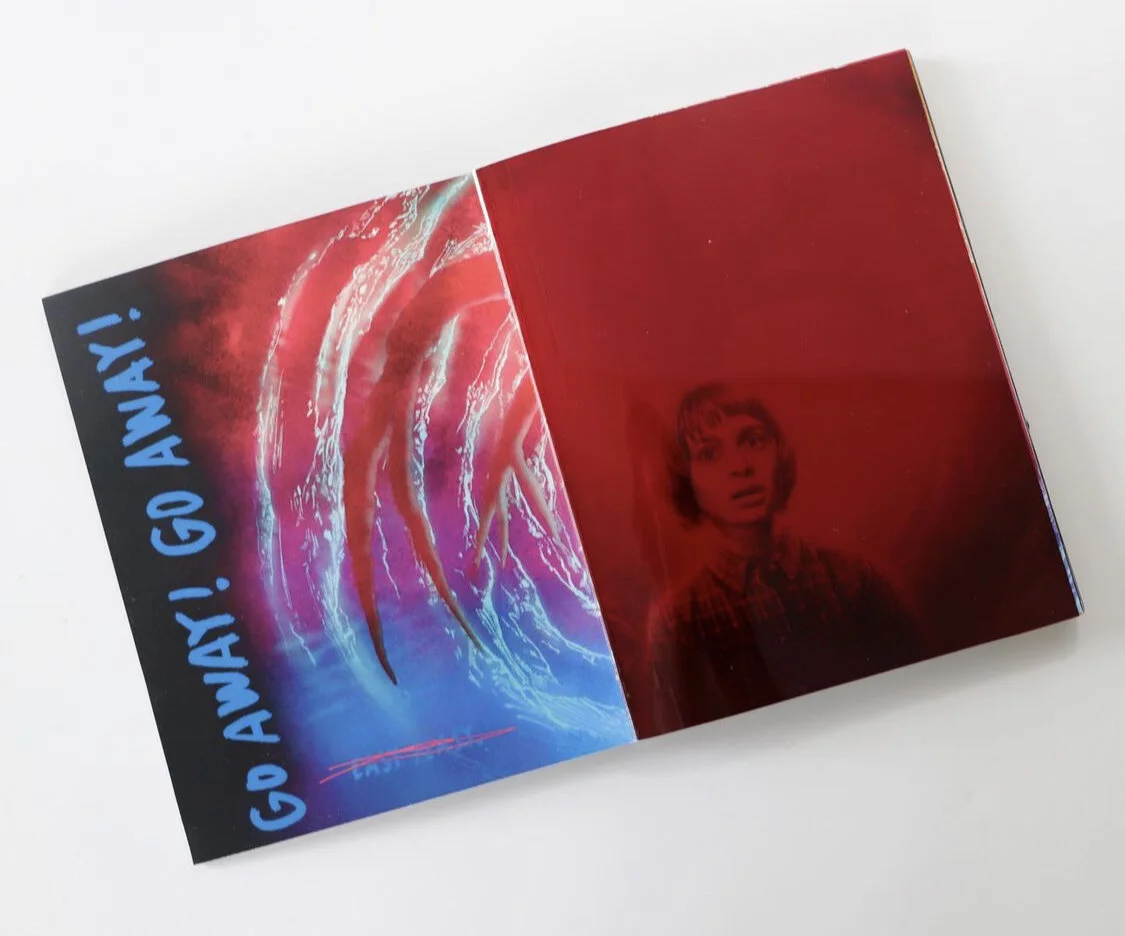
Flipping the red tinted transparent spread causes the creature behind the character to disappear, shifting & bending the visuals.
3D glasses cause the map to jump off the page.