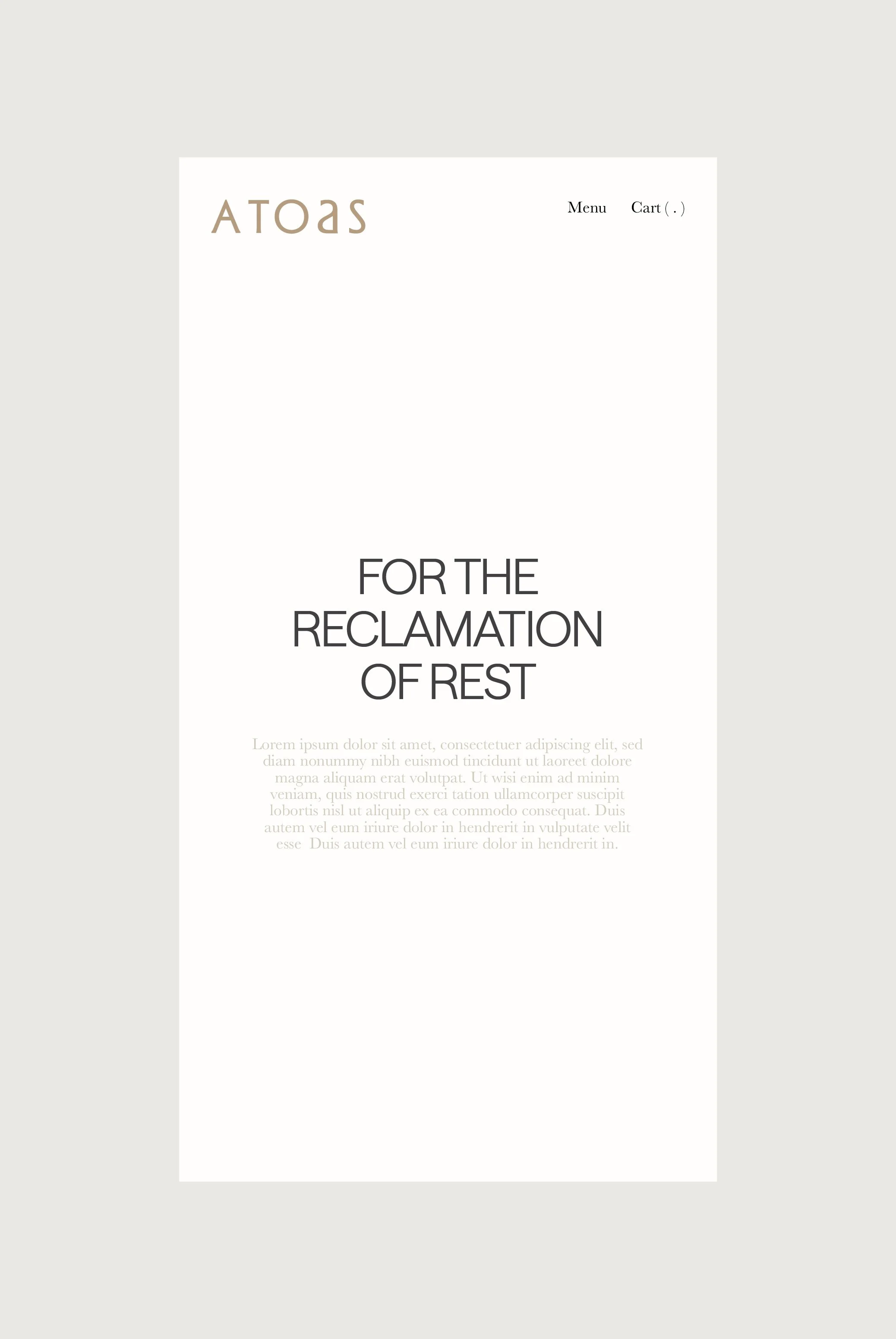
SALTON
SECTOR
SOLUTIONS
Naming
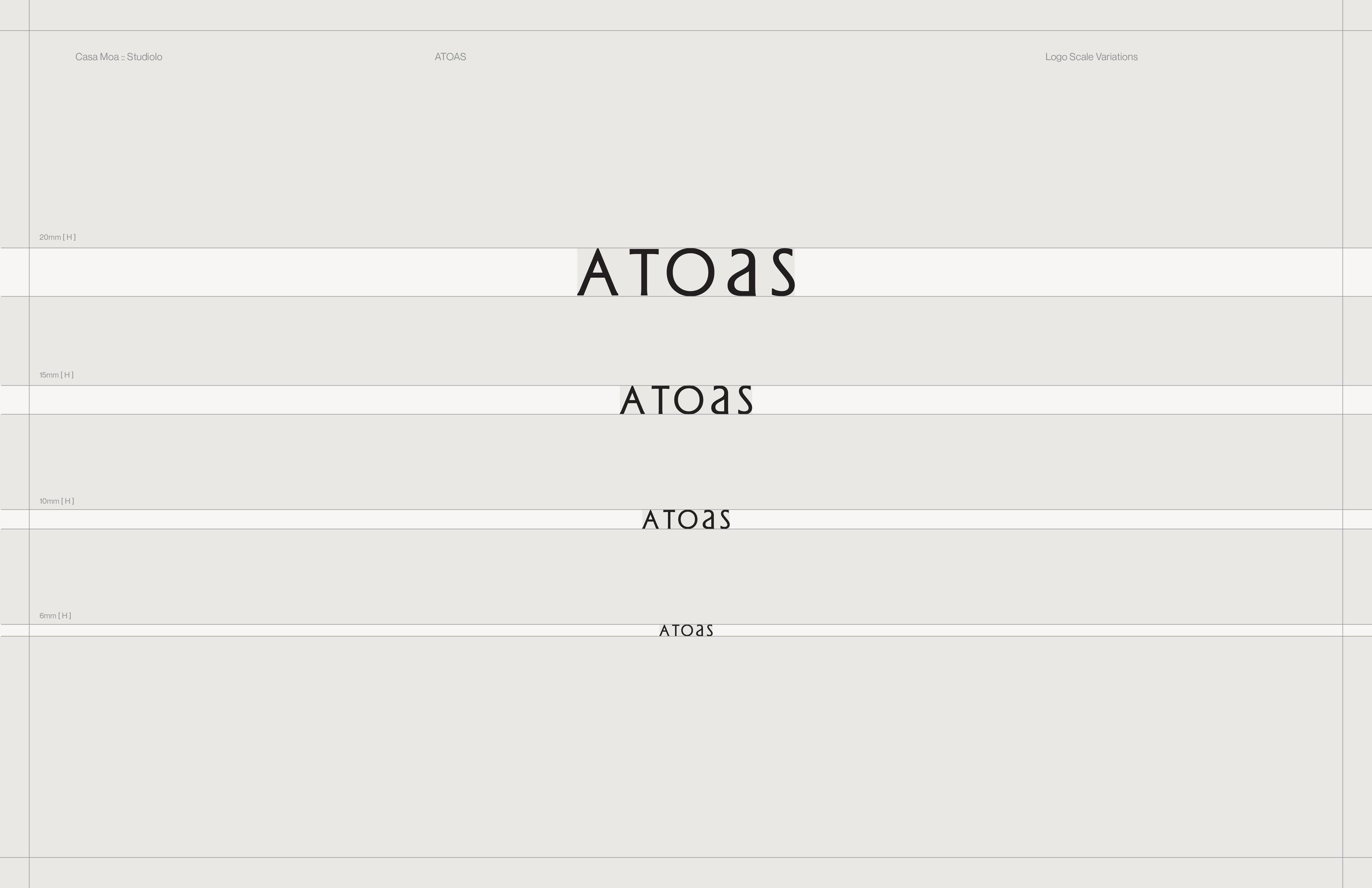
Identity
Guidelines
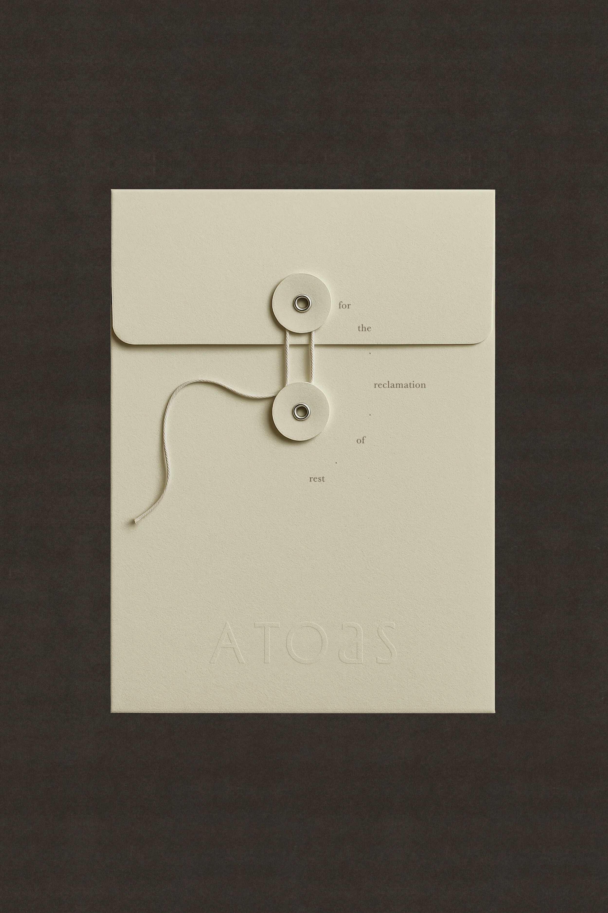
Packaging
Collateral
Wine + Heritage Beverage
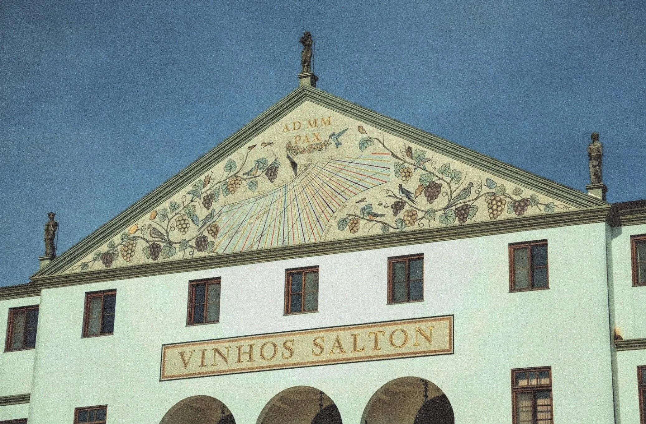
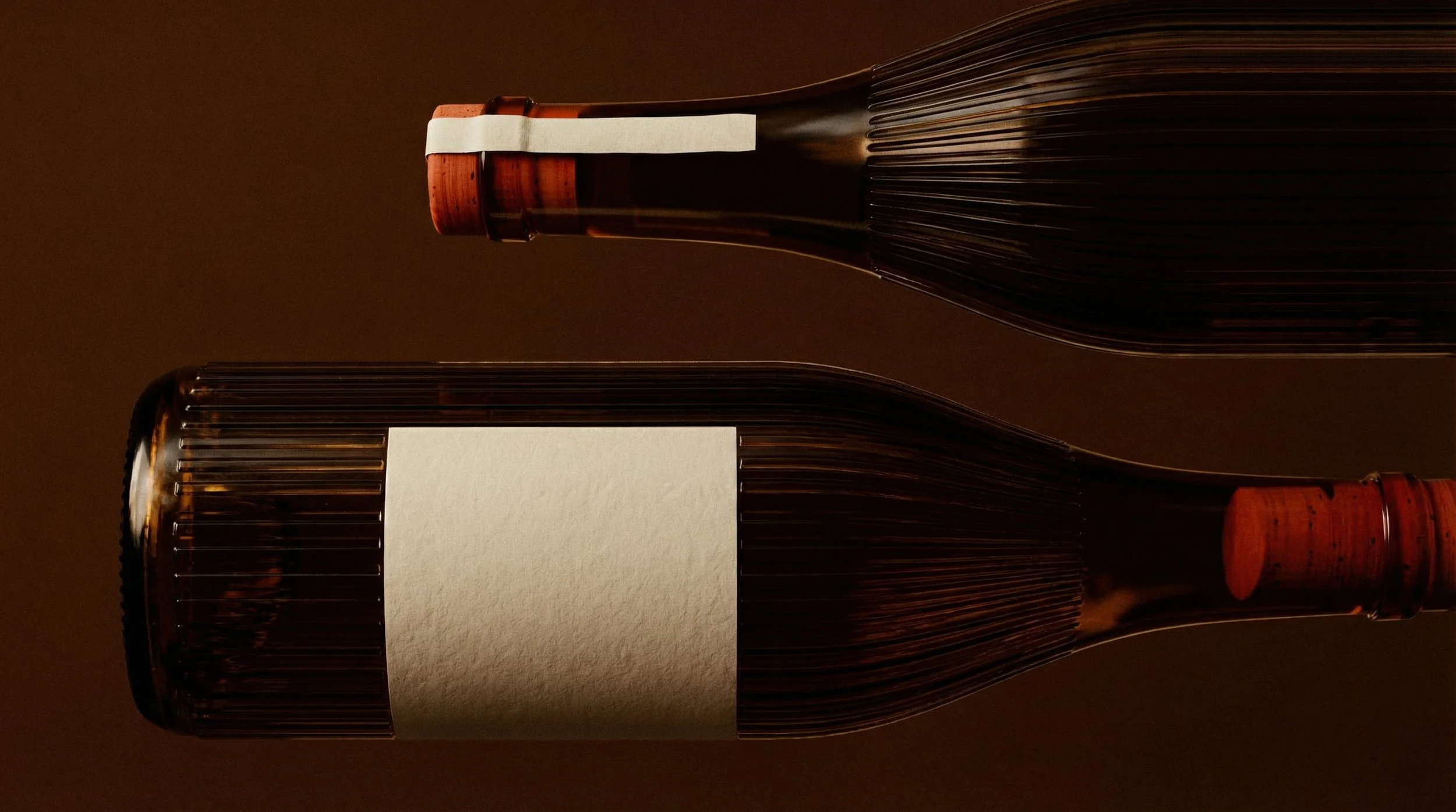
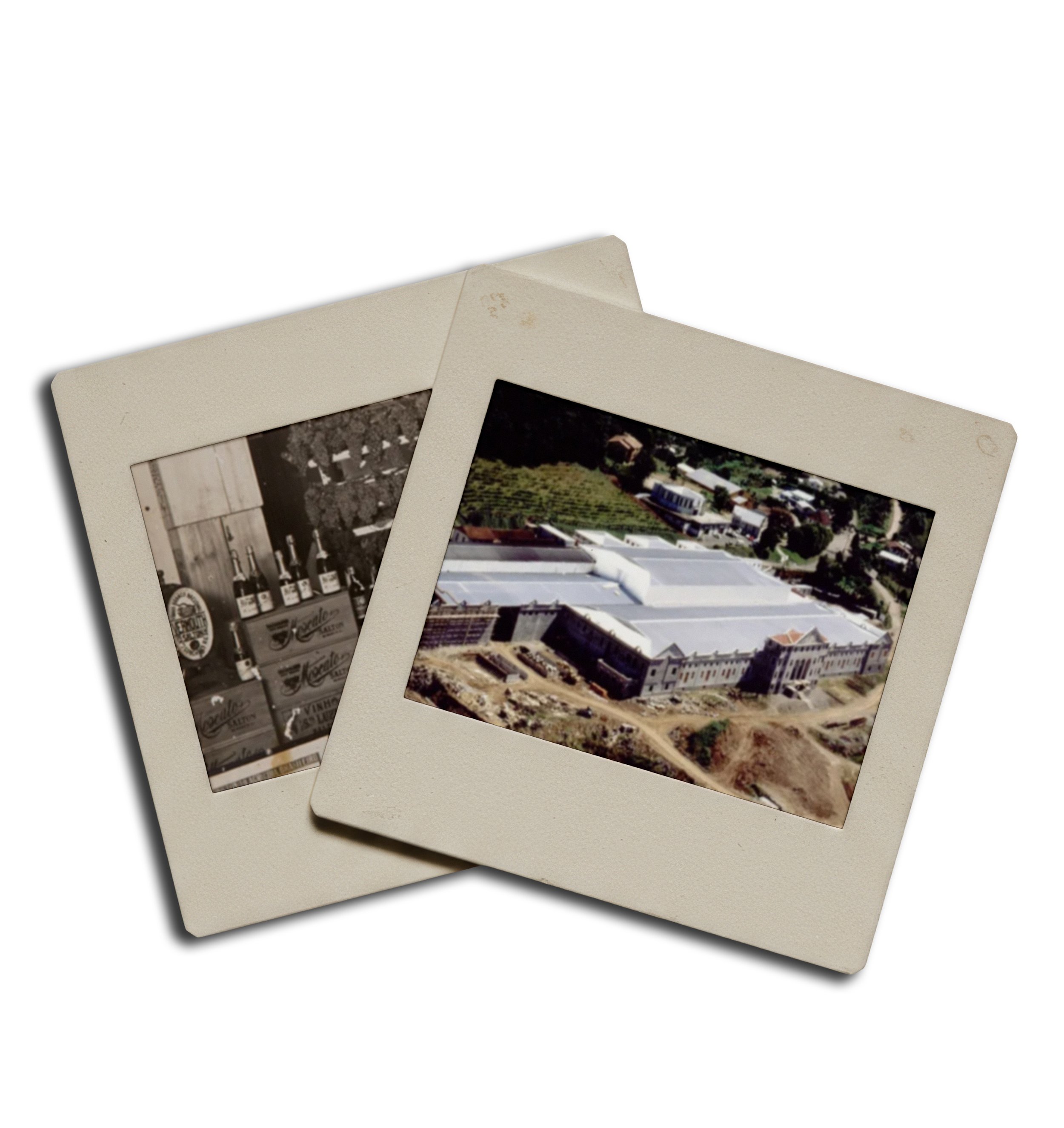
Evolving with legacy. Salton, Brazil’s oldest wine merchant, carries over a century of heritage — a name deeply intertwined with the roots of South American viticulture. As they prepared to expand their global presence, they needed a packaging system that honored their legacy while feeling at home on shelves across North America and Europe.
The Alchemy. We crafted a design system that bridges old-world tradition with contemporary elegance. Typography, color, and layout were chosen to reflect the weight of history — while inviting a modern, international gaze. Photography and video direction leaned into warmth, earth, and ceremony, allowing the product to be experienced as both grounded and aspirational.
The Outcome. The new identity feels like memory, refined. Salton now holds its legacy with fresh posture — ready to meet global audiences without abandoning its soul. The brand presence resonates across cultures while staying rooted in its place of origin.
OVERVIEW
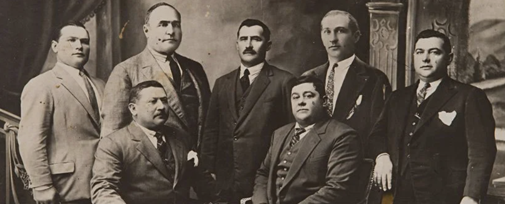
Salton Family
1910
Context
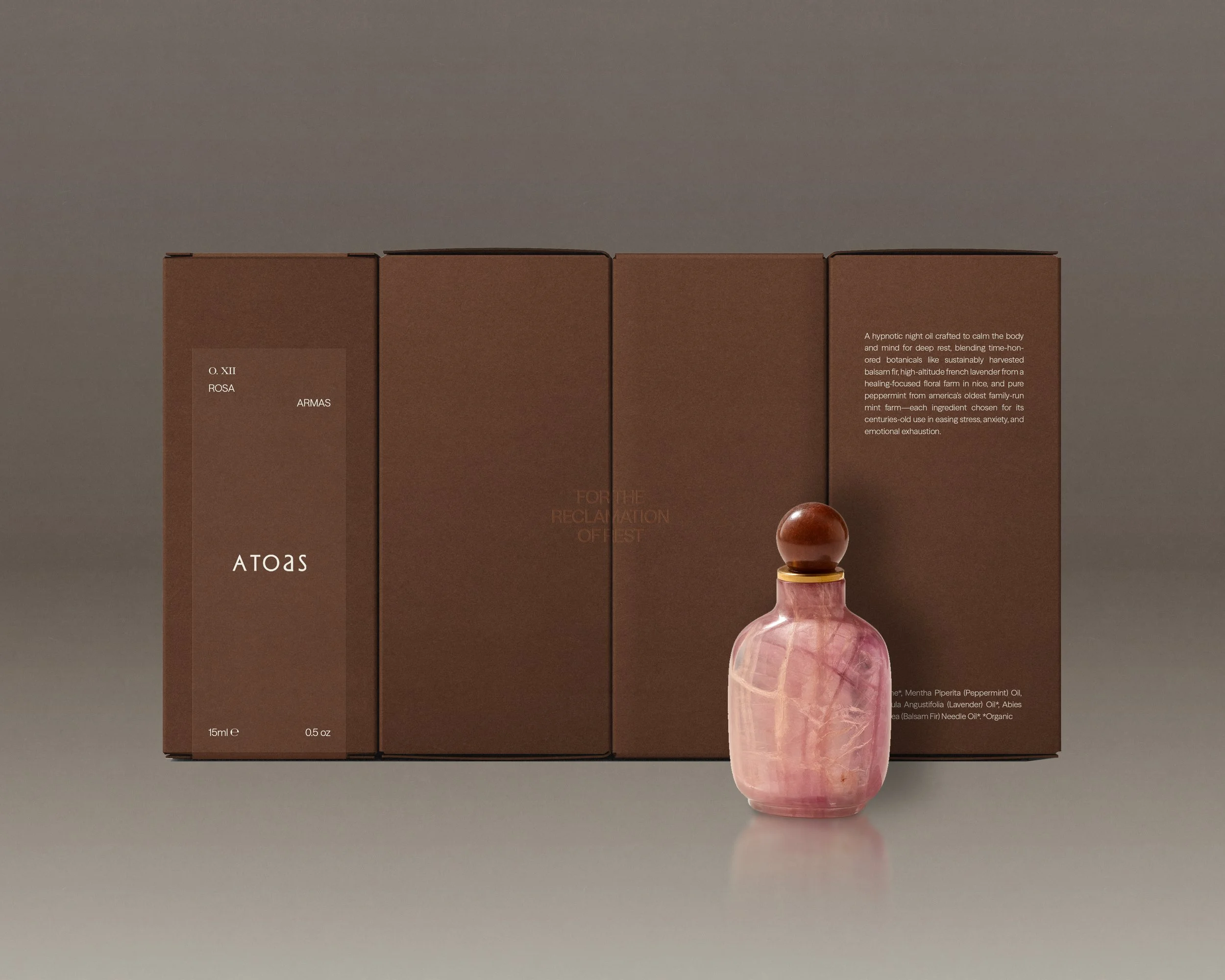
Botanical skincare line F. Miller was developed to embody the essentialism that its creator, Fran Miller, found to be lacking in the market when she debuted her signature Face Oil in 2014. Four years in, she approached us to embark on a long-term partnership to develop and evolve a new brand identity that conveyed the values behind her formulations. We translated Fran’s emphasis on simplicity and versatility through a pared-back design language to recentre the F. Miller brand around typographic clarity, consistency and modularity.
Solutions
Brand Identity
Packaging
Print Assets
E-Commerce Design
Development
Digital Assets
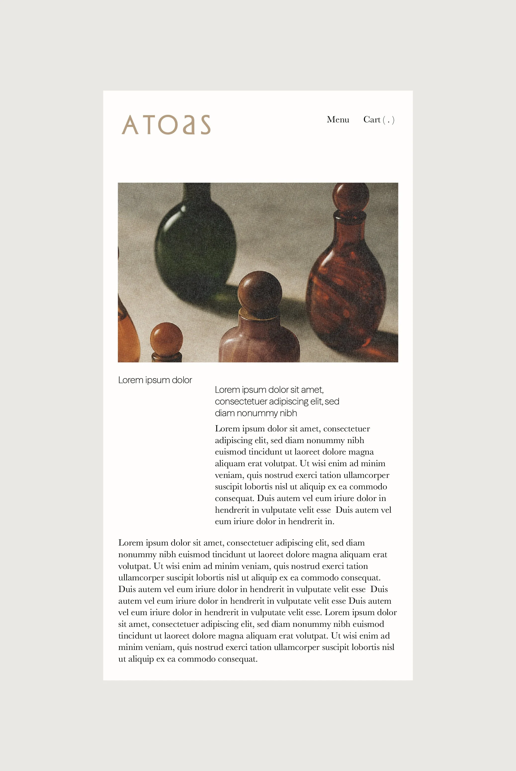
Casa di Pasto Salton MALBEC
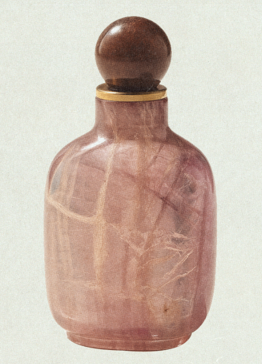
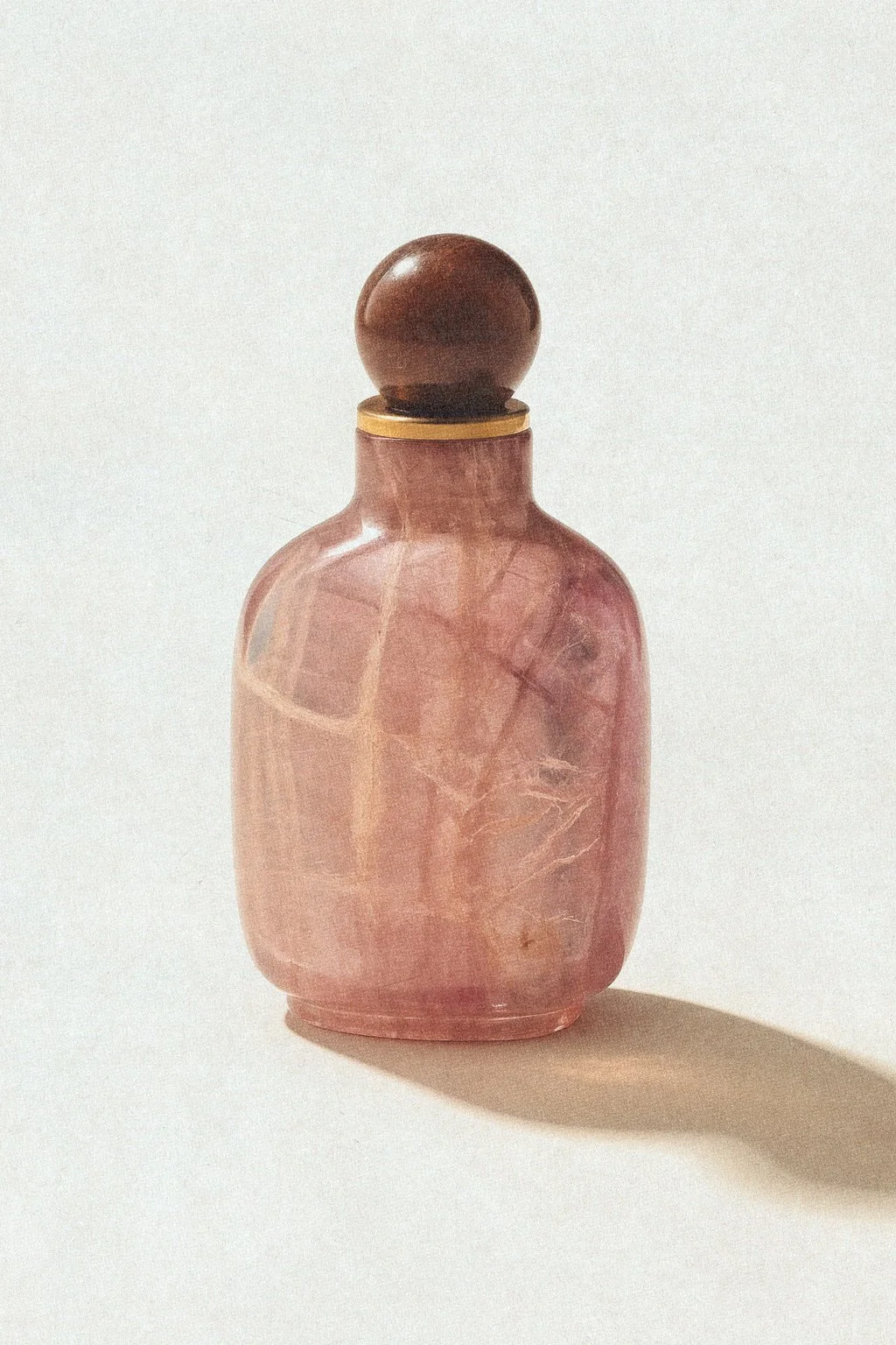
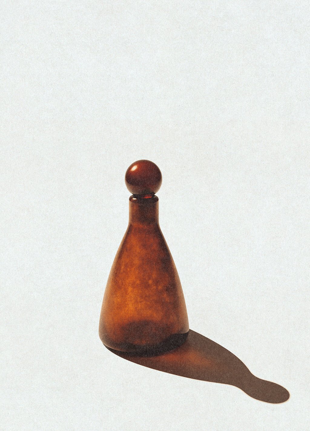
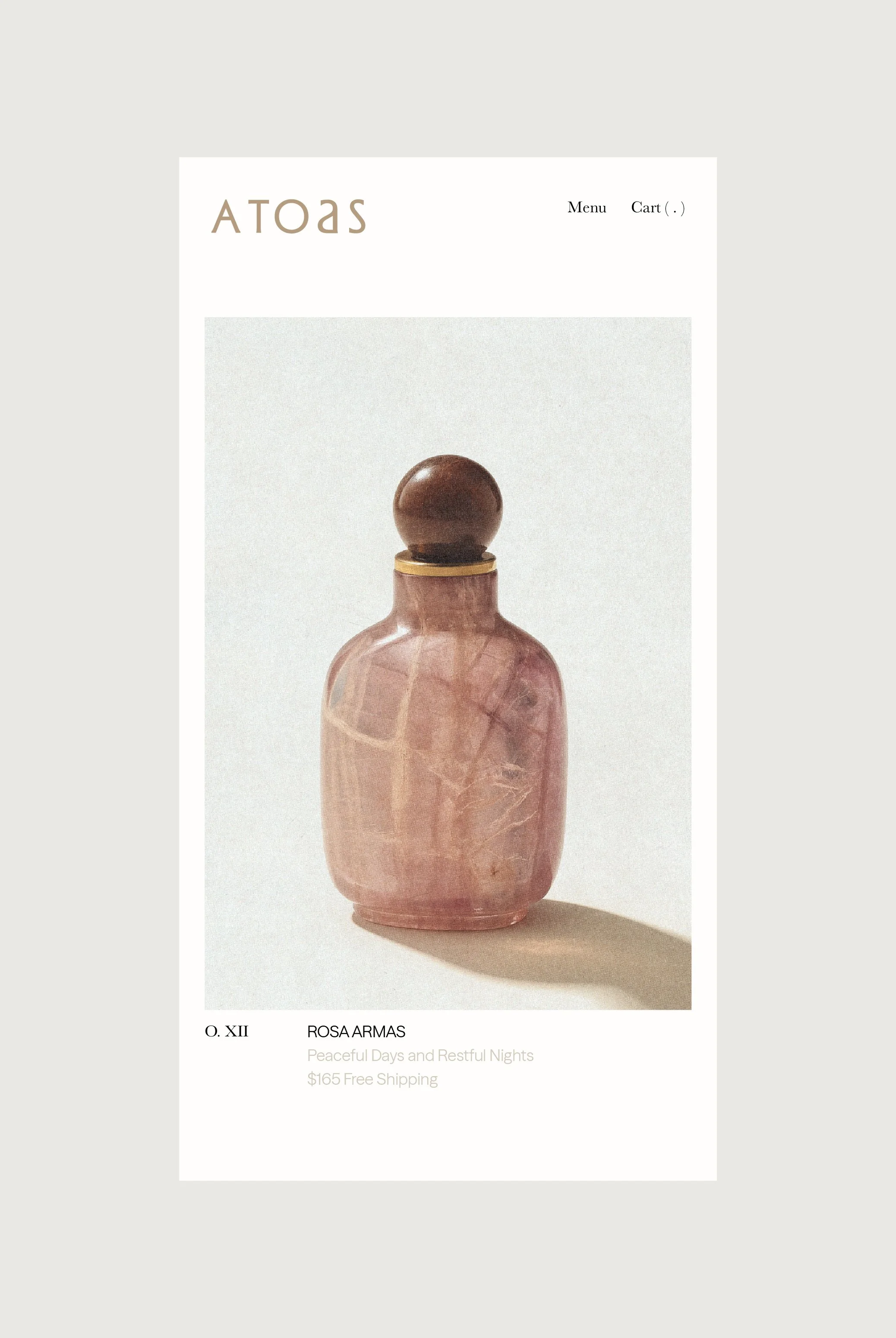
ROSA and HYKO Vessel Textures

Oil Eye Packaging
Packaging
Botanical skincare line F. Miller was developed to embody the essentialism that its creator, Fran Miller, found to be lacking in the market when she debuted her signature Face Oil in 2014. Four years in, she approached us to embark on a long-term partnership to develop and evolve a new brand identity that conveyed the values behind her formulations. We translated Fran’s emphasis on simplicity and versatility through a pared-back design language to recentre the F. Miller brand around typographic clarity, consistency and modularity.
Oil Eye Packaging
Oil Eye Packaging
Packaging System

Website
Botanical skincare line F. Miller was developed to embody the essentialism that its creator, Fran Miller, found to be lacking in the market when she debuted her signature Face Oil in 2014. Four years in, she approached us to embark on a long-term partnership to develop and evolve a new brand identity that conveyed the values behind her formulations. We translated Fran’s emphasis on simplicity and versatility through a pared-back design language to recentre the F. Miller brand around typographic clarity, consistency and modularity.
Home Page Altar
Mobile View
Mobile View
Collateral
Botanical skincare line F. Miller was developed to embody the essentialism that its creator, Fran Miller, found to be lacking in the market when she debuted her signature Face Oil in 2014. Four years in, she approached us to embark on a long-term partnership to develop and evolve a new brand identity that conveyed the values behind her formulations. We translated Fran’s emphasis on simplicity and versatility through a pared-back design language to recentre the F. Miller brand around typographic clarity, consistency and modularity.
Oil Eye Packaging
Oil Eye Packaging
Home Page Altar