Creative studiolo specialized in brand identity and creative direction.
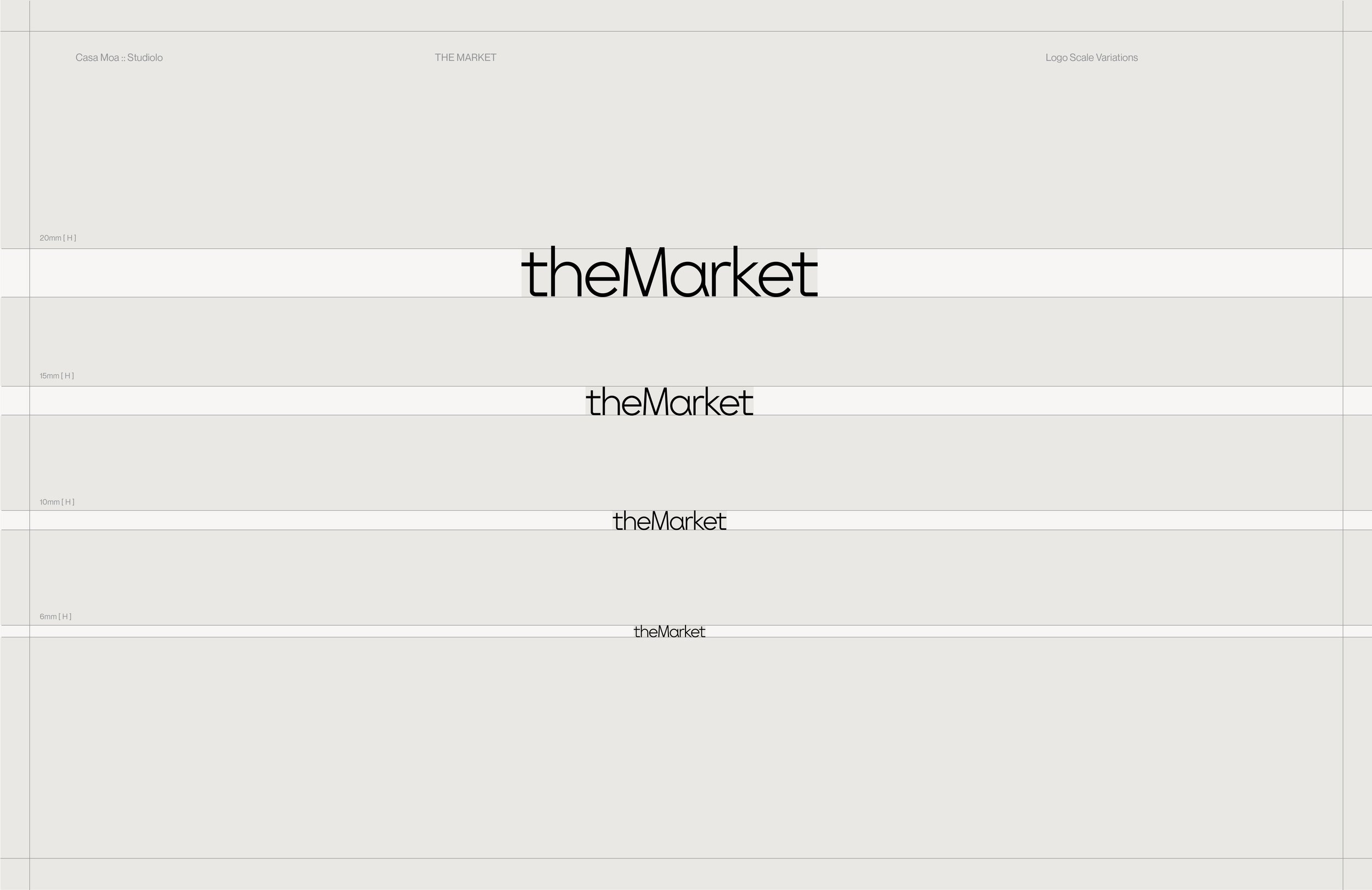
THE MARKET
SECTOR
SOLUTIONS
Identity
Guidelines
Packaging
Collateral
Hospitality + Specialty Retail
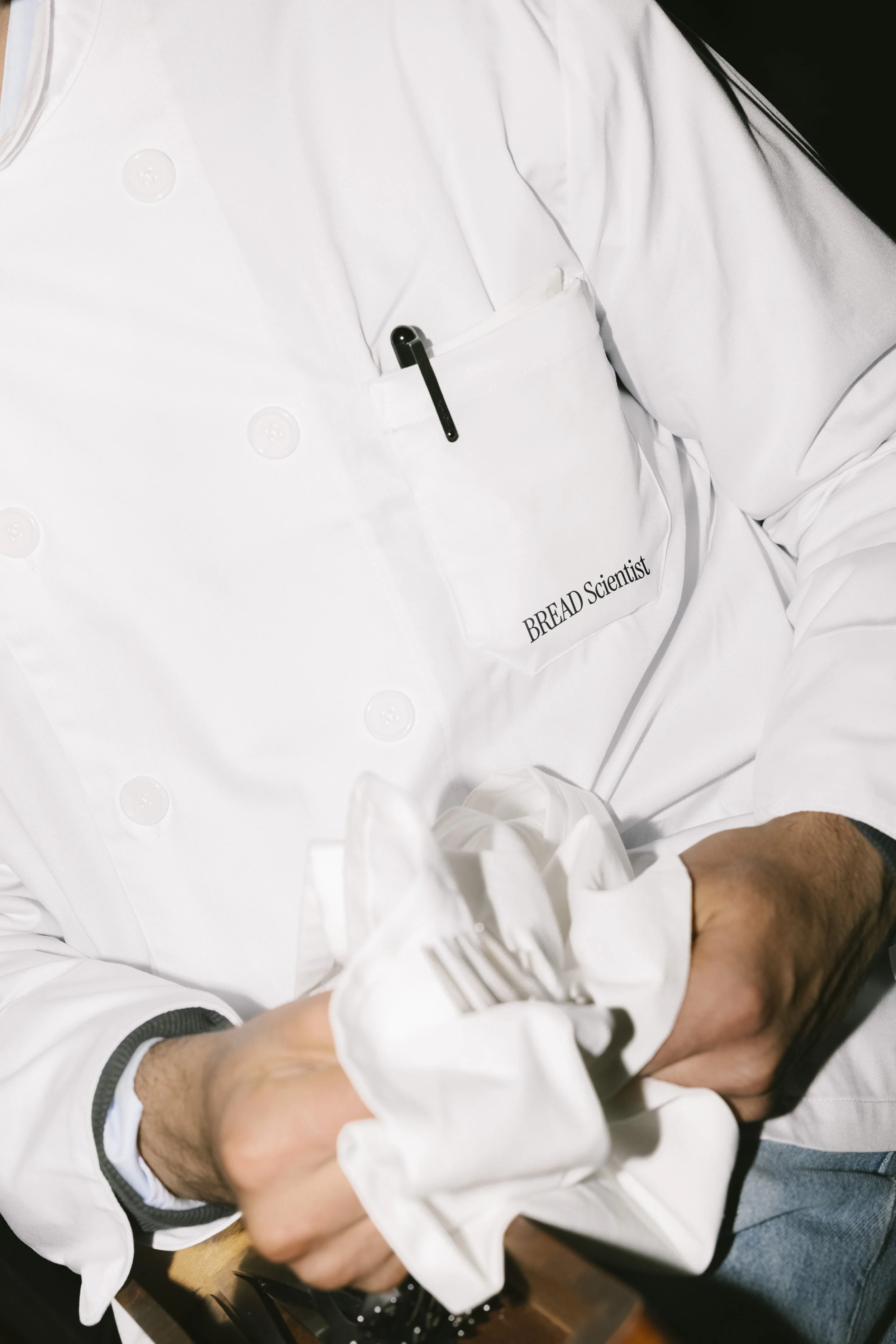
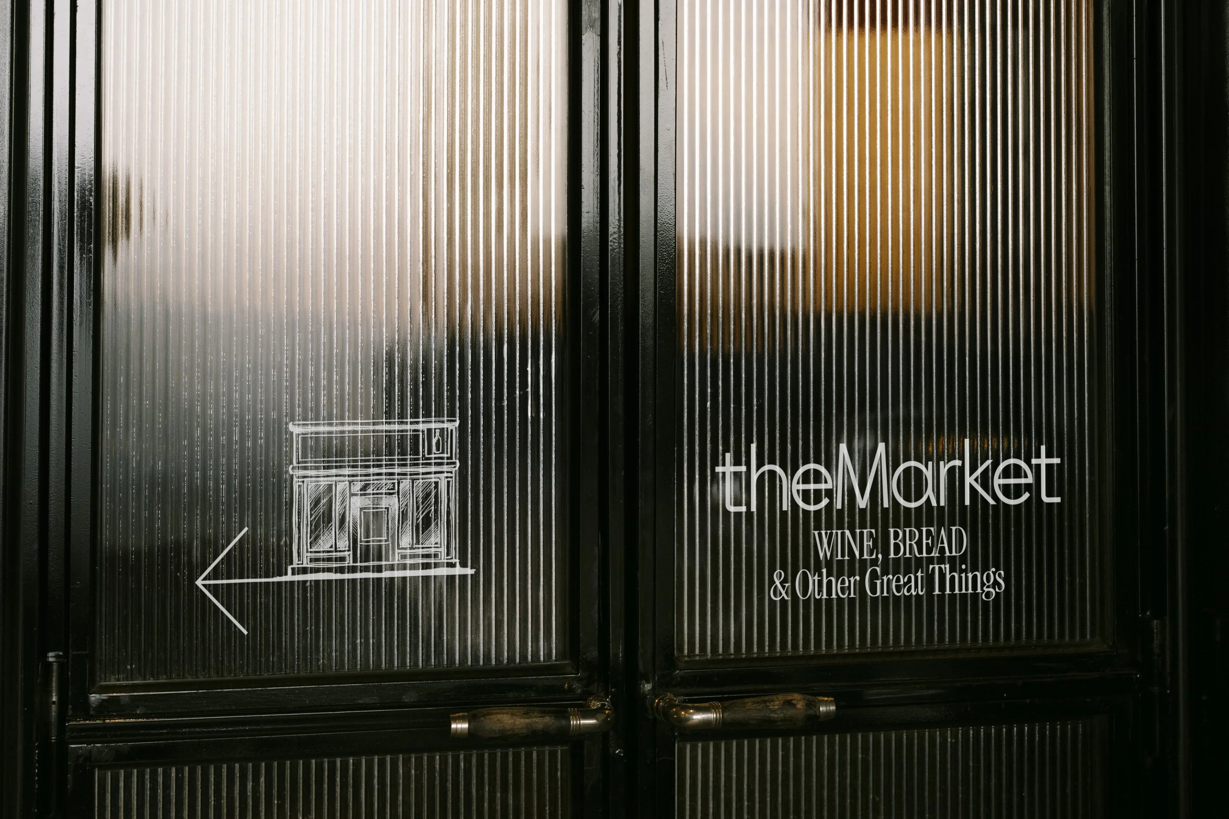
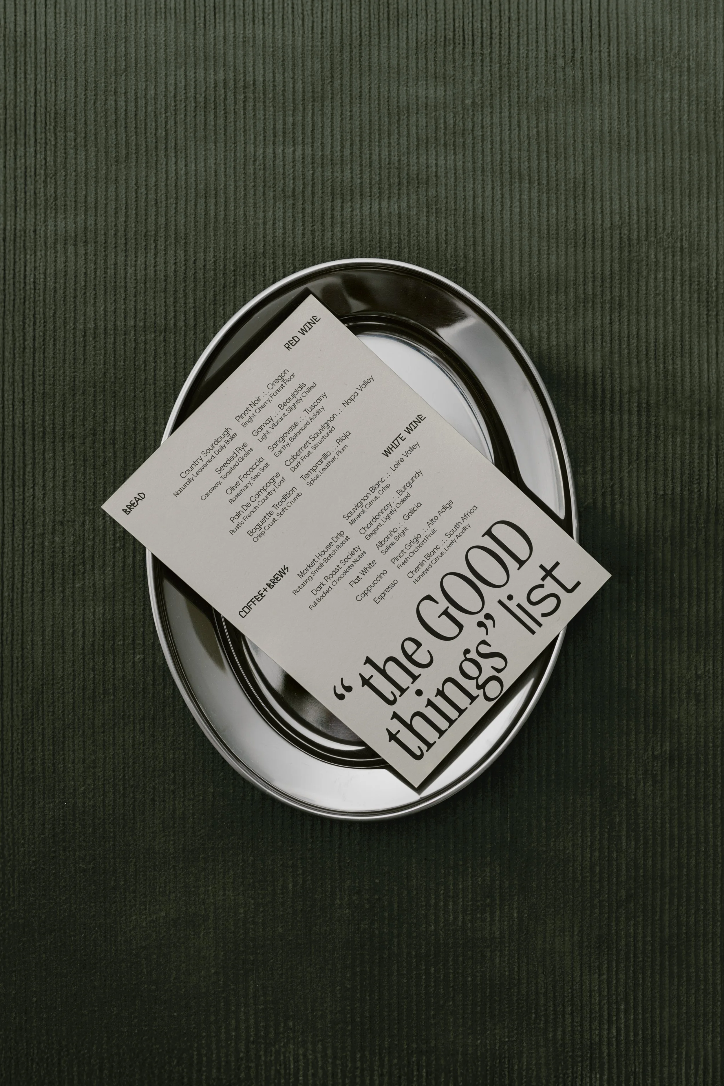
Tucked within a boutique hotel in Vail, Colorado, The Market was conceived as a place guests could return to throughout the day — for bread in the morning, coffee in the afternoon, wine in the evening.
The identity was developed to reflect that rhythm: relaxed but considered, welcoming without losing the sense of quality expected in a hotel setting. Rather than leaning heavily into luxury, the brand introduces warmth and personality through small moments of language and character.
The result is a brand presence that feels both elevated and easy — inviting guests to pause, gather, and enjoy the simple rituals that define the space.
OVERVIEW
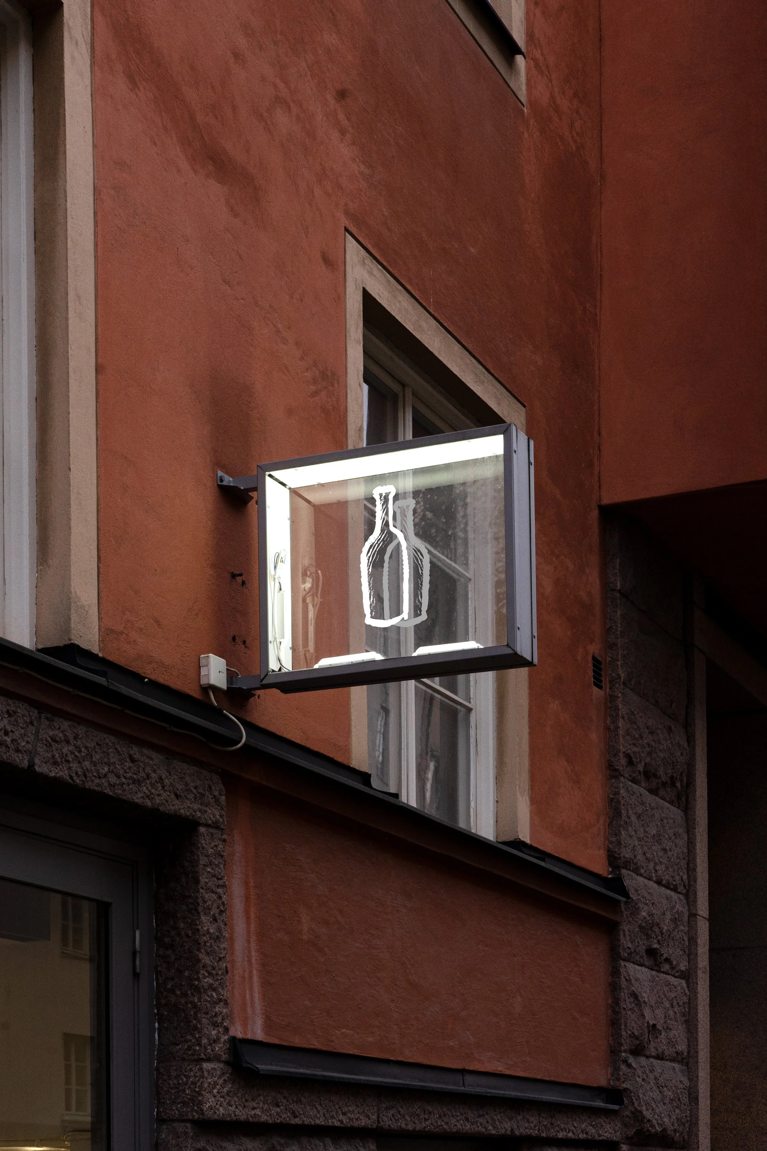
Neon Signage
Context
The Market was created to offer a welcoming space to guests that balanced luxury and wit. Hotel Talisa, located in Vail, Colorado approached us to develop the visual expression and the tone of the brand that conveyed warmth and elegance. We translated the founder’s emphasis on narrative with a smile through message-forward design to centre the brand around typographic play and a sense of dialogue.
Solutions
Brand Identity
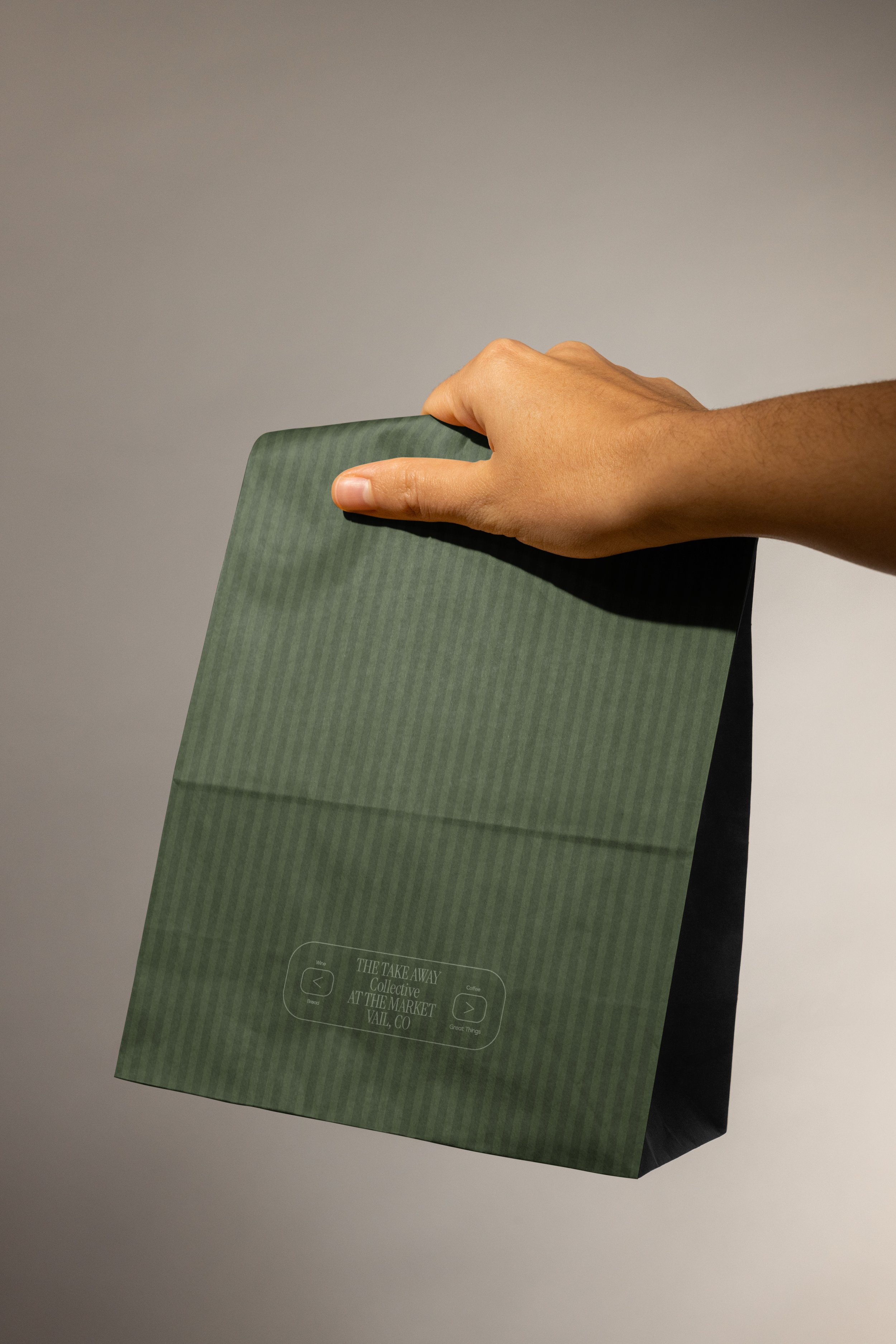
Packaging
Print Assets
Development
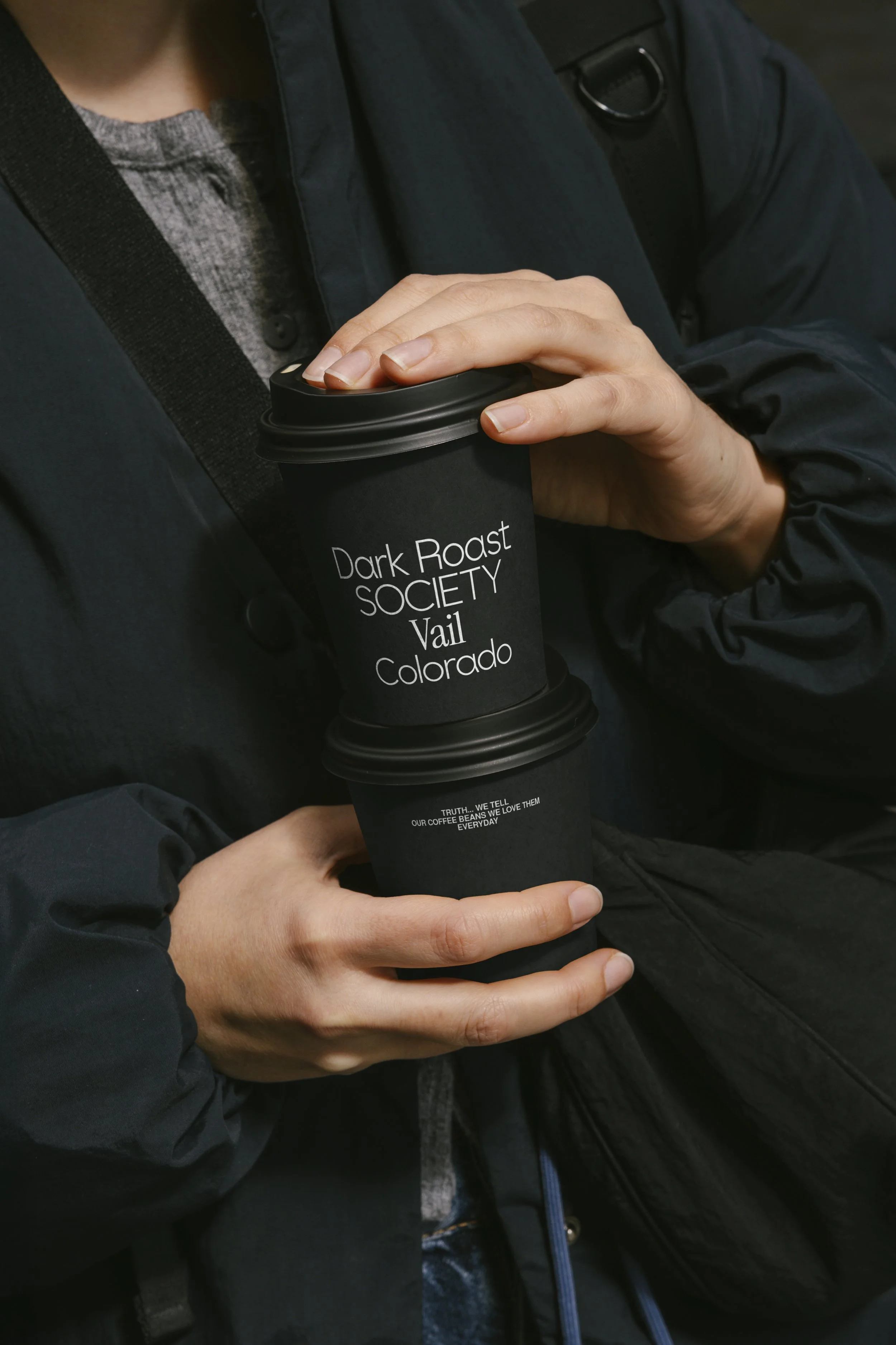

Vail, CO
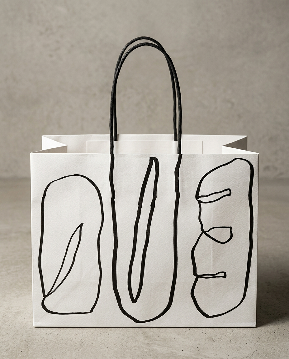
Packaging
Inspired by the nature of bread making, where the dough often embraces a language of its own, the brand sytem for The Market came to life within type systems, drive by tone and narrative. Adding flare to the ultra simplistic name. Illustrated moments were embraced by forms and witty message created a lighthearted brand world.