Ejento
Talent is in the family line. In 2018, Ejento acquired three California-based executive recruiting companies — Neohire South, RockIT, and Hero.jobs — uniting them under one name and one vision. The challenge was to create a cohesive brand identity that could honor each company’s legacy while carving a bold, unified path forward. The new brand needed to carry ambition, tradition, and a sense of collective power.
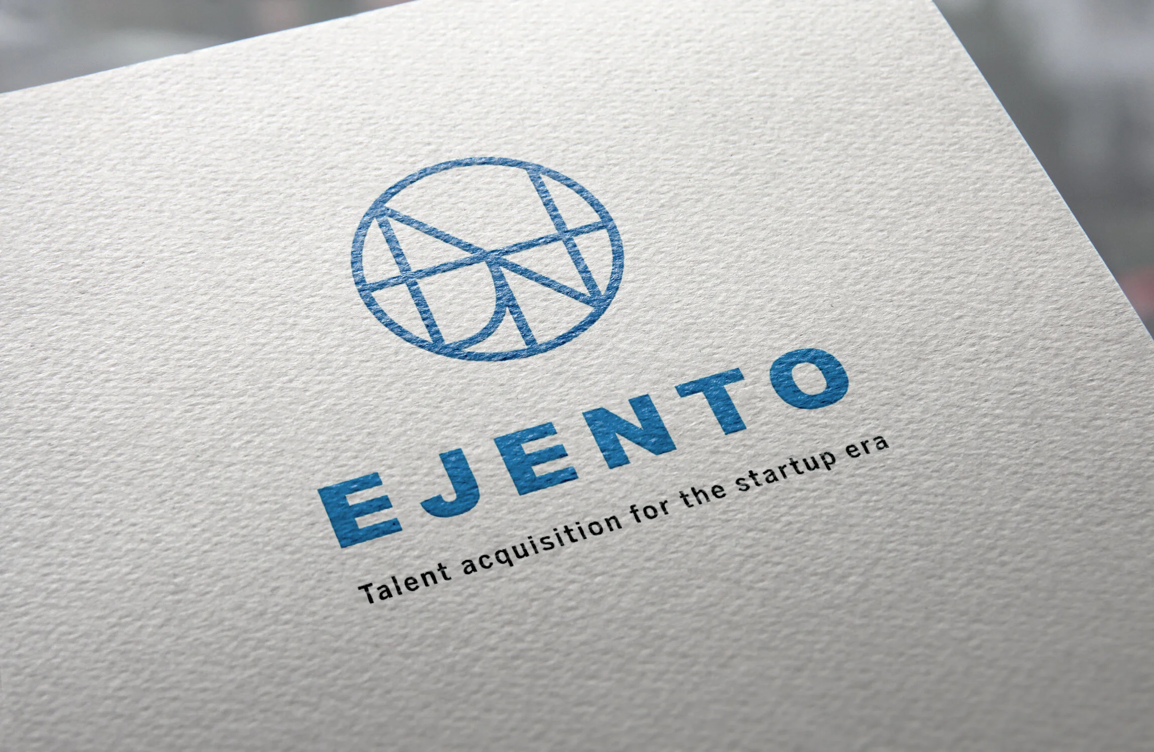
The Alchemy. The final mark takes the form of a modern family crest — a symbol rooted in Japanese tradition, reimagined with fluidity and structure. Custom-designed from the letters in the Ejento name, the crest becomes a visual emblem of belonging, legacy, and potential. Its intersecting lines represent the paths, relationships, and opportunities within the Ejento network — where talent is passed forward, and new chapters are built together.
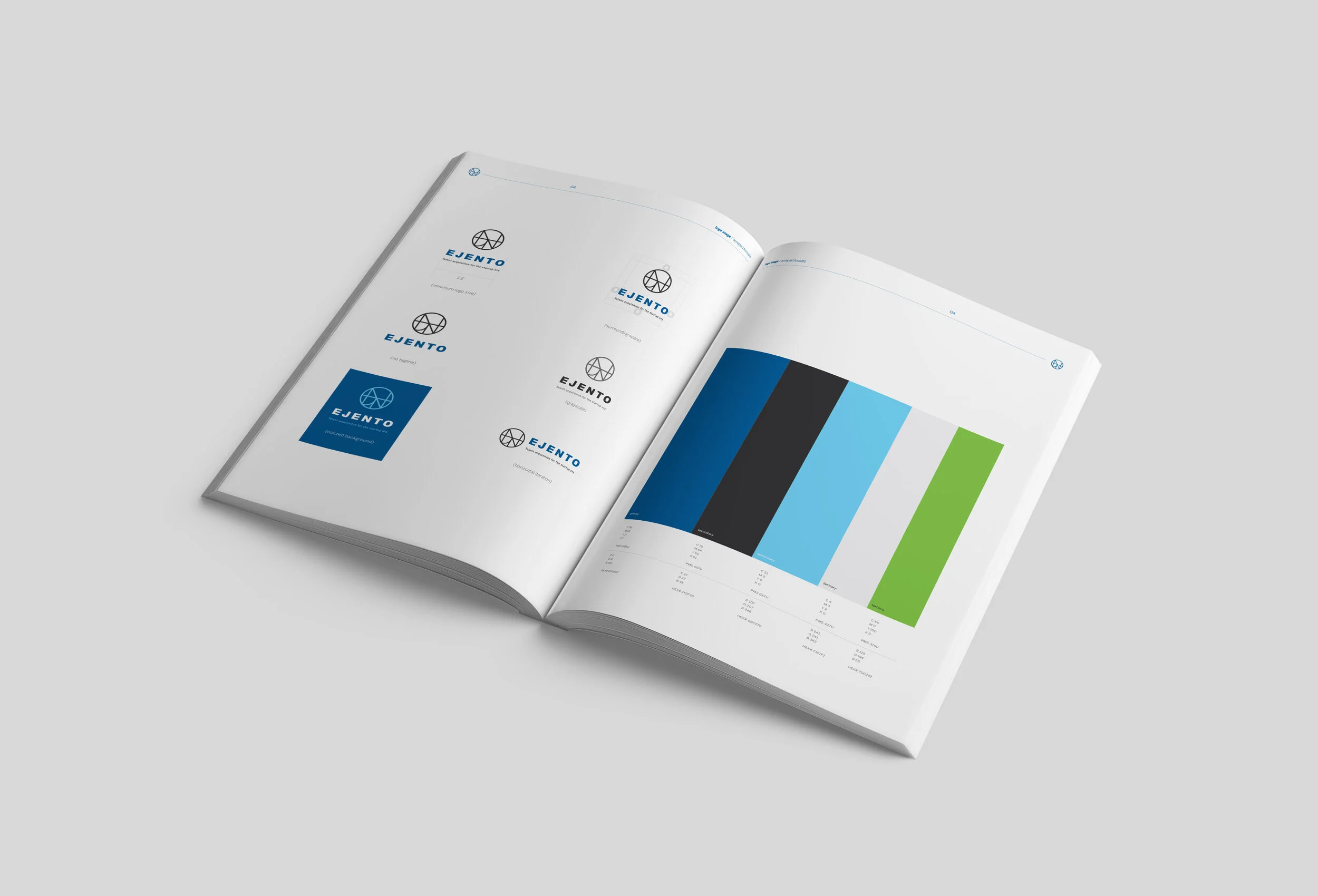
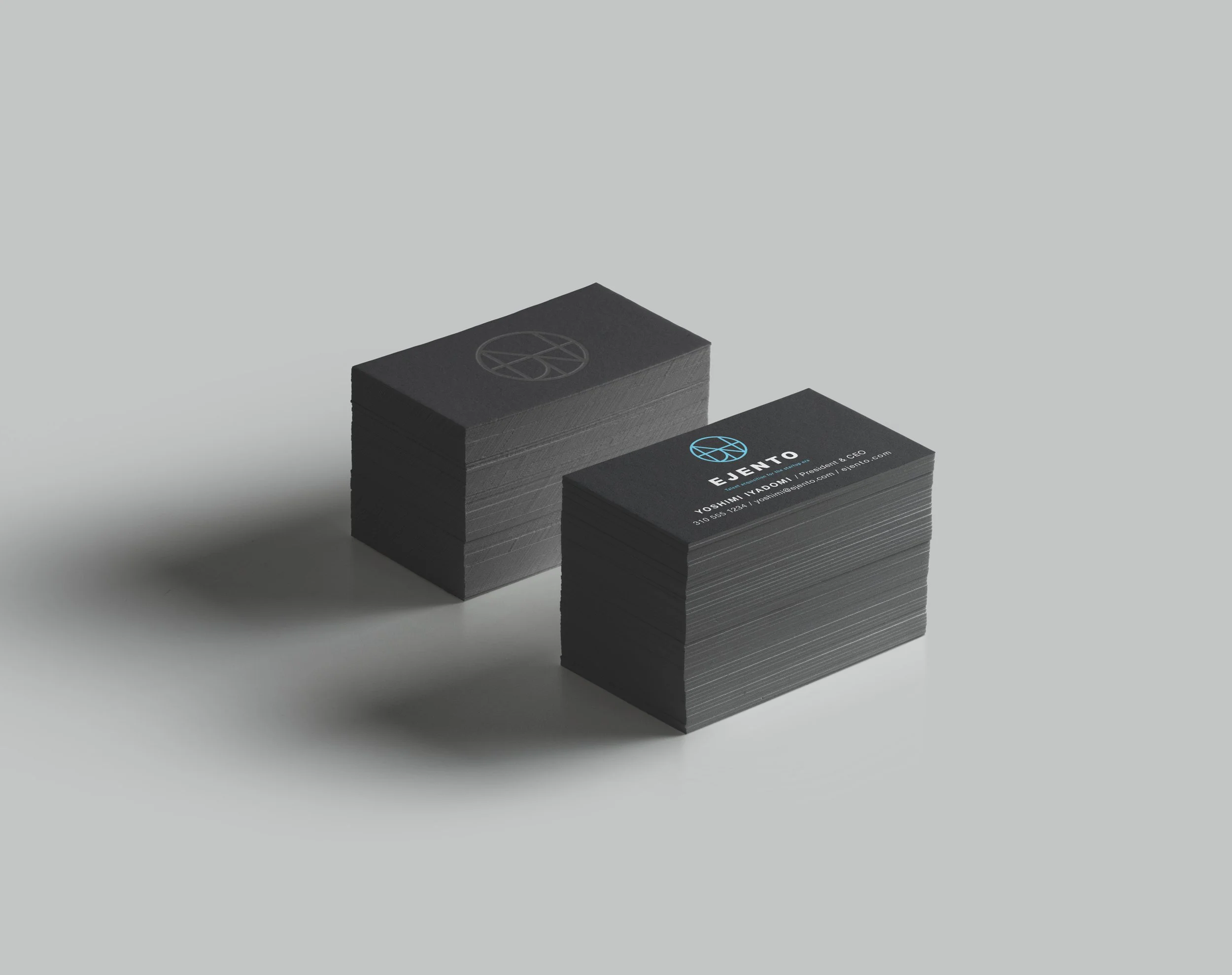
The identity was expanded across collateral, digital platforms, and user experience design — carrying the message of unity with visual clarity and quiet power.
The Outcome. Ejento now leads with a brand presence that reflects its values: heritage, transformation, and the strength of the collective. The crest holds space for all that came before — and all that’s yet to rise.
Sector Talent Acquisition + Executive Search
Discipline Brand Development
Services Logo & Crest Design, Visual Identity System, Guidelines, UX/UI Design, Brand Collateral, Creative Direction
In partnership with Ignited