Emma Rose
Elixirs for awakening. Emma Rose’s debut collection of handcrafted sprays and oil elixirs called for a visual identity that could hold both strength and softness, a design language that would echo the energetic intention poured into each blend. The brand needed to feel sacred, balanced, and rooted in the body.
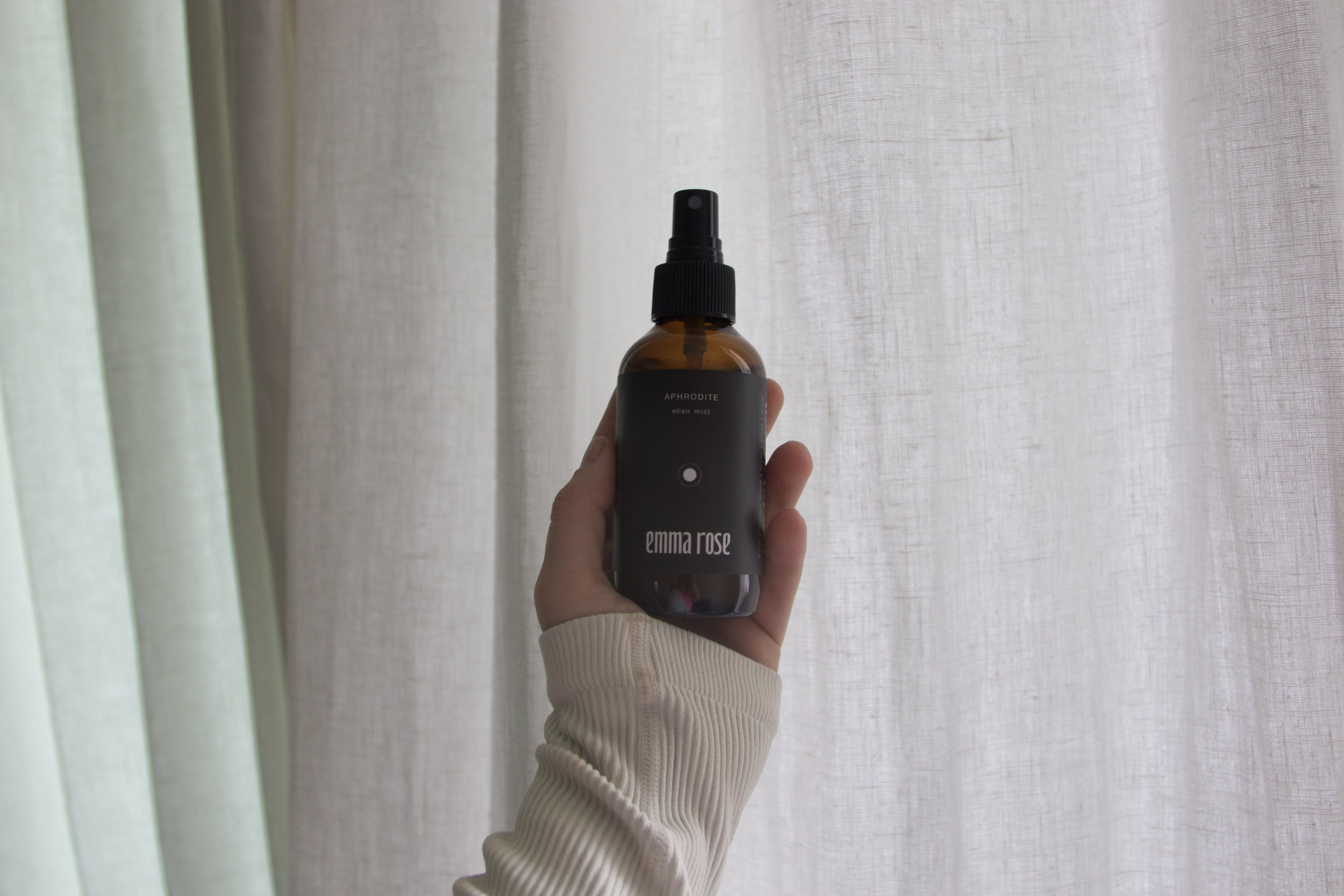
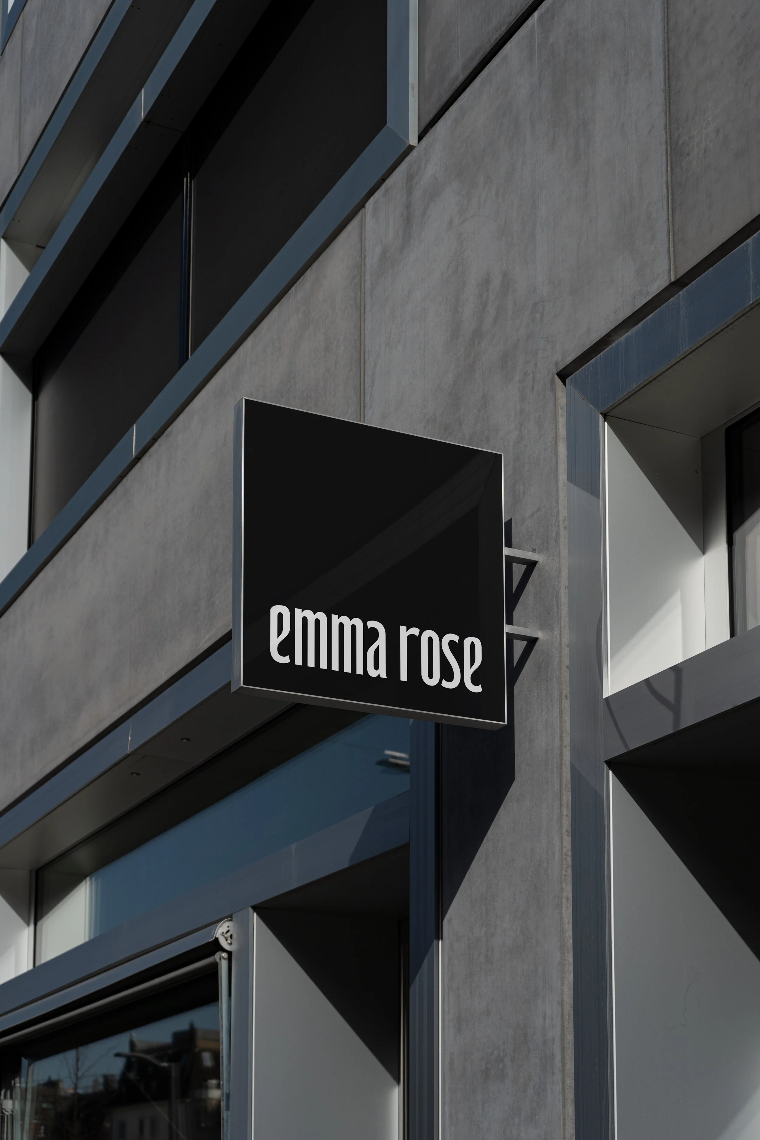
The Alchemy. We developed a timeless wordmark and accompanying icon system that reflected the duality within each formula: masculine and feminine, stillness and movement. Symmetry in the letterforms offered rhythm and strength, while packaging design leaned into clean elegance, allowing each scent to speak for itself within the brand family. The iconography system provided a symbolic signature for every blend, deepening the storytelling and offering visual cues for energetic distinction.
The Outcome. The identity invites ritual. Emma Rose now moves into the wellness space with a brand presence that feels embodied, refined, and energetically aligned — a product line designed to be held, gifted, and cherished.
Sector Handcrafted Wellness
Discipline Brand Development
Services Visual Identity, Brand Strategy, Packaging System, Photoshoot Direction, Creative Direction


