Meadow
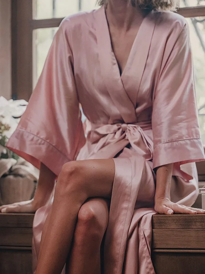
Home as sanctuary. Meadow was born from a desire to bring the ease, elegance, and intimacy of luxury hotel living into the everyday. With its debut collection of sleepwear and home accessories, the brand needed a visual identity and foundation that would feel as tactile and tranquil as the products themselves — designed to be worn, touched, and adored.
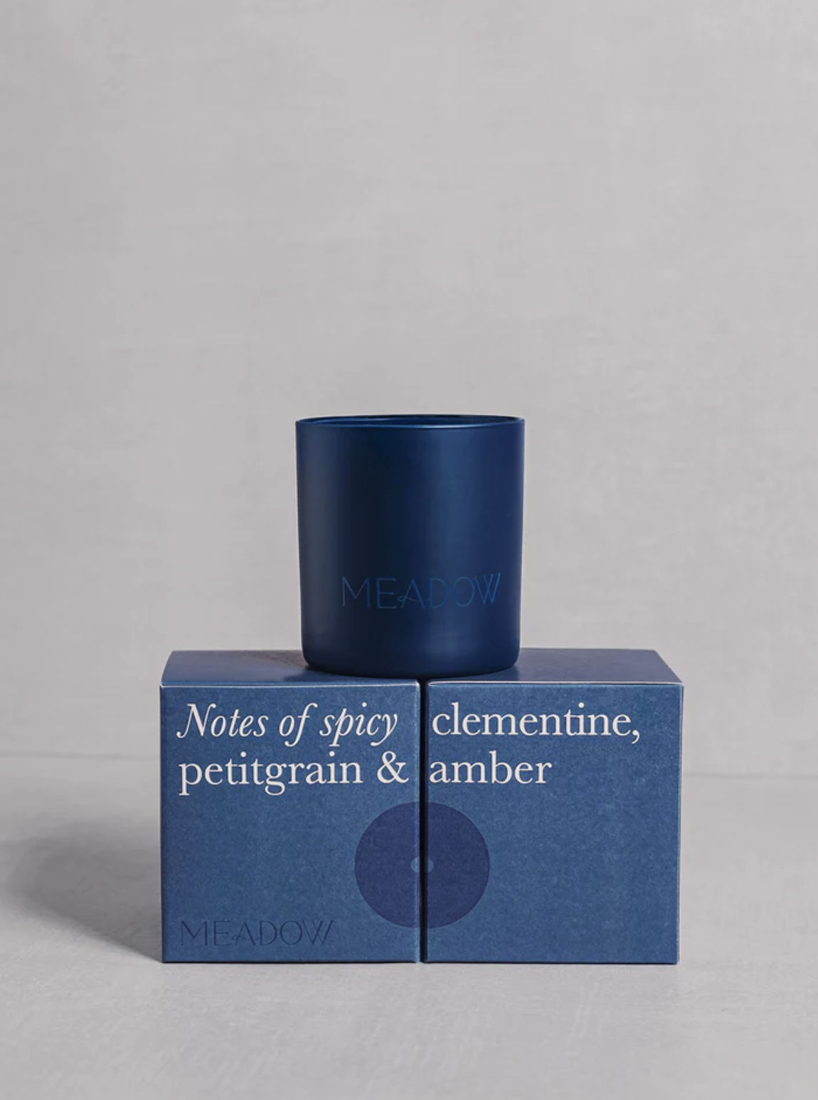
The Alchemy. We began with strategic groundwork to define Meadow’s brand pillars: sensual minimalism, sustainable craftsmanship, and grounded elegance. The logo is an abstracted expression of fluidity — inspired by the gentle movement of wind through a meadow. This core symbol extended into product iconography, packaging details, and graphic themes, each layered with a quiet hospitality influence.
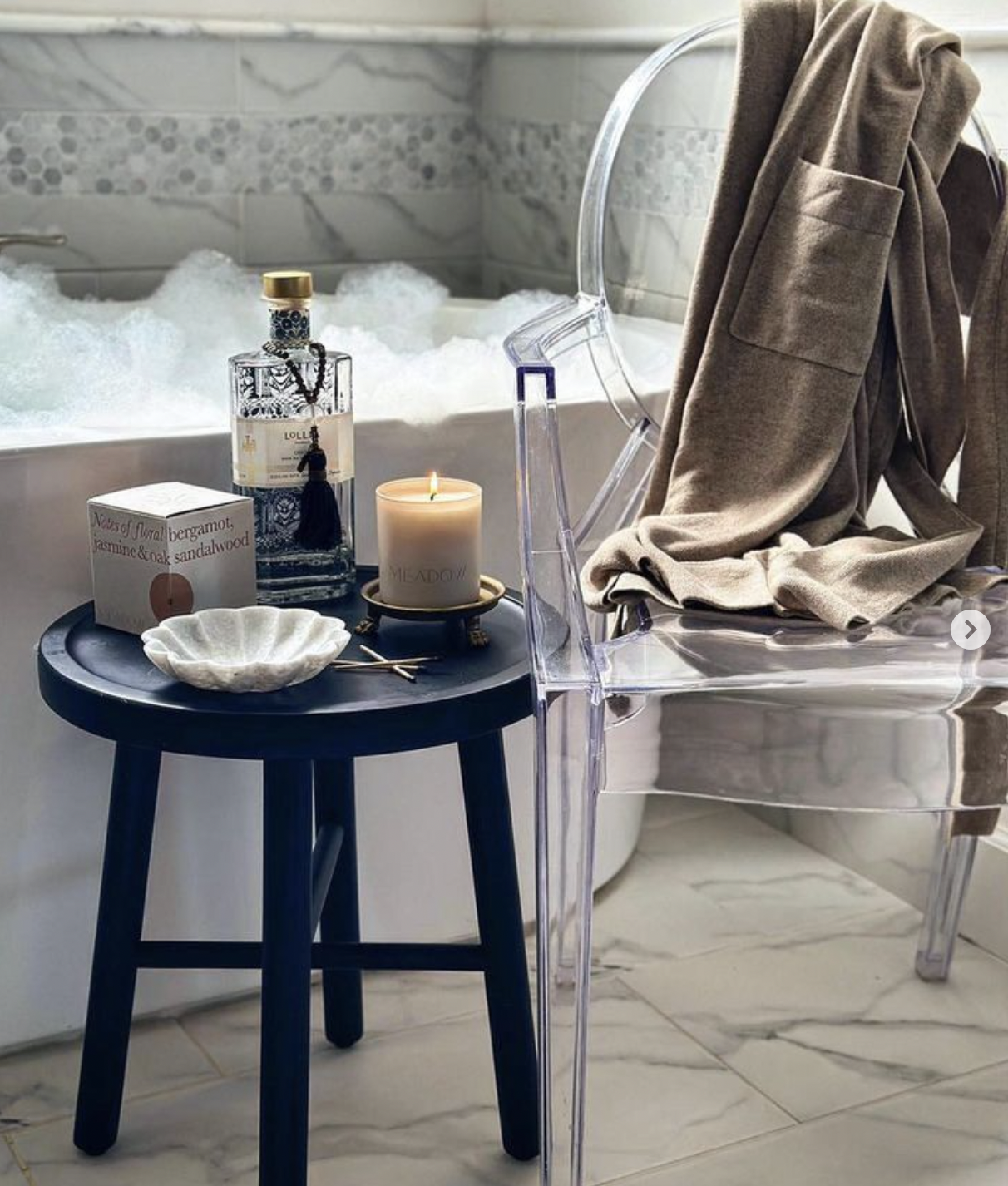
Photography direction emphasized softness and light, evoking the luxurious pleasures of solitude. Every brand touchpoint — from robe tags to ribbon-wrapped boxes — was designed to feel like a personal invitation into rest.
The Outcome. Photography direction emphasized softness and light, evoking the luxurious pleasures of solitude. Every brand touchpoint — from robe tags to ribbon-wrapped boxes — was designed to feel like a personal invitation into rest.
Sector Loungewear + Home Rituals
Discipline Brand Development
Services Strategic Brand Framework, Visual Identity, Packaging System, Iconography, Collateral Design, Photography Direction, Creative Direction