Metrolink
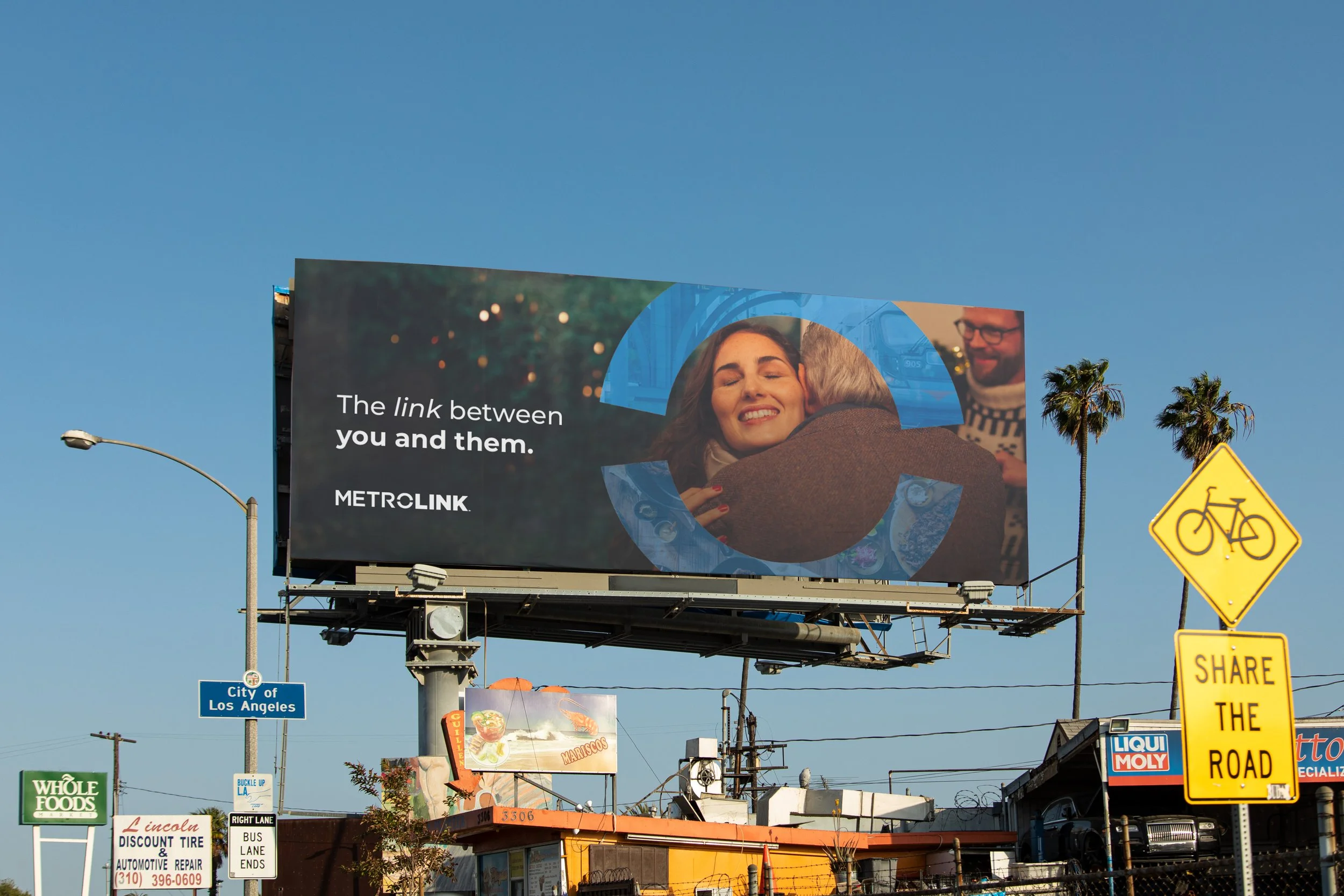
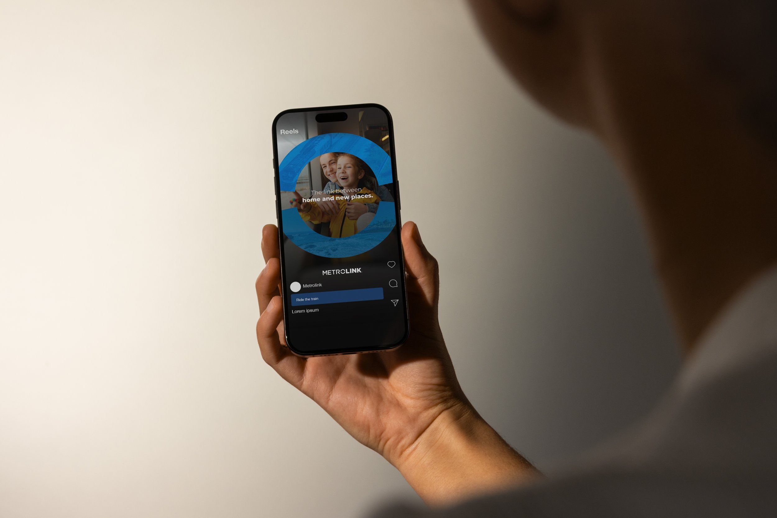
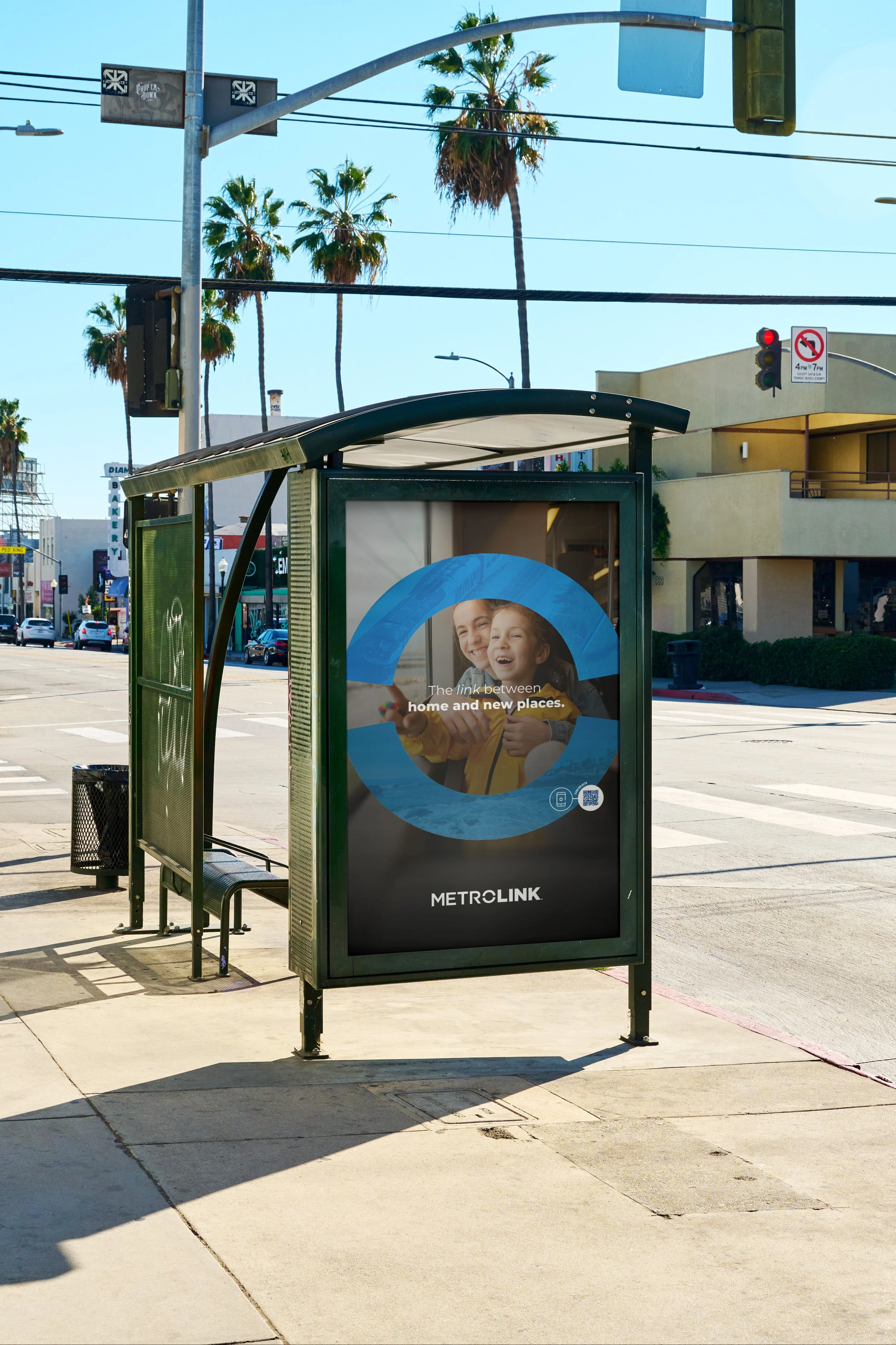
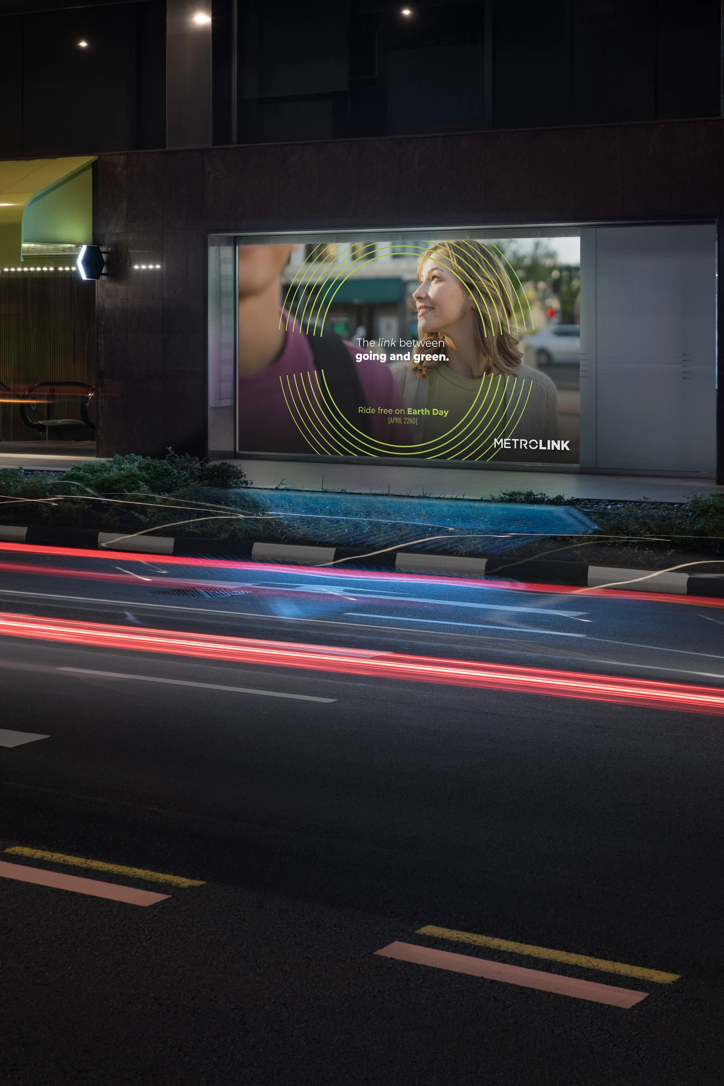
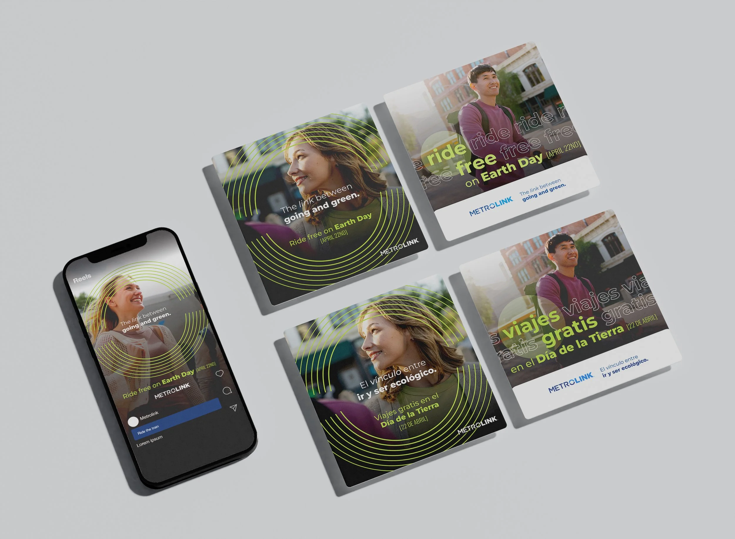
Brand AwarenessThe link between. Following a major rebrand, Metrolink sought to deepen its connection with Southern California communities through a long-term brand awareness campaign. The goal: to ground this legacy transit system in something more human, emotive, and relevant, making “The Link Between” not just a tagline, but a lived experience for riders.
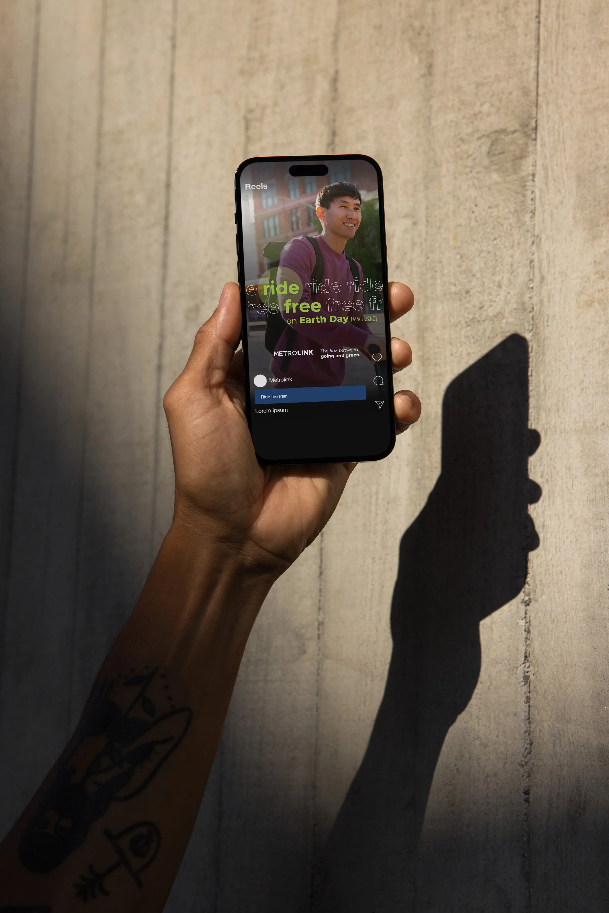
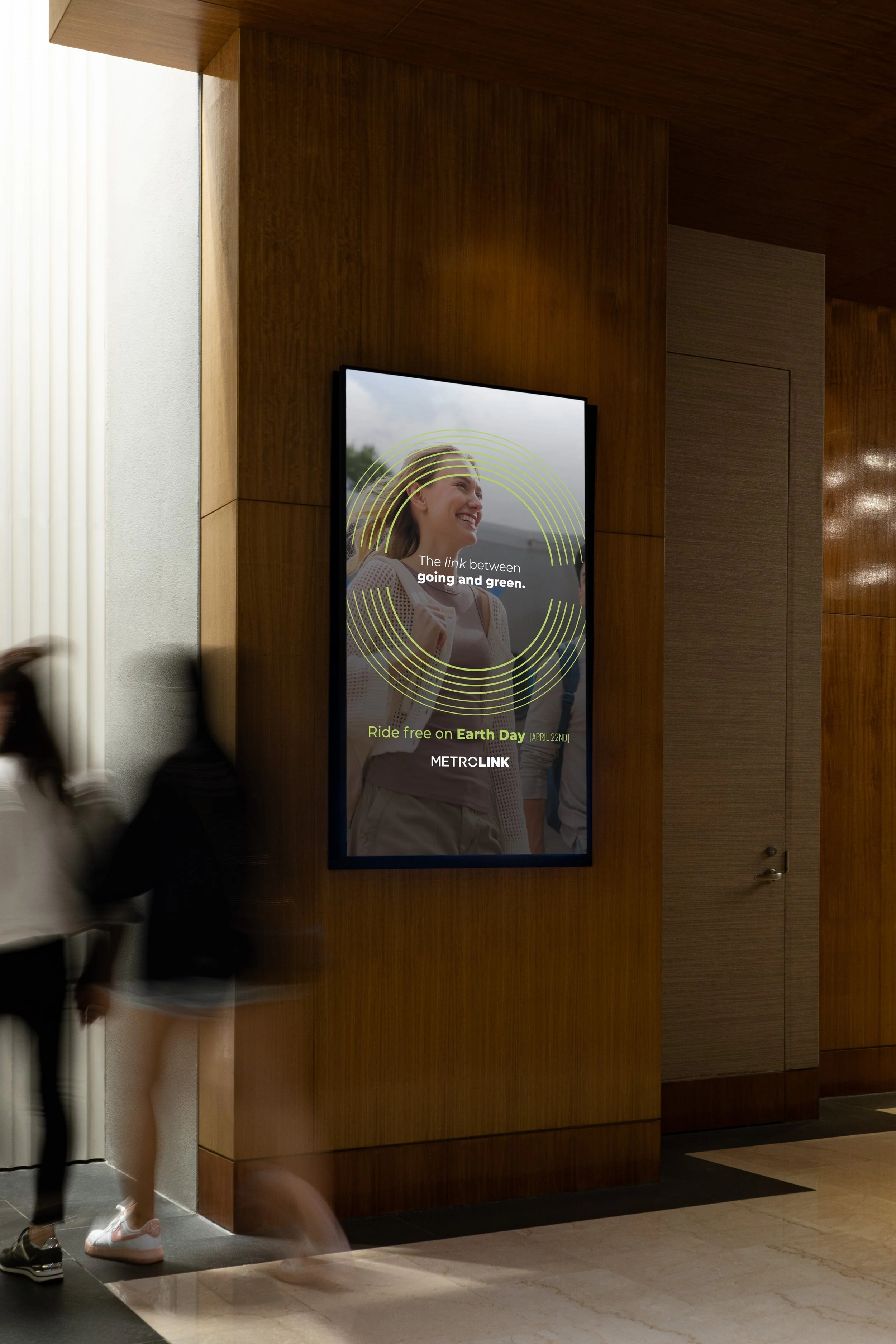
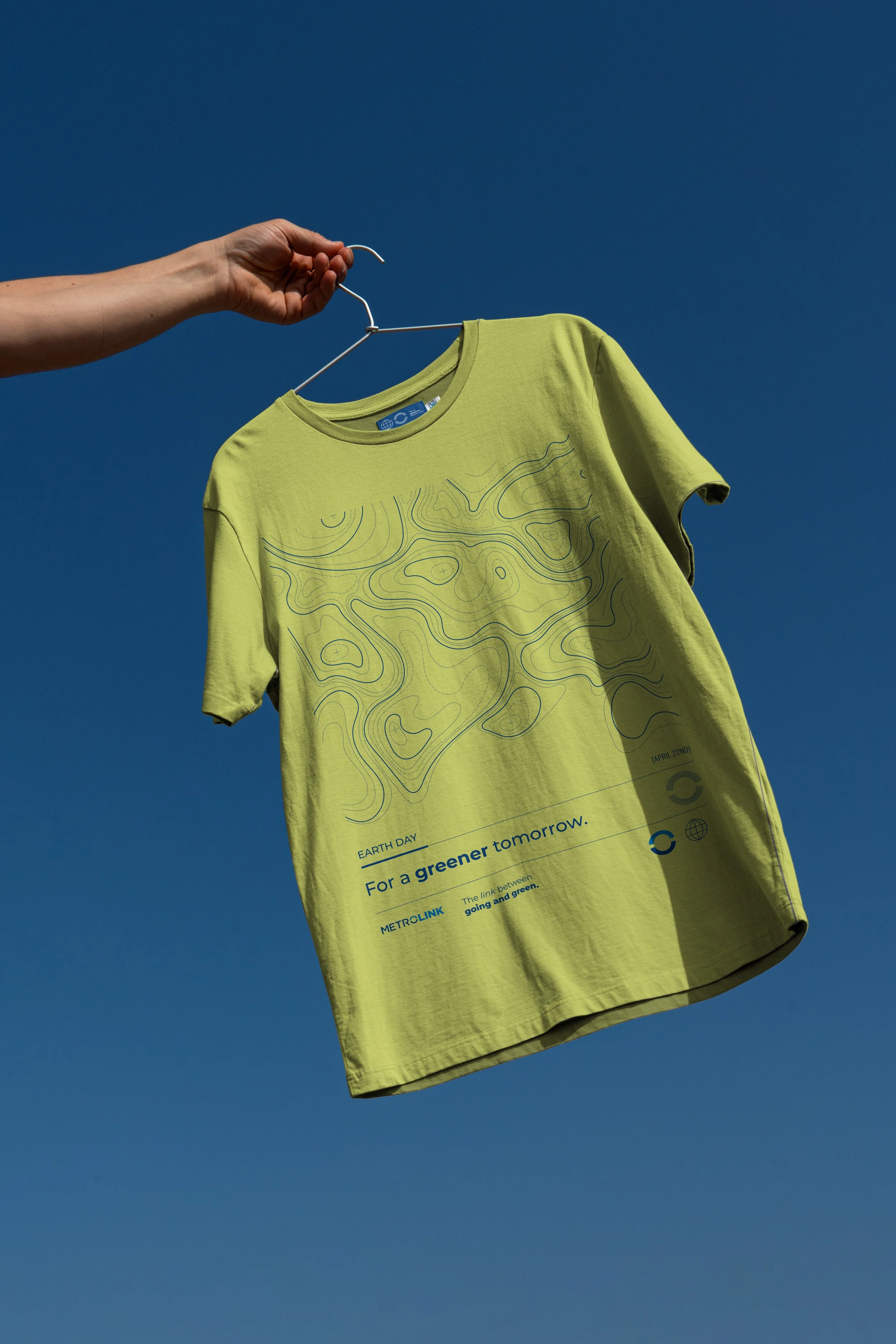
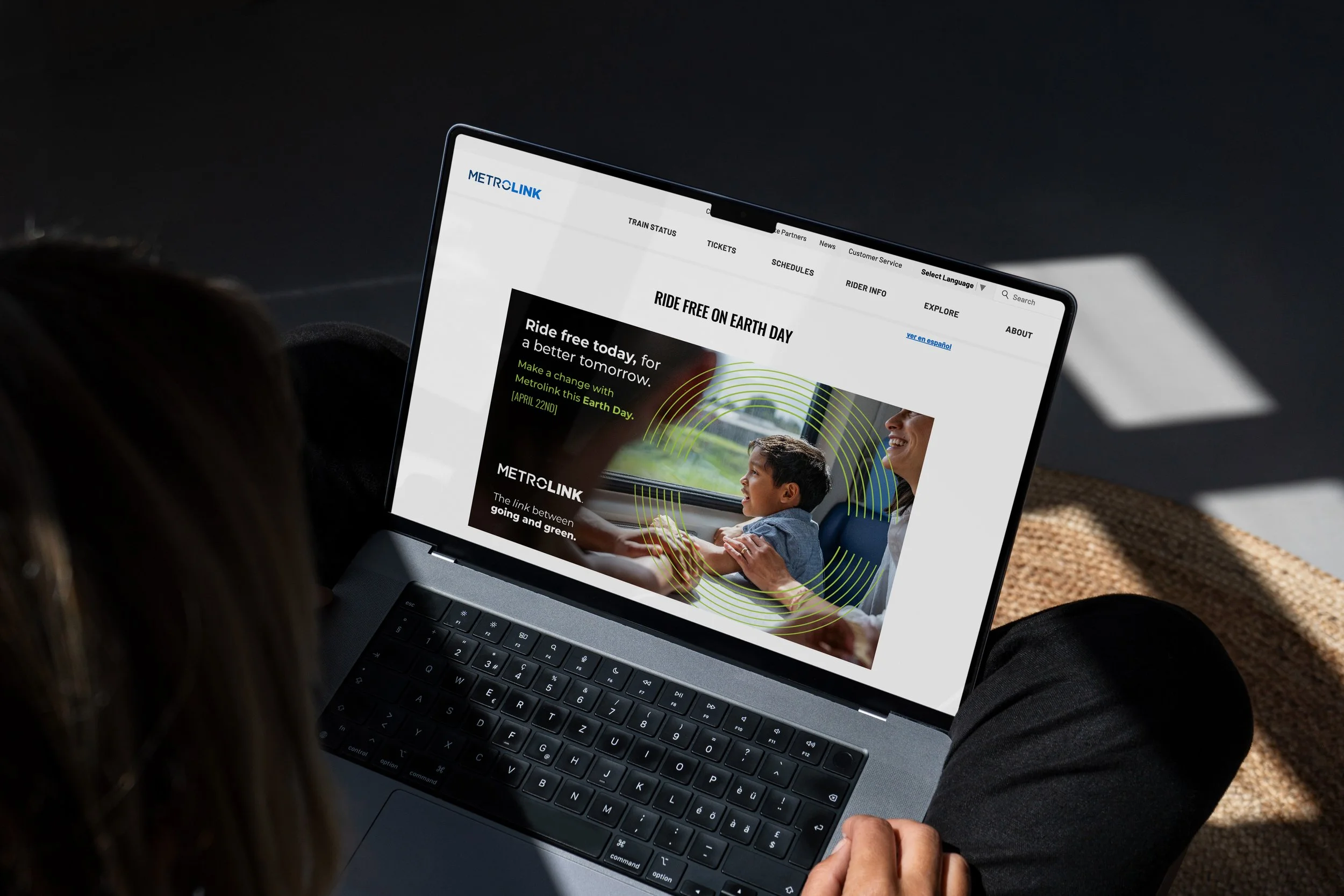
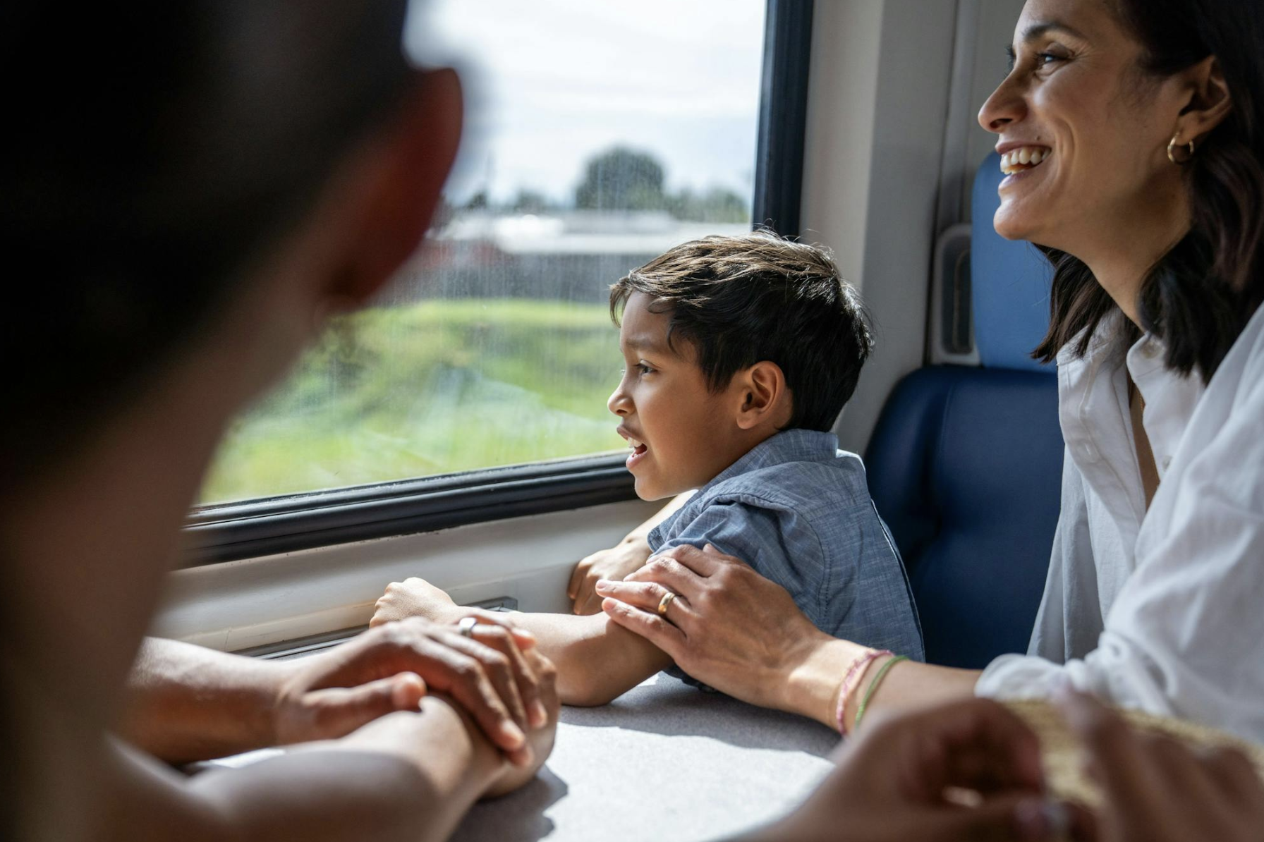
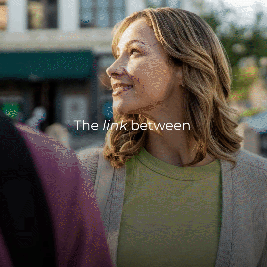
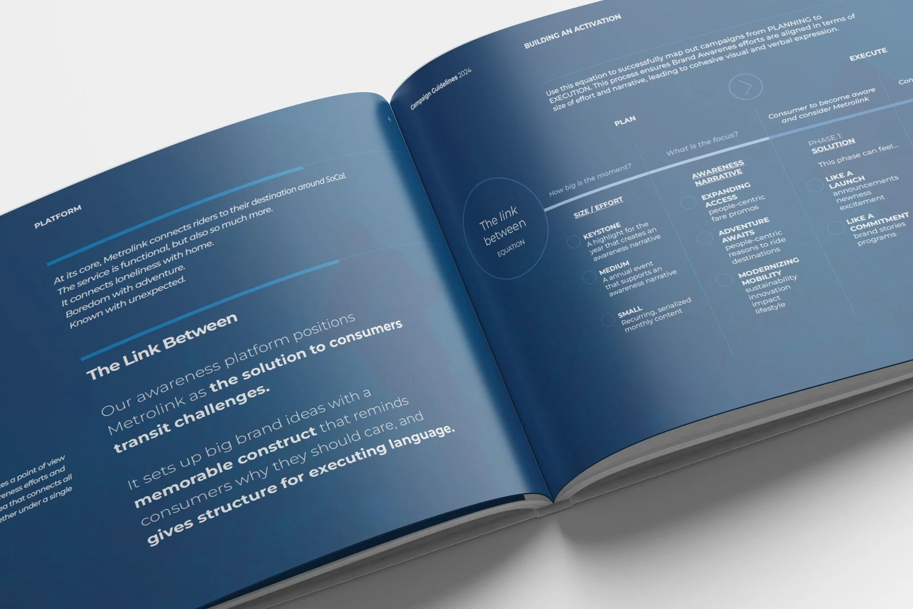
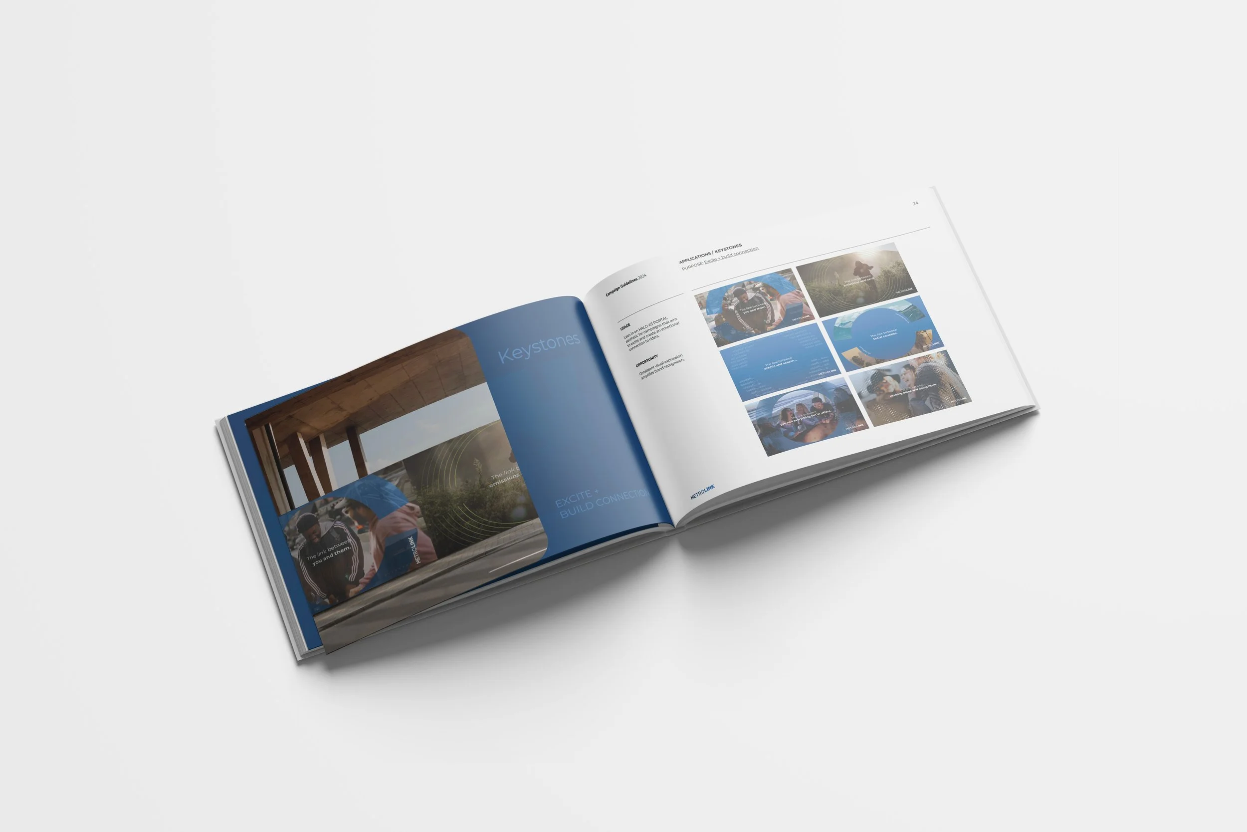
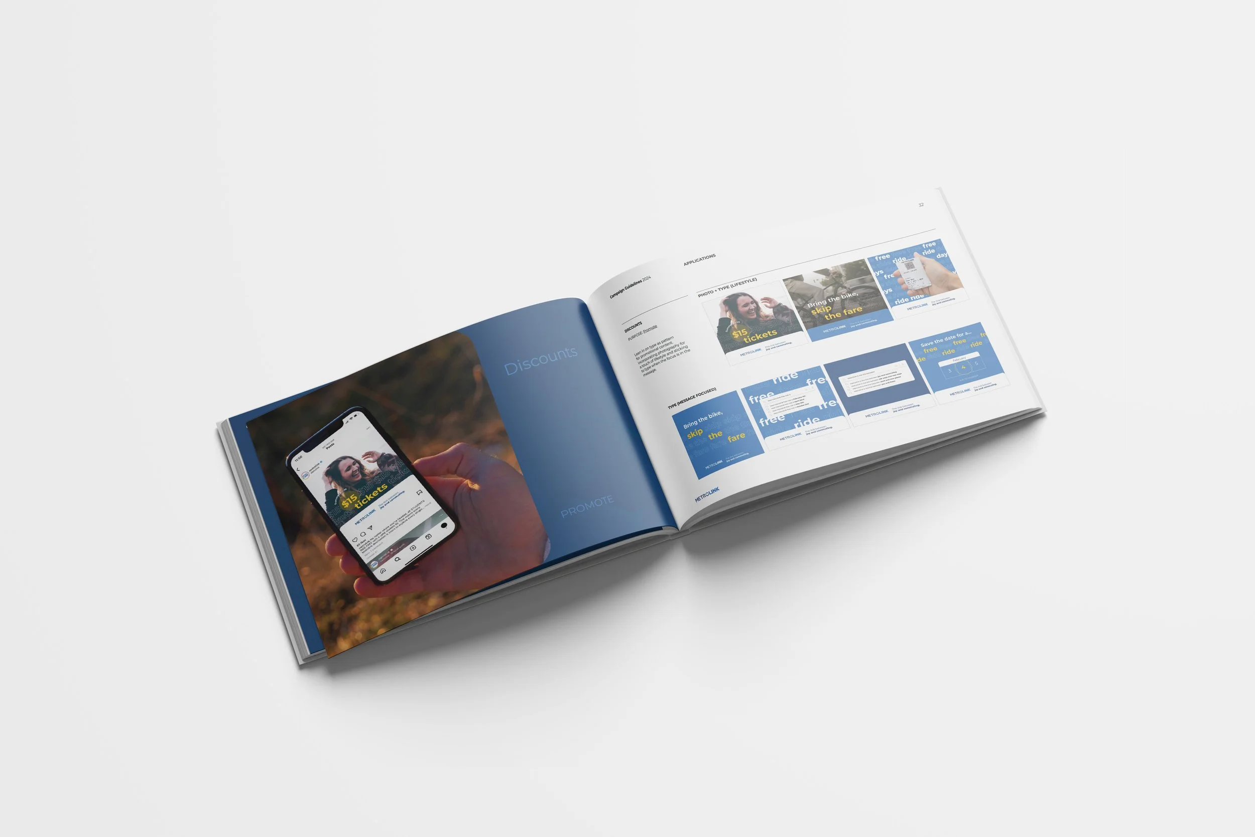
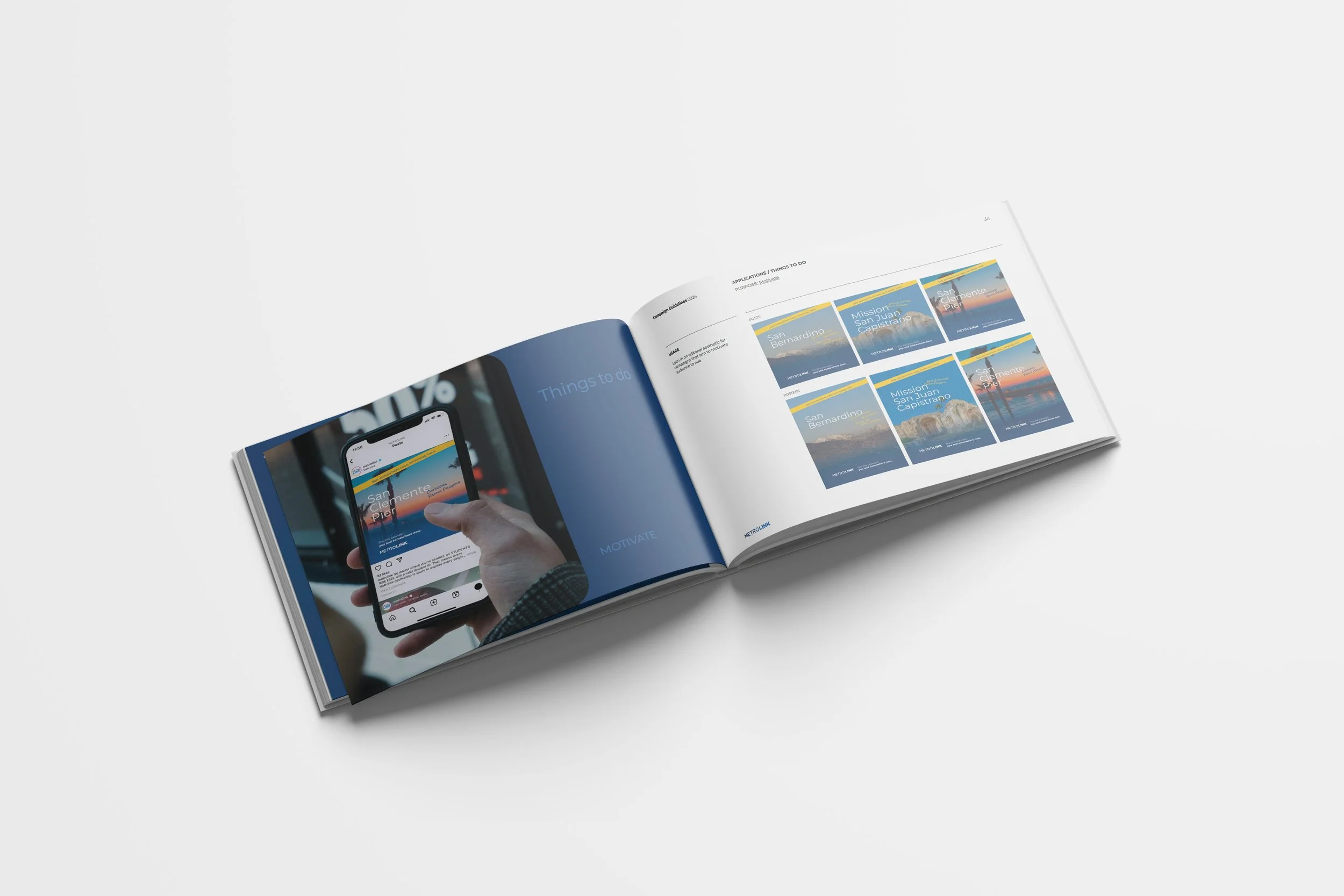
The Alchemy. In partnership with strategy and client teams, we directed the creative development of a multi-year campaign. Our work included campaign identity, art direction, and rollout across web, social, video, print, and station environments. The “Halo” — Metrolink’s reimagined brand icon — became a central visual device: a symbolic portal through which connection, movement, and future-forward messaging flowed. Photography and motion captured real moments in transit — anchoring the campaign in both purpose and place.
The Outcome. From digital banners to physical signage, the campaign offered consistency without rigidity, and symbolism without abstraction. “The Link Between” became more than just a line — it became a language. A system-wide reminder of why transit matters.
Sector Pet Care + Wellness
Discipline Brand Development
Services Campaign Identity & Guidelines, Video & Photography Creative Direction, On-Set Direction, Web & Social Assets, On-Station Print & Digital Ads, Creative Direction Across Channels
Project completed while a Sr. Art Director at Clever Creative