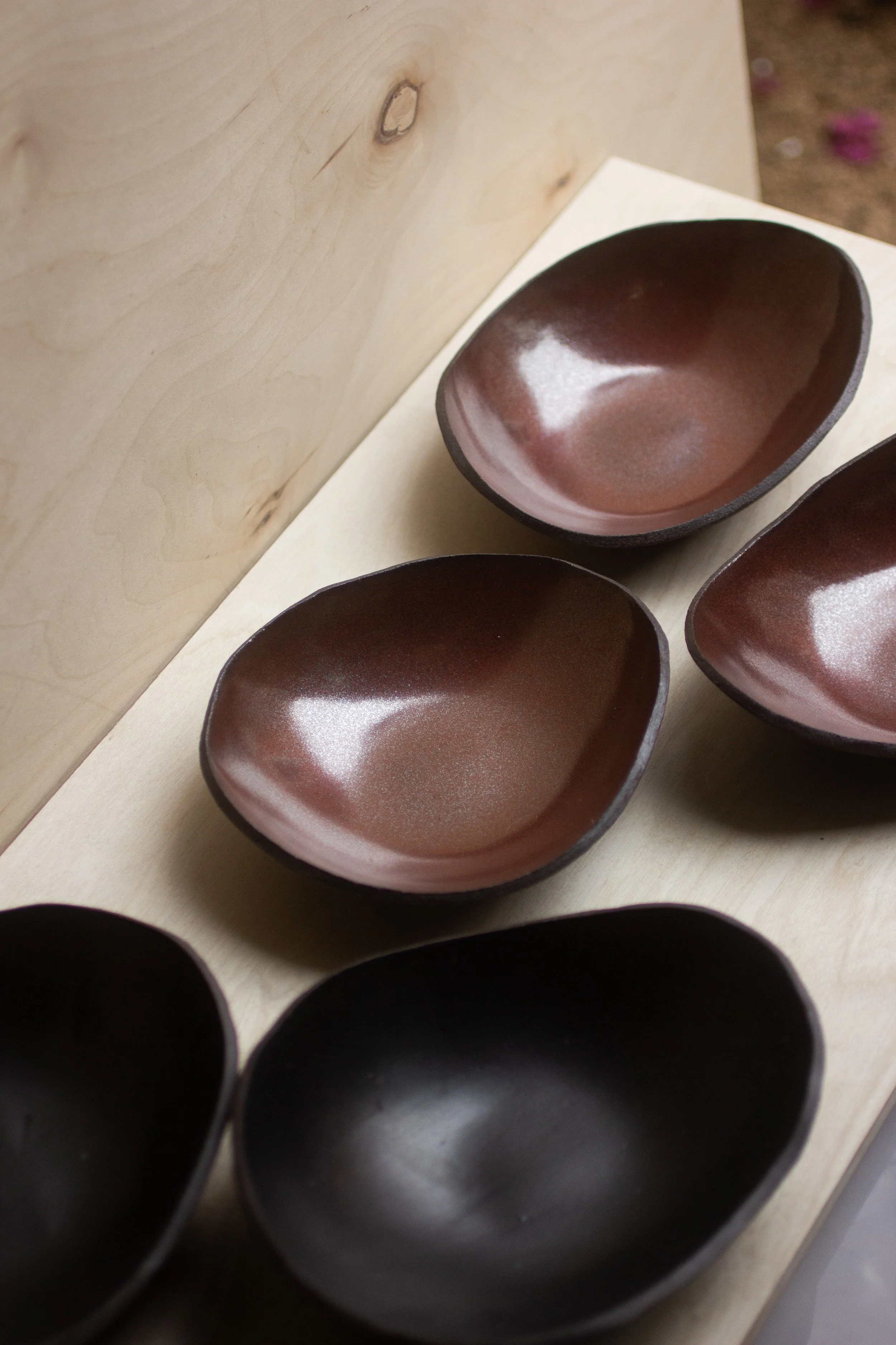
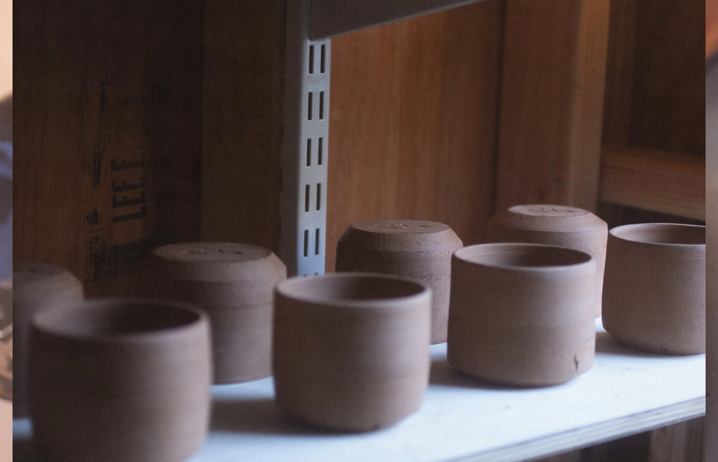
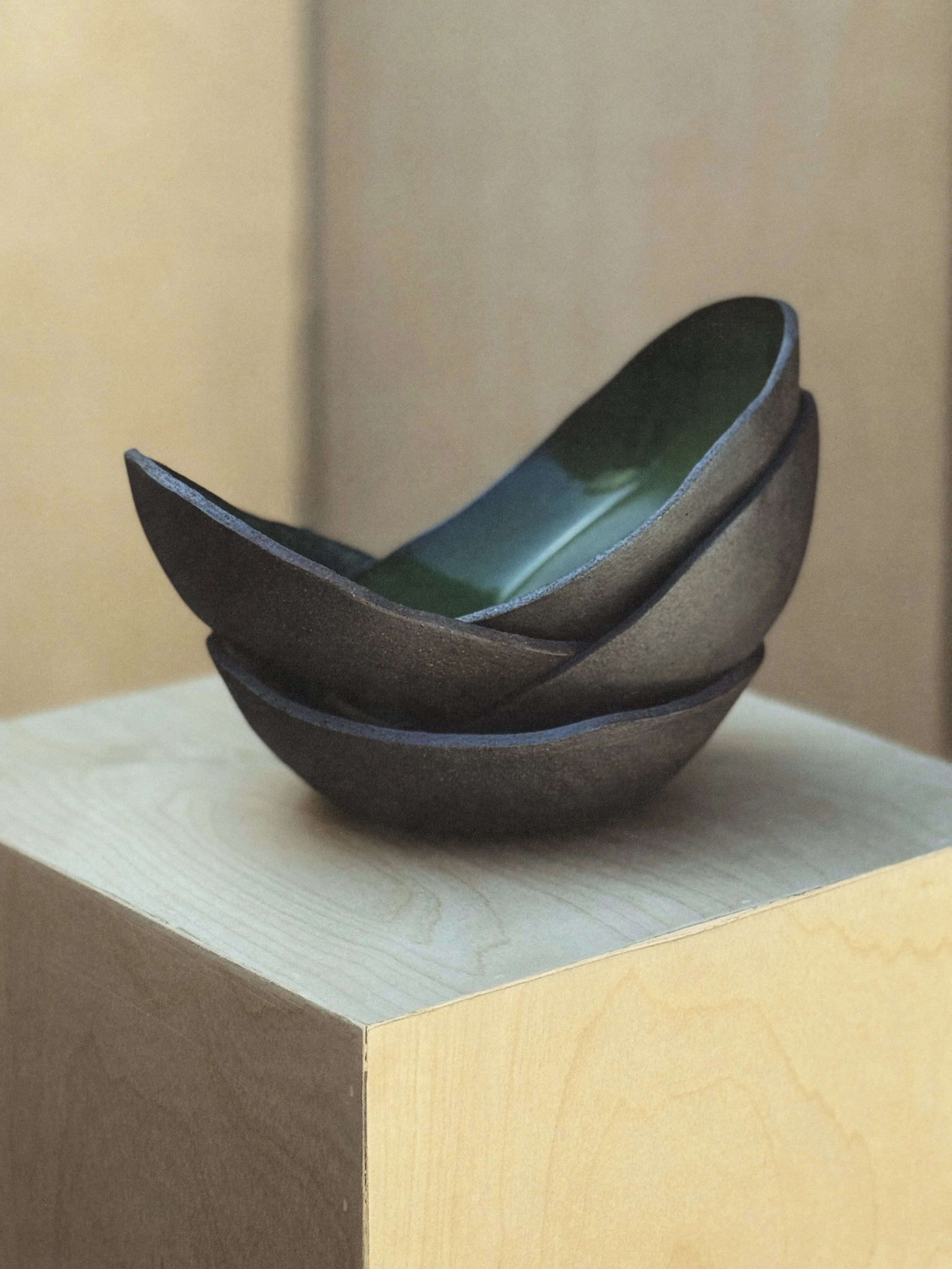
Monaad
Los Angeles–based mud studio creating functional stoneware for intentional pouring, sharing, and sipping. Rooted in craft and ceremony, the brand called for an identity that could hold both grounding and sacredness.


Approach
Inspired by Egyptian mythology, the visual system draws on the sacred cat, symbol of guardianship and presence. The logo merges softness with structure, while photography and spatial direction frame each piece as an invitation to pause and receive.
Monaad lives as a sacred brand experience: tactile as clay, timeless as myth, and intimate as a morning sip.
Sector Arts + Ritual Object
Discipline Brand Development
Services Logo & Visual Identity, Guidelines, Photography + Video Direction, Spatial Design, Creative Direction