Oxigen
Drink Oxigen. As Oxigen expanded its reach in the wellness and hydration space, the brand needed a visual evolution to support growth, something that could elevate the current wordmark while expanding its visual toolkit for use across packaging, content, and digital.
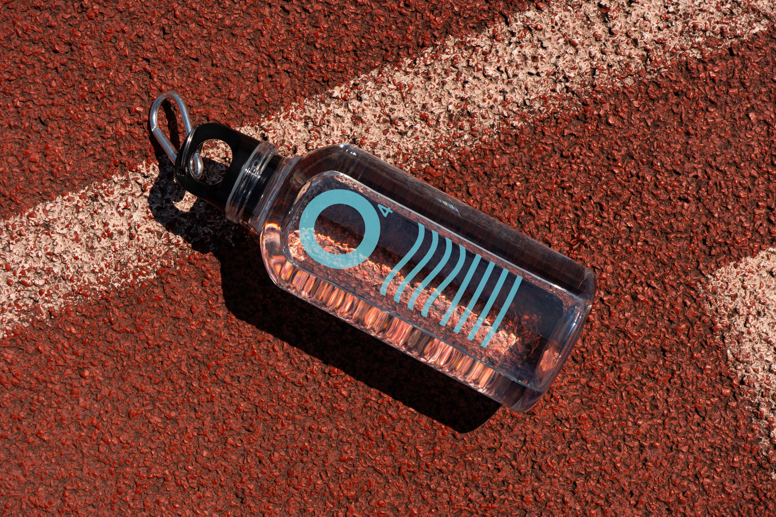
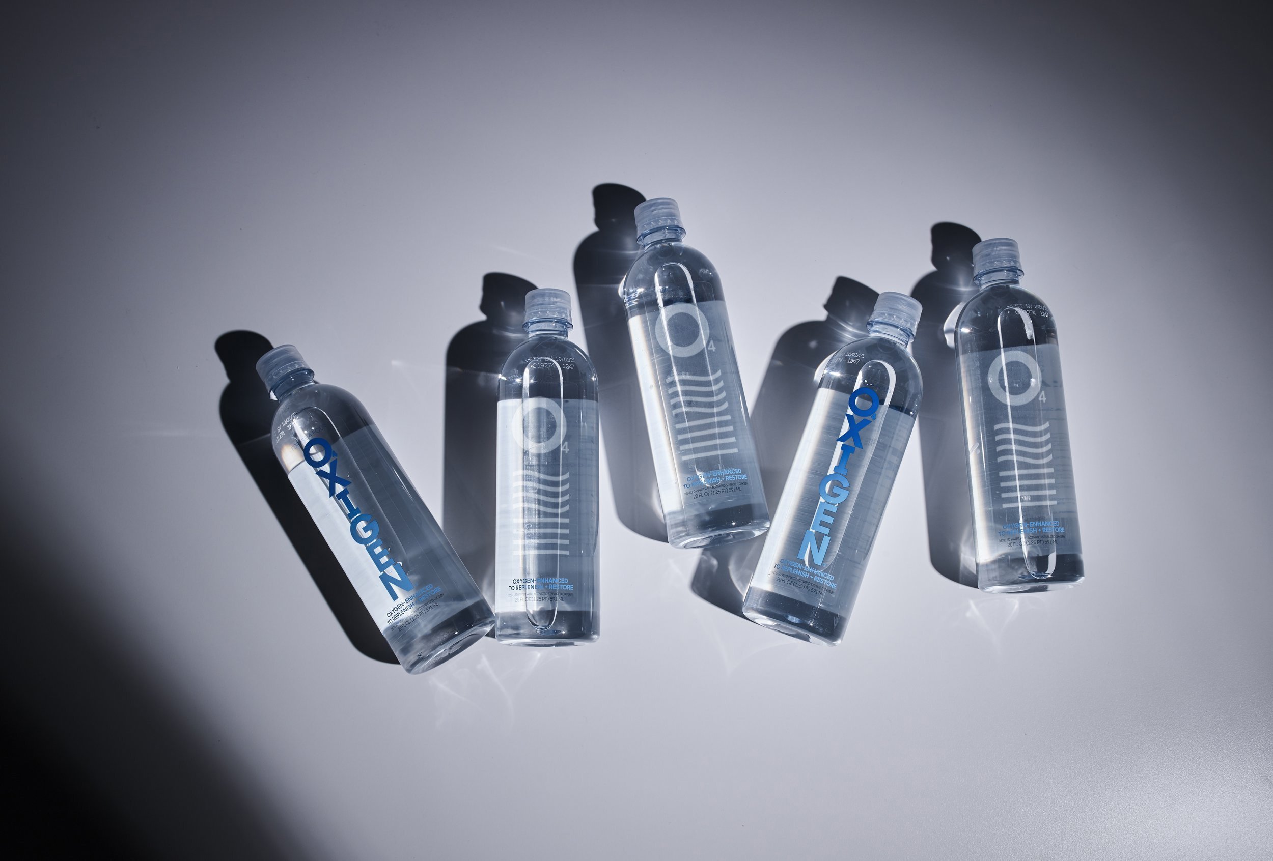
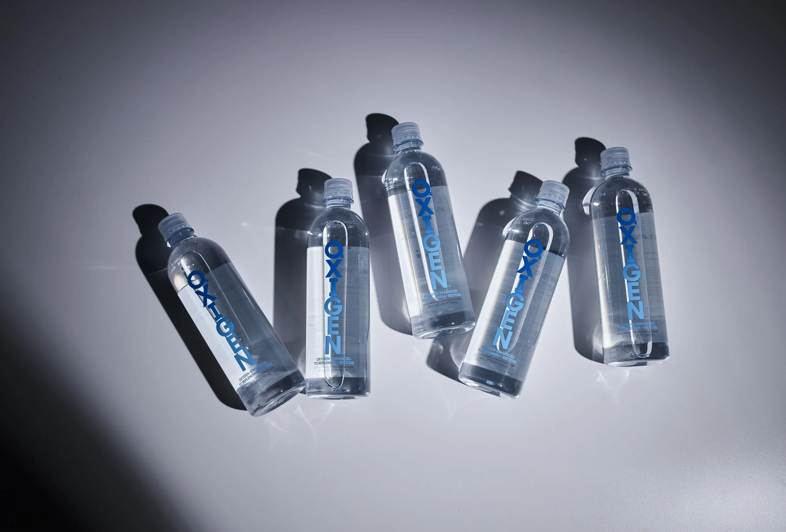
The Alchemy. We refreshed the visual identity with intention and air. A new icon was introduced to bring dimensionality to the existing wordmark, acting as both a visual anchor and a symbolic representation of breath, movement, and restoration. The style guide was rebuilt as a living resource, filled with graphic assets, color direction, photography guidance, and layout rules to ensure consistency across every touchpoint.
The Outcome. The updated brand system supports Oxigen’s wellness-forward mission while feeling premium, flexible, and modern. The refreshed identity now moves as the product does — fluid, structured, and energetically clear.
Sector Hydration + Functional Wellness
Discipline Brand Development
Services Visual Identity Refresh, Brand Icon Development, Photography Direction, On-Set Direction, Guidelines, Creative Direction
In partnership with Ignited